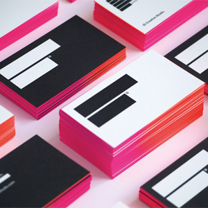
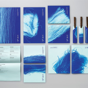
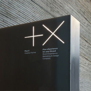
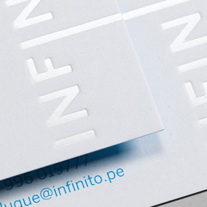
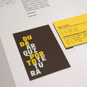
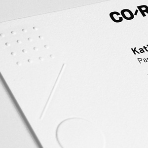
With a maximum of three applications, this category gives a glimpse into how a logo is implemented, providing context that the Logo category can not. Judges reacted positively, awarding various projects where the logo on its own would have probably been rejected. Interestingly, and perhaps an indication that print communications aren't completely dead, ten of the twelve winners showcase business cards and letterheads as their main applications, as opposed to web or digital applications. Taking Best of Category was a set of business cards that first sparked intrigue through the use of a redacted visual device in stark black and white— offset by a bright, hot pink edge. That the name of the design firm behind the redaction is Ingrediente Secreto (IS for short, “Secret Ingredient” in English) satisfied the judges' craving for a good story and concept.