CLIENT
A Madrid-based design consultancy, operating in a global marketplace. Founded in 2010, the concept and goal of IS Creative Studio is to be an important platform for creativity and design with simplicity as the operating philosophy. IS stands for Ingrediente Secreto (Spanish for Secret Ingredient).
BRIEF
Create a bold, minimalistic logotype that can capture IS Creative Studio’s philosophy of simplicity in a graphic identity.
APPROACH
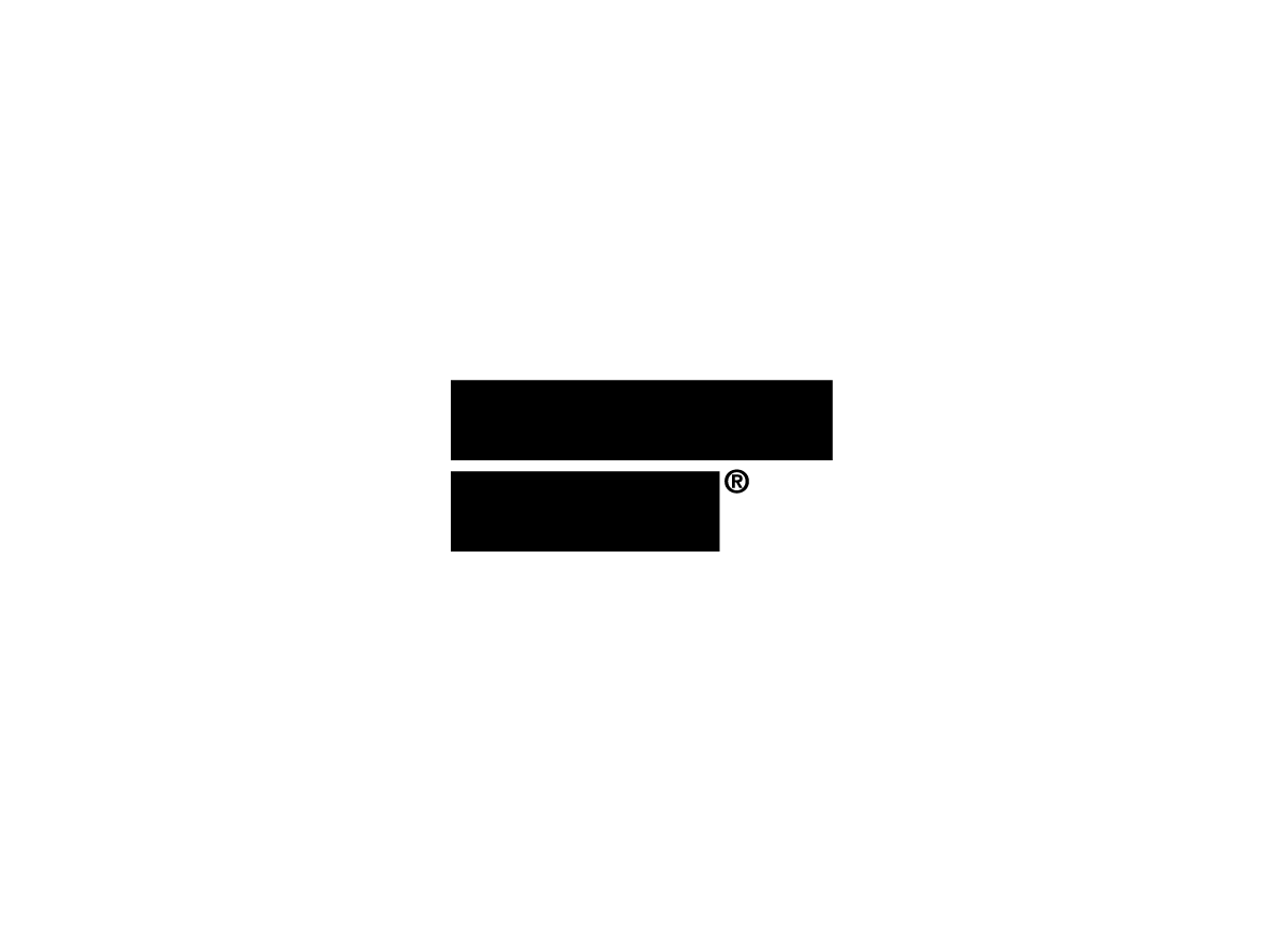
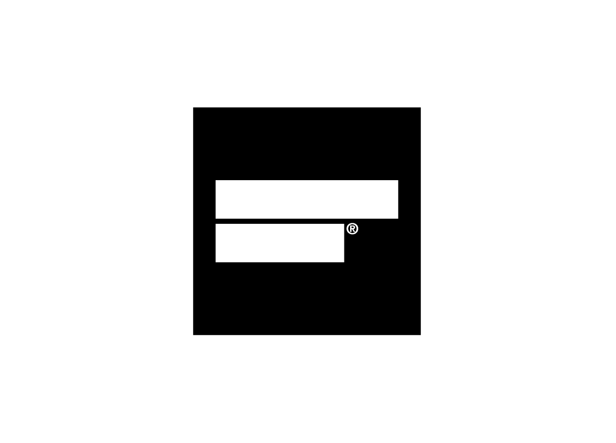
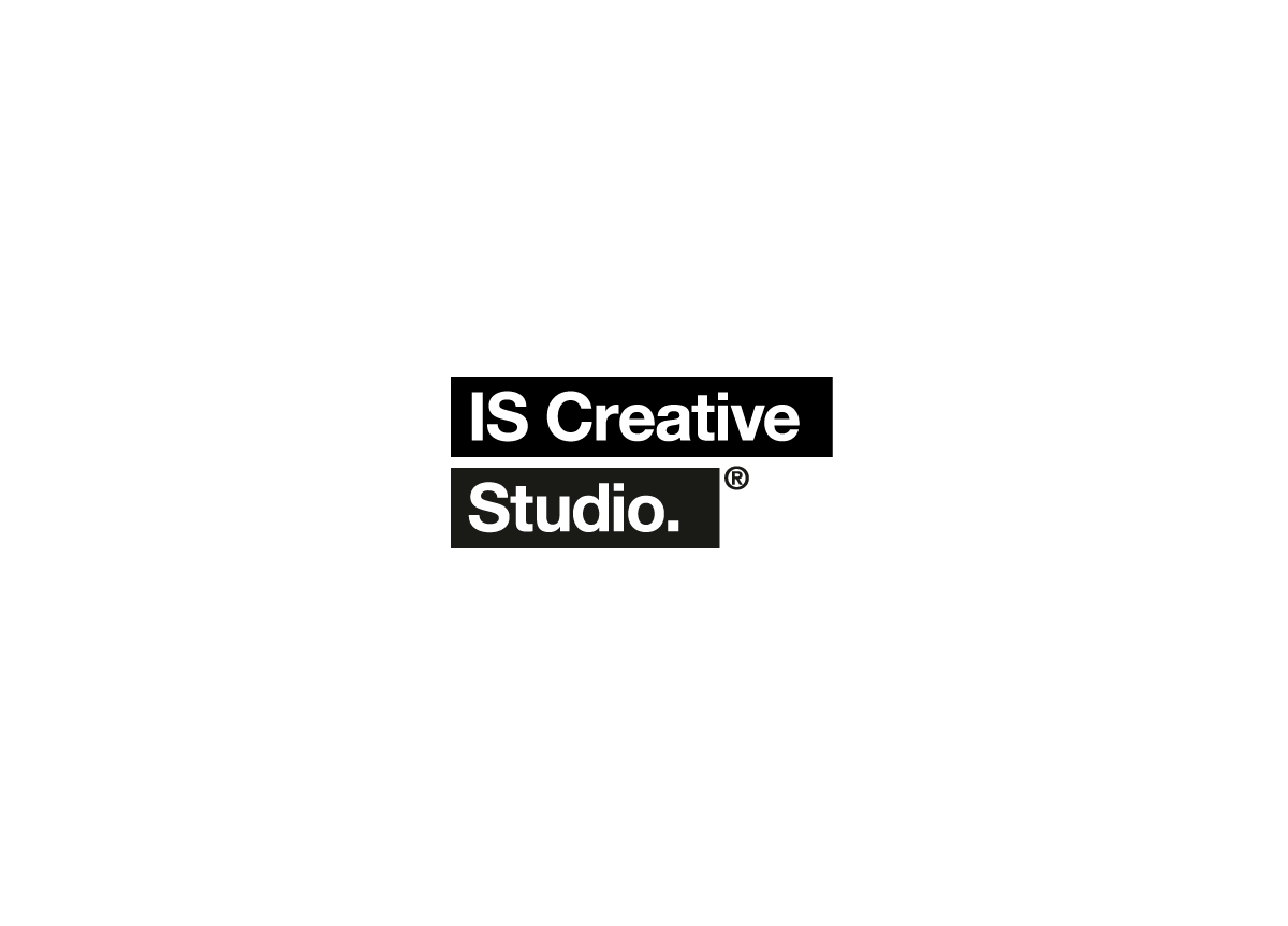
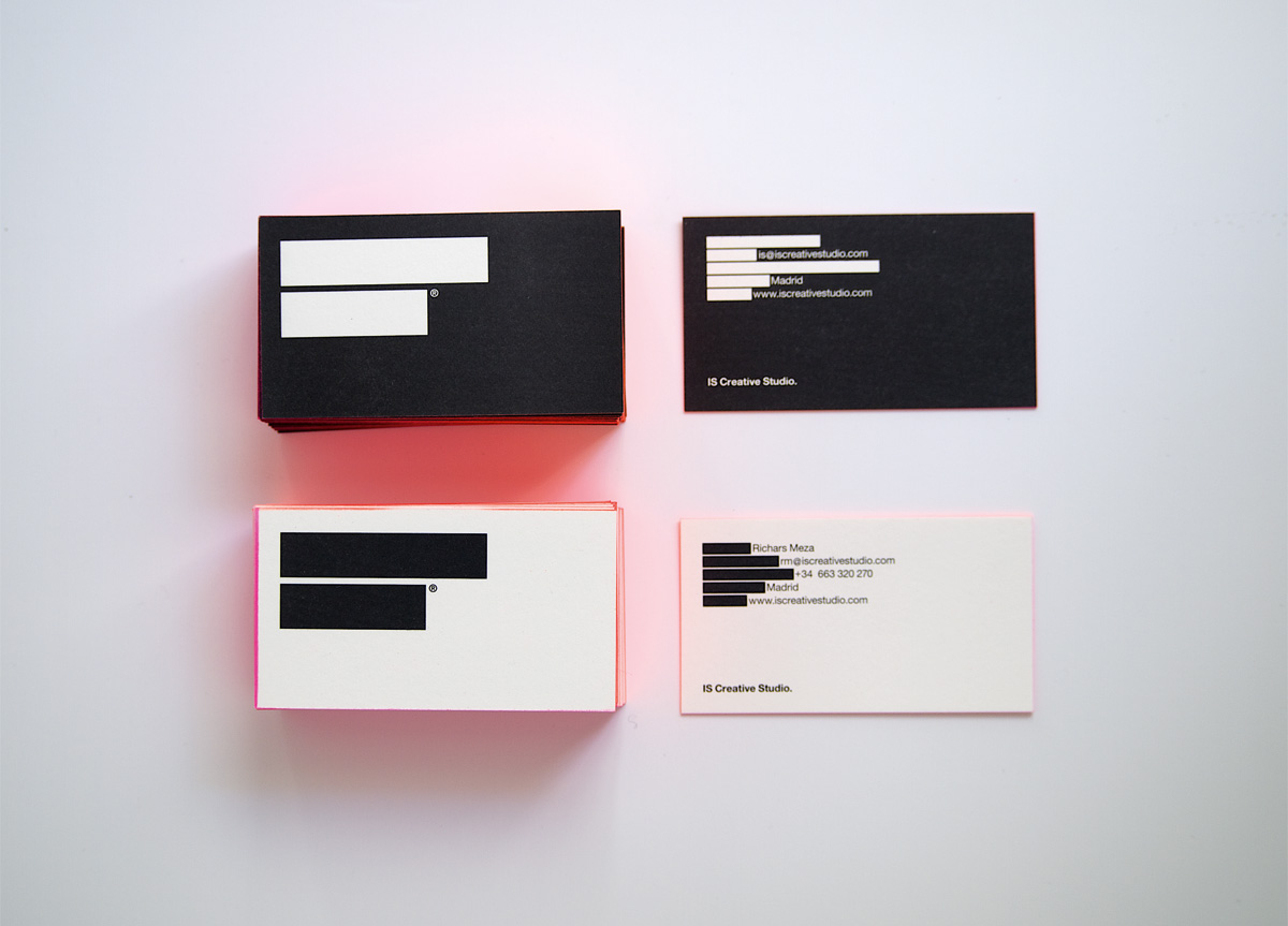
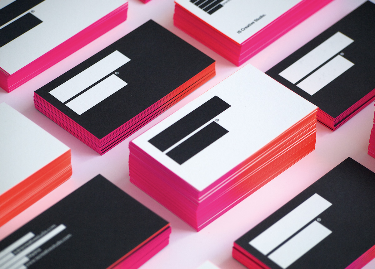
I started by covering some part of the typography, and ended up covering all of it with two black stripes. The addition of the registered trademark symbol helps show that there is something behind the black stripes. With the business cards, even though we liked the black and white design, we realized that it needed a little color. We didn’t want to add a new corporate color, so we decided to paint the sides. I painted them myself with an old airbrush.
The reception to the identity has been quite diverse. When we print something with our logo on it, printers will write back thinking there must be a problem with the file and it is not displaying correctly. It’s funny, and I think it means the logo is something different. When we give the card to clients or prospects, they keep looking at it from the side of the logo, and do some thinking trying to understand how it works. Sometimes they ask about the logo and whether they need to scratch it to see what is behind the two stripes. Usually, if another person is nearby, they will ask for a card as well. — Richars Meza, Creative Director of IS Creative Studio.
Judge’s Comments
While not entirely novel, it did seem to capture the spirit of the time quite well. It worked for me on two levels: one, as a piece of social narrative since communications today are somewhat of a paradox—there are so many forms of high-speed messaging, it seems like important messages can get buried by the the noise. Second, by adopting an “anti-identity,” IS (as a design studio) presents itself as a clean slate, not about to impart some pre-determined agenda on their clients’ work. Of course, the “anti-identity” posture is very much an identity. The airbrushing of the card edges was a nice touch, giving a contemporary ring to the austere presentation of redaction. — Brett Wickens / This was Wicken’s Judge’s Pick
This appropriately ambiguous mark wants to have it both ways: a fill-in-the-blank invitation and a blacked-out redaction. I can’t decide if the registration mark is creepy or cutesy, but the red/magenta and black/white color scheme is beautiful. — andrew blauvelt
The irreverence of the redacted symbol elicited laughter and admiration from all judges. — Ellen Glassman
This system is clean, spare, and elegant. — PAULA SCHER
Again: simplicity and originality. I really liked this one for those reasons. The execution with the color being applied on the side of the business cards made it even stronger. This one put a smile on my face. — Michiel Schriever