CLIENT
The biggest Polish Internet portal with an average number of users reaching 14 million a month. This is a classic horizontal portal that provides over 200 thematic services spreading from news to entertainment to social activities. The audience is Polish Internet users between 15 and 64 years old.
BRIEF
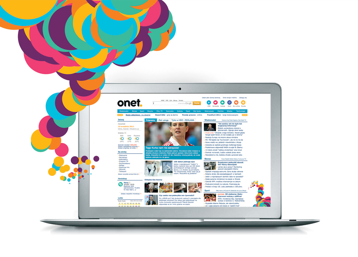
After 15 years of step-by-step changes of its image, Onet came to the position of a leading but quite neutral player with little potential to spark the emotions of its target group. The changes in the media landscape and growing popularity of mobile devices created a natural opportunity for Onet to recreate itself as a modern and progressive lifestyle brand with a literally colorful personality. The task was to reposition the brand, restyle the logotype and create a new visual look for the portal followed by engaging collateral materials.
APPROACH
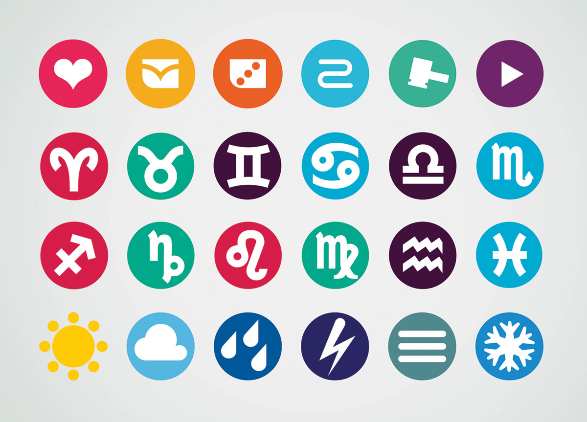
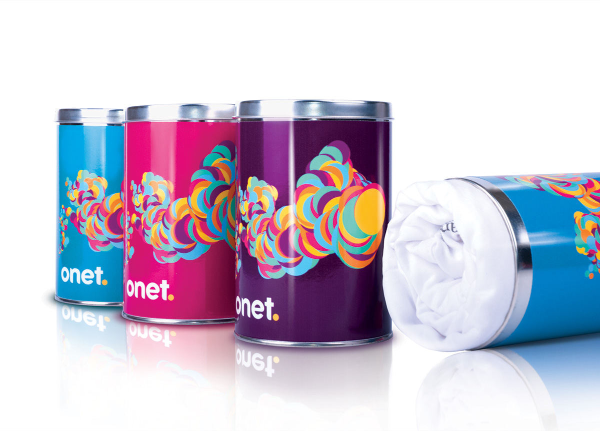
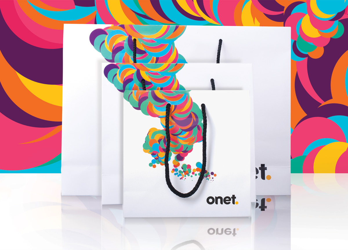
In opposition to the linear way of traditional media consumption, the new Onet promised “The world at your command—whenever and wherever you want.” Before, the only visual elements of the brand were the logo and a yellow dot. This led us to create the identity based on multiplication of colorful dots. We wanted this colorful world to represent richness and attractiveness of the services available at the portal. At the same time, we consciously rejected “glow” stylings typical on the Internet. This idea of dots was also recreated in the icons used on the refreshed web site and subsequent services and materials.
