CATEGORY

Logos

LEVEL

Professional

RANK


DESIGN CREDITS

Art Directors, Designers

Igor Manasteriotti
Mia Maric

Typographer

Matt Ritchie


TAGS

, , , ,


LINKS

grizli.hr
manasteriotti.com

Grizli Communications Agency by Manasteriotti∞Maric


CLIENT

A new Croatian marketing/PR agency run by three big, hairy, experienced communication specialists. After working in big agencies, they decided to start their own company utilizing their skills in more alternative ways (i.e., guerrilla, Internet, etc.).


BRIEF

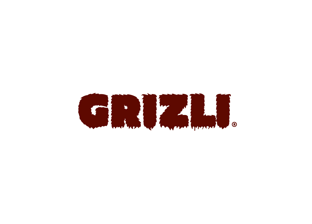
Design a strong, dynamic, original mark that separates Grizli from the usual serious, corporate logos of other agencies. 


APPROACH

We focused on their name, Grizli, which is tge Croatian spelling for“grizzly bear.“The name was perfect: the owners also visually reminded us of bears, and they were hungry for success. Since there are tons of logos featuring bears, and we didn’t want the logo to look like a sports team, we decided to focus on the bear metaphor: a bear is large (heavy font), hairy, and brown. Brown color was also chosen because they could could own it—no other marketing firm in Croatia uses it.

Our first ideas about our logo and visual identity were that we wanted to be original, distinctive, and memorable, just like the name. Basically, we wanted to stick out from other PR and advertising agencies that kind of have this fancy, soft, mellow, and girlish touch. Our name symbolizes our strength and vitality but it also tells a lot about the three founders of the agency with the average height of about 6 feet 3 inches. The only thing we didn’t want was the logo to be aggressive. Hairy typography was a perfect solution and we loved it from the first moment we saw it. — Thomas Bauer, Director of Grizli Communications Agency

Browse entries