CLIENT
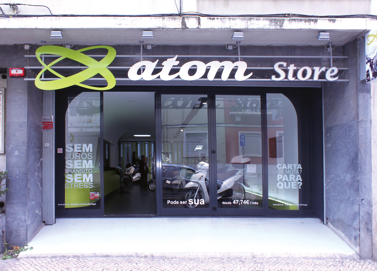
A registered brand, from a group of investors, doing various kinds of business. They wanted to start a brand-new motorcycle company selling their own models of motorcycle and providing lower price and assistance services. The company would start with a store.
BRIEF
Create an identity for a new Portuguese brand of motorcycles that will live with other well established brands on the market. A future aim is international expansion. The target is young and urban.
APPROACH
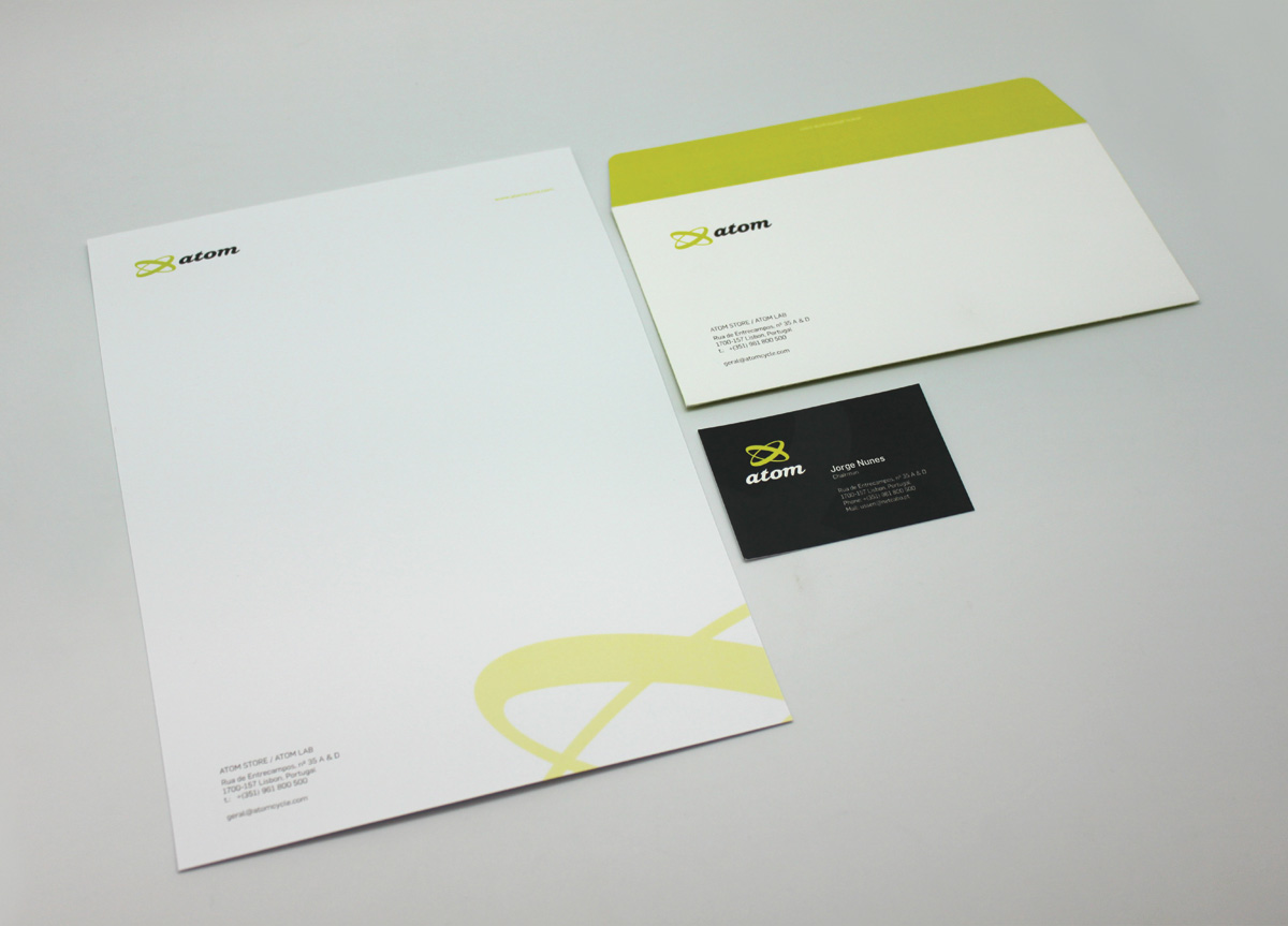
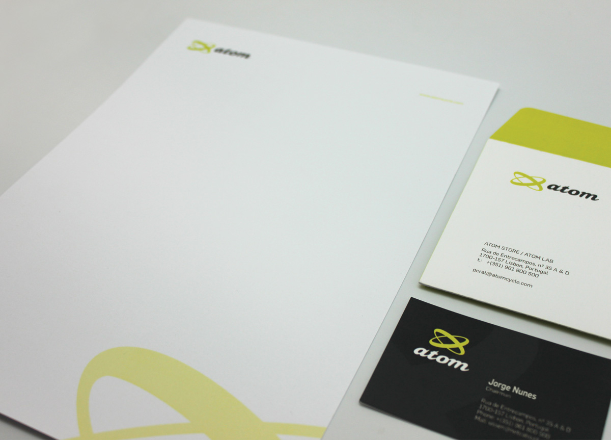
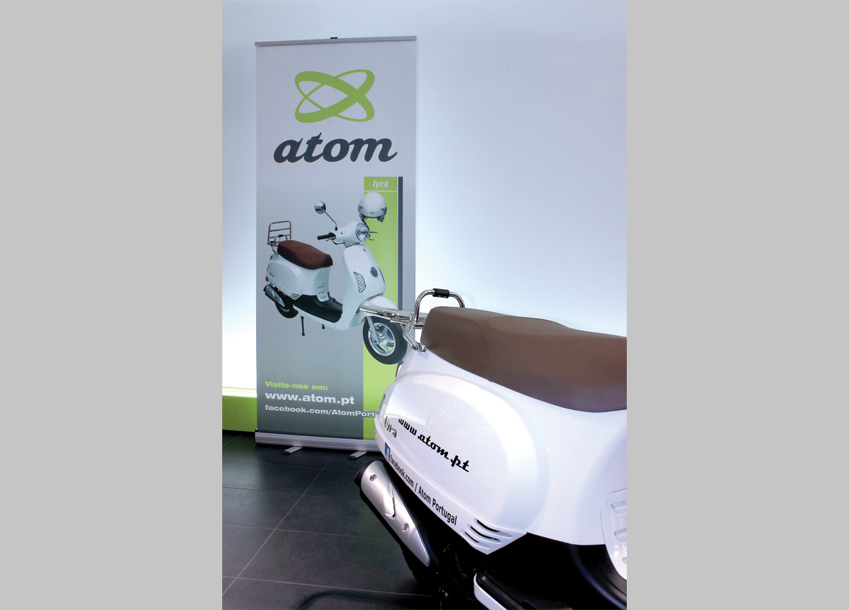
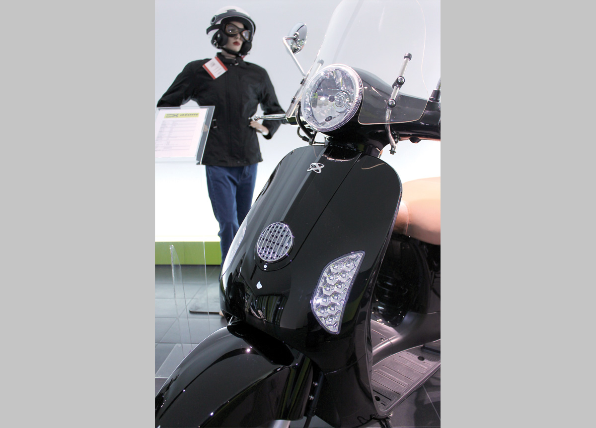
First, the brand characteristics were developed: friendly and able to counteract the prejudice that motorcycles are aggressive and masculine. The logo was designed with fluid forms to transmit movement, freedom, and direction and found reference in the motion of the atom. The two orbits of the symbol suggest both wheels of motorcycles. The typography and colors contribute to a likable and young brand.
