CATEGORY

Comprehensive Identity Programs

LEVEL

Student

RANK


DESIGN CREDITS

School

Warsaw Academy of Fine Arts


TAGS

, , , , , , , ,


LINKS

witekgottesman.com
asp.waw.pl

Tap Water Campaign by Witek Gottesman


CLIENT

A project that wasn’t made for a particular institution, but designed to be potentially used by any municipal body or NGO that deals with environment protection. The target group was all citizens of Warsaw, Poland.


BRIEF

Tap water in Warsaw, Poland is suitable for drinking but most people don’t know about it. For my graduation project I chose to design a social campaign aimed at spreading awareness. The subject of my project is also meant to serve as a design statement. I believe that designers should pay more attention to down-to-earth problems instead of troubling themselves with abstract and bombastic subjects.


APPROACH

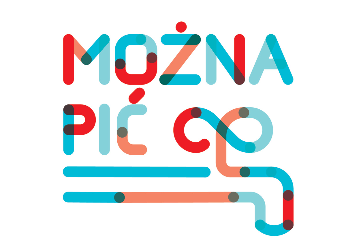
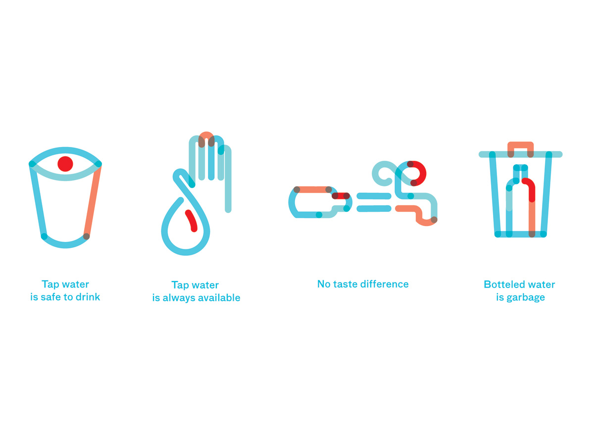
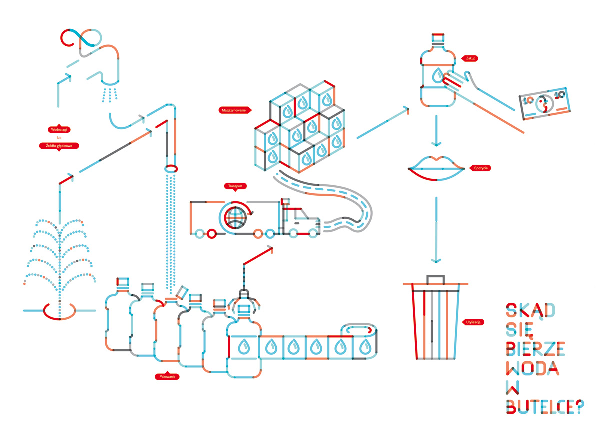
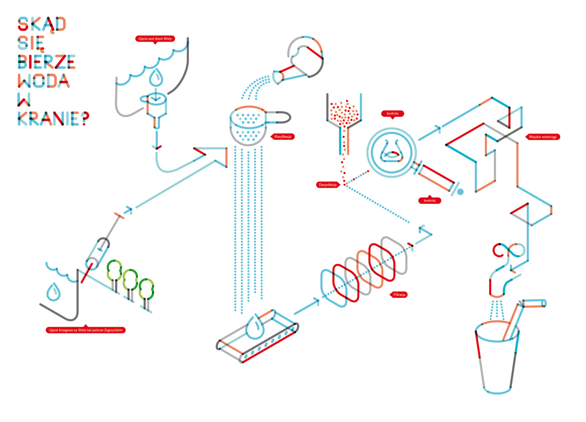
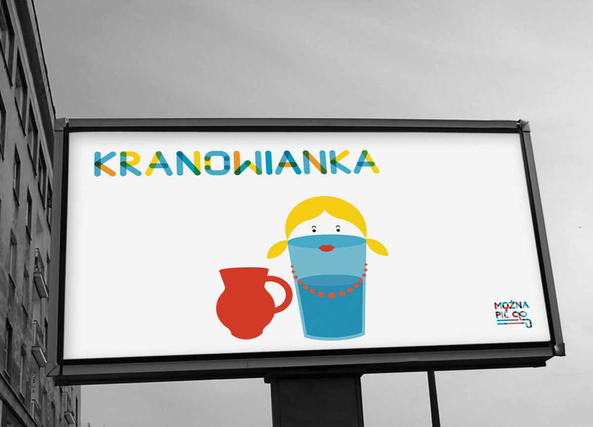
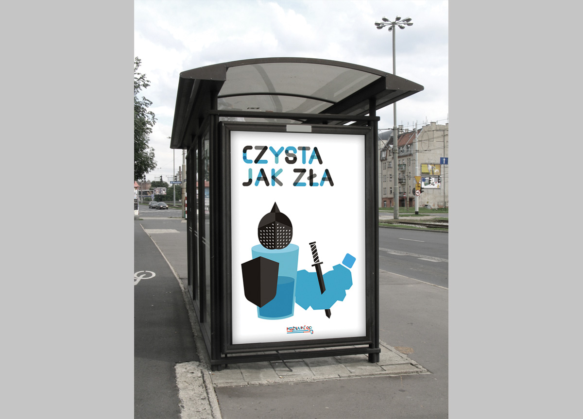
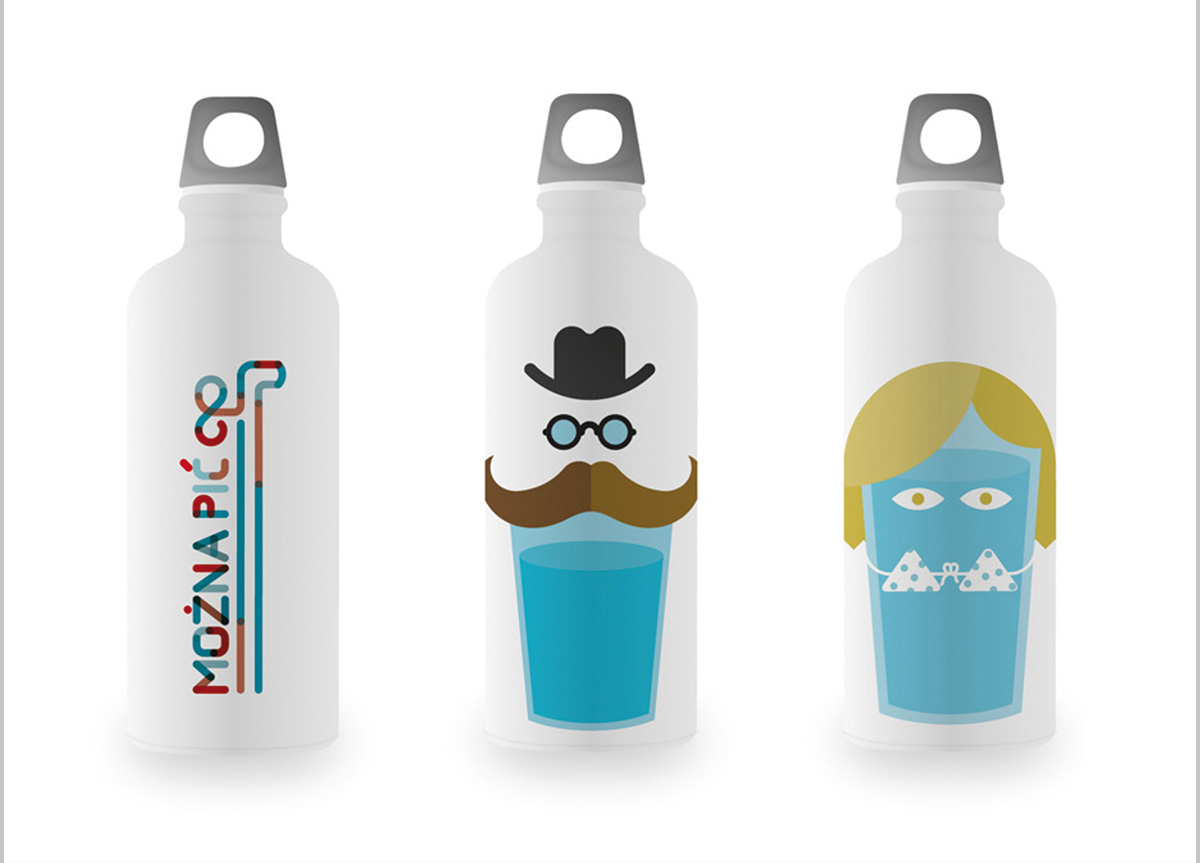
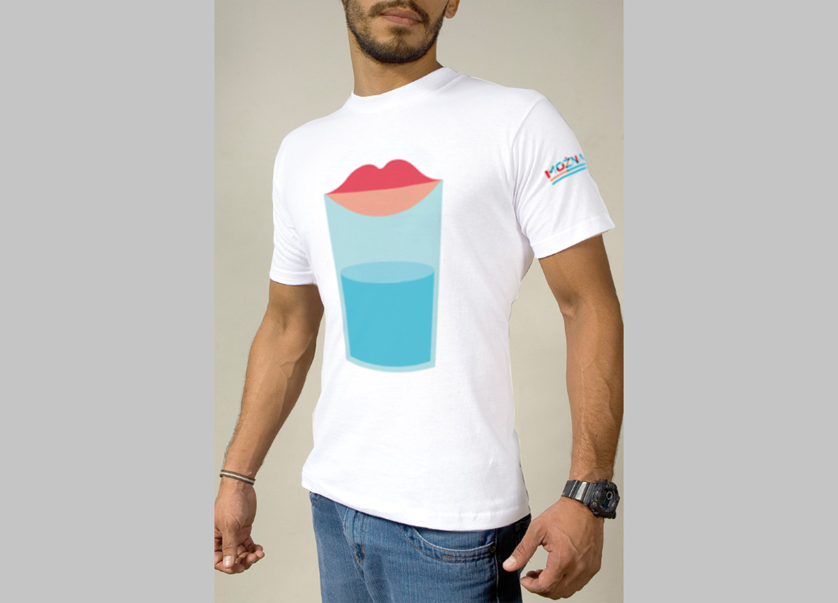
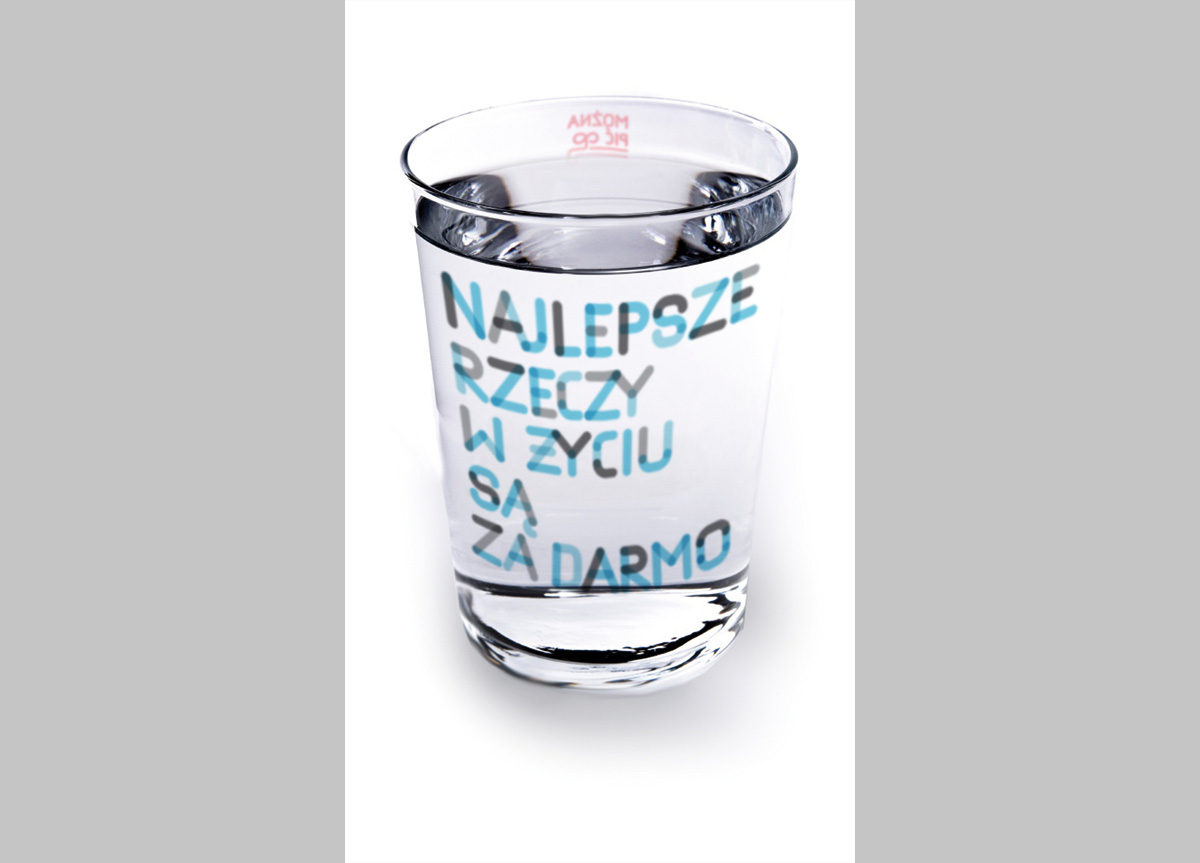
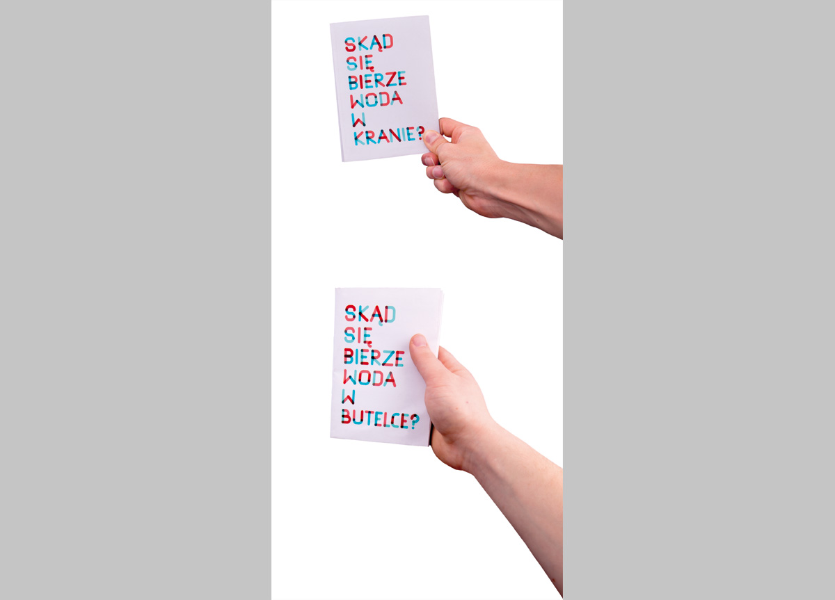
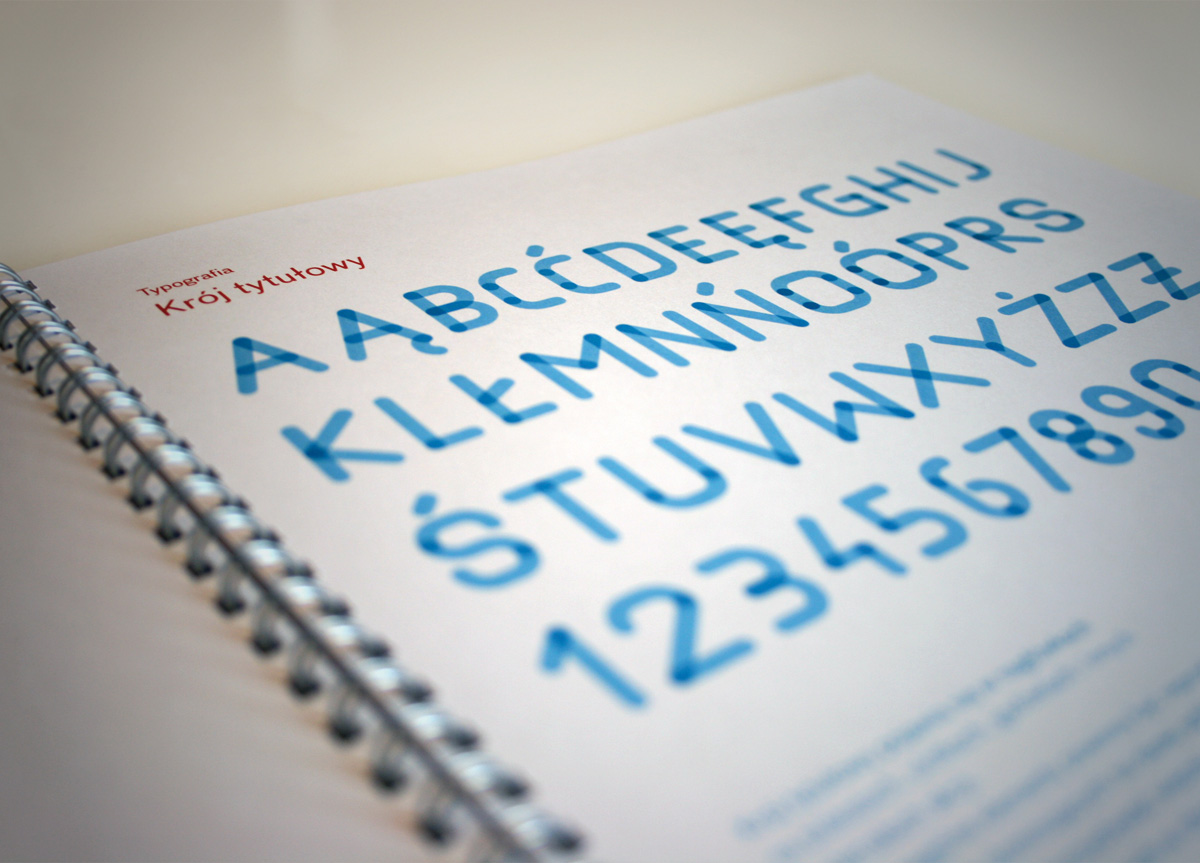
The campaign, titled straight-forwardly “You can drink,” has two major parts. The first is meant to tease the viewer. It consists of illustrated characters of a glass and a bottle accompanied by a bold headline copy. It’s meant to entertain and intrigue the viewer. Most of the materials are designed on white background to emphasize clarity and a scientific approach. The second part is all about information. Materials like info-graphics and ideograms communicate the advantages of tap water. A custom headline typeface, a set of icons, a collection of illustrated characters, and the logotype are among the graphical elements of the campaign.

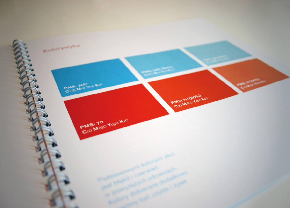
Witek’s graduation project represents a successful attempt at popularizing the idea of tap water consumption. It’s not an easy task to fight prejudices, habits, and lack of correct information. His campaign’s clarity, aesthetic, and methodology help relieve any potential misgivings. The series of informational signs is transparent and understandable to the average consumer. To underline the cleanliness that represents water, the PSA maintains an element of simplicity in presentation and color. The illustrations speak to the Polish sense of humor. I greatly appreciate this project, especially because of its differing visual identity compared to pre-existing PSA efforts. — Professor Lech Majewski, Warsaw Academy of Fine Arts

Browse entries