CLIENT
A British typographer and designer based in London, UK. Rob designs logos, develops typographic identities, and custom-designed fonts. He works both directly for clients and through collaboration with design and advertising agencies.
BRIEF
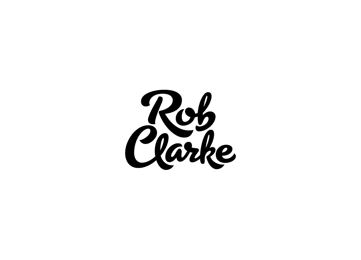
Design a mark of typographic quality that is also unique, playful, and full of personality. It is important to design a wordmark that will not box in the company with one particular style but act as a stamp of quality and personal assurance.
APPROACH
Primarily, I wanted the logo to be a signature of craftsmanship. I didn’t want it to be a run-of-the-mill signature, but more of a considered “brand” wordmark. The weight is bold and the curves were purposely drawn with no imperfections. There was also a desire to show typographic creativity—achieved, in part, by not connecting all the characters.


