CLIENT
A subscription service for wonderful things. This online service ships physical items to customers from influential contributors of their choosing. The list includes Tina Roth Eisenberg, John Maeda, Mike Monteiro, and many more. Each contributor declares a theme but the contents are a mystery to the subscriber.
BRIEF
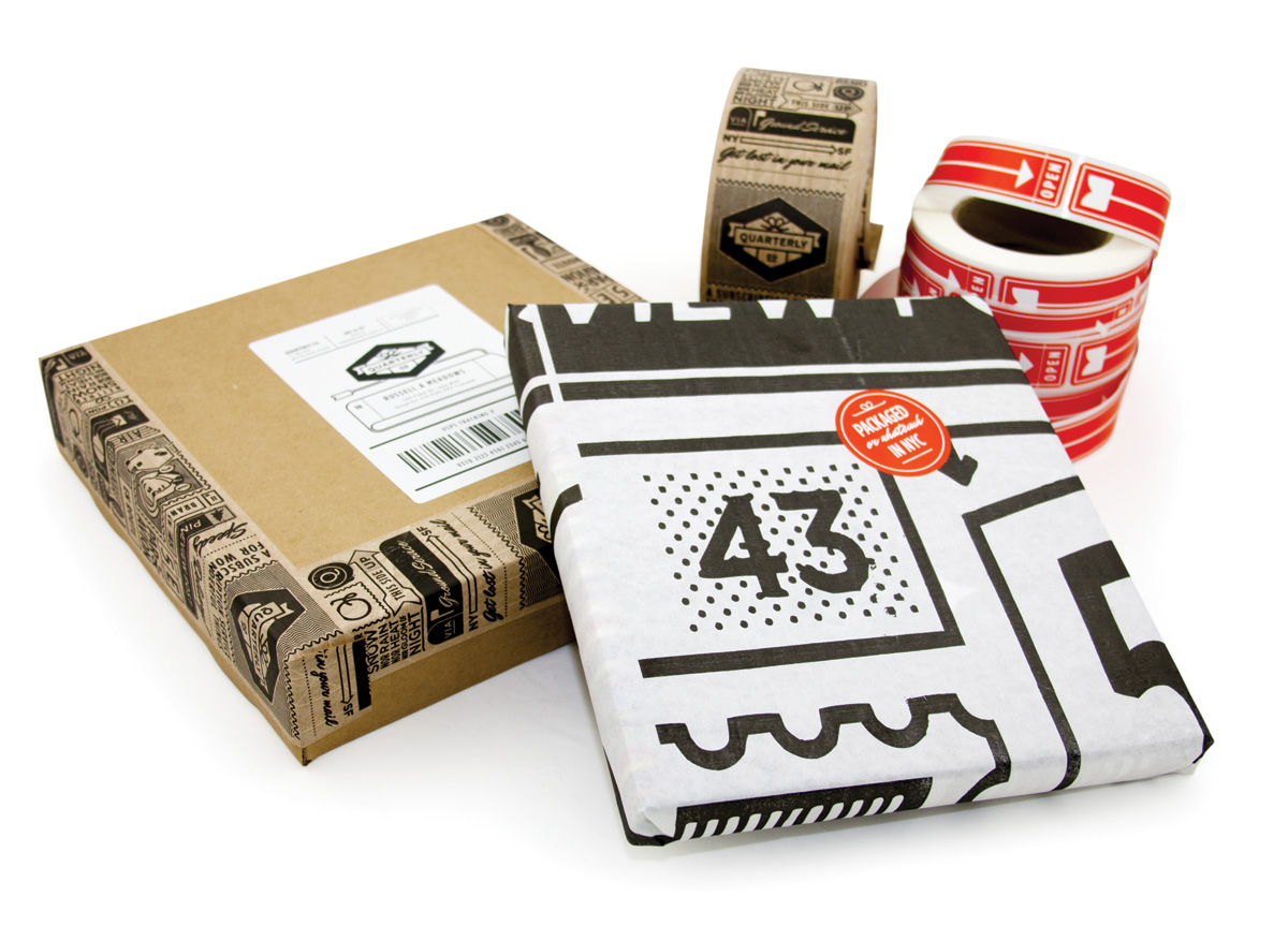
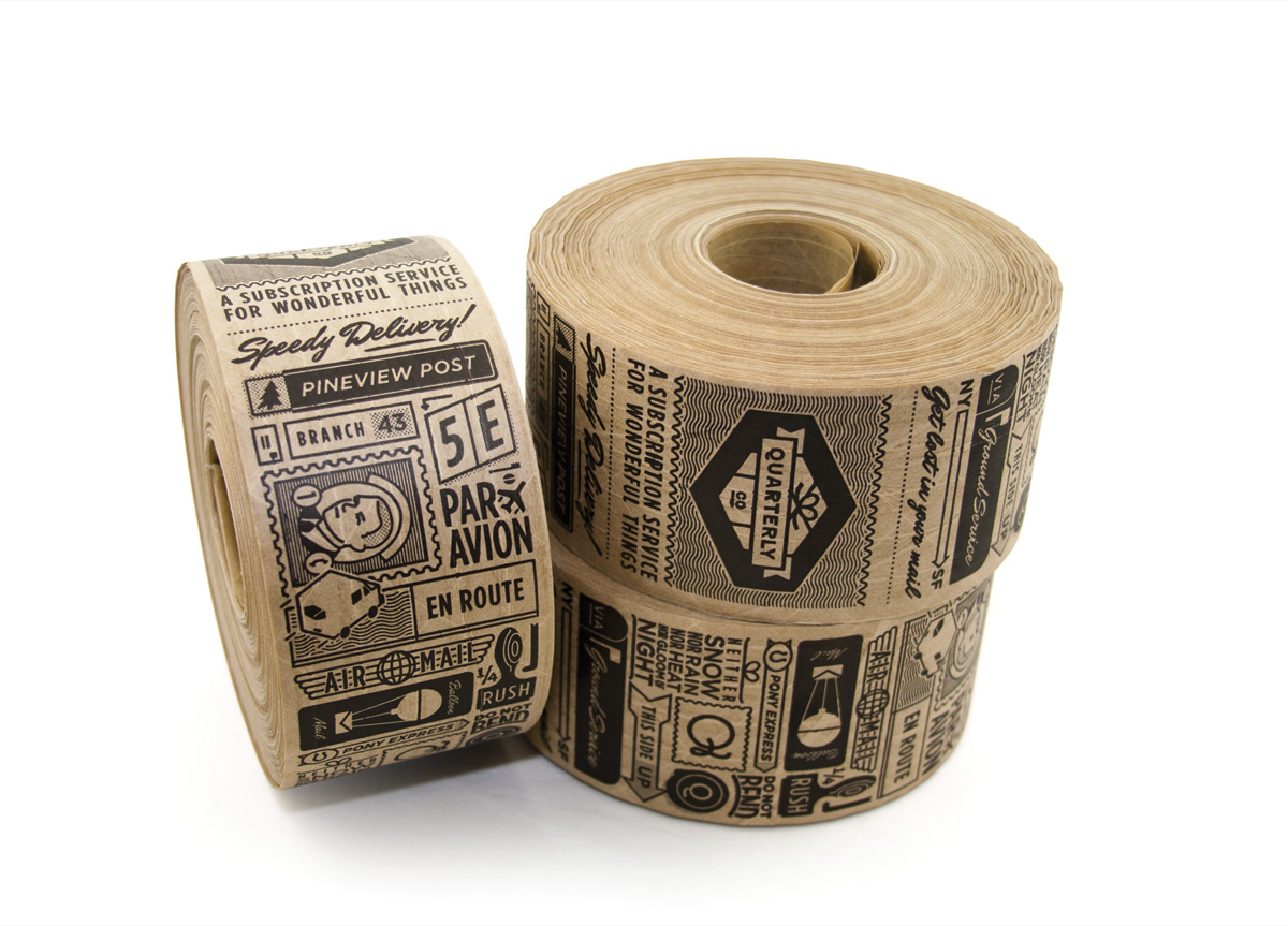
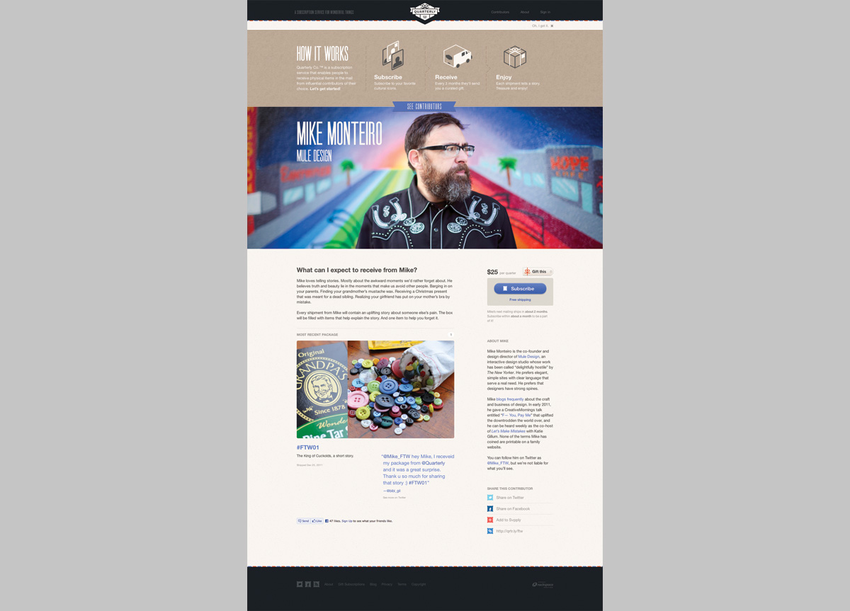
Develop branding, a commercial website, and packaging. Quarterly Co. needed a consistent brand feeling between media. Because of the variety of sizes and shapes of packages, they needed flexible branding elements that could be applied in consistent ways. As a brand that would live on the web and in print, they needed a solution that would withstand hostile print conditions and common screen resolutions. Specifically, they would be printing on coarse materials such as cardboard and wanted to have stamps made: multi-colored and effects-driven designs would not translate well.
APPROACH
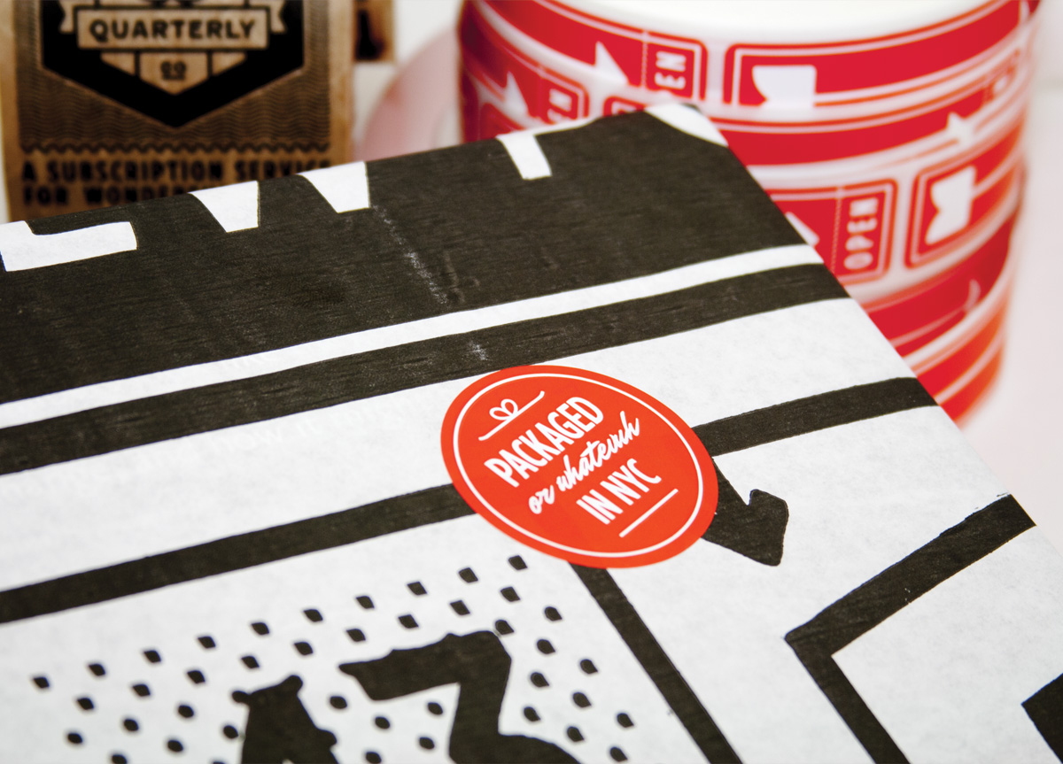
We developed a simple visual language that included color and illustration. The mono-weight line-drawing style is popular, smells of nostalgia, and is applicable to many subjects. The illustrations salute about a dozen pop culture references. We designed flexible elements that can be applied to a variety of package shapes and sizes. The website is commercial in style and is meant to be easy for the user. Tactile effects and styles were used in the interface to introduce some of the warmth seen in the packaging.


