CATEGORY

Logos

LEVEL

Professional

RANK


DESIGN CREDITS

Art Directors, Designers

Igor Manasteriotti
Mia Maric


TAGS

, , , , , ,


LINKS

croatia-fishing-charter.com
manasteriotti.com

Megabite Charter by Manasteriotti∞Maric


CLIENT

A new Croatian fishing charter that offers big game fishing tours.


BRIEF

Megabite wanted a professional identity that would make them stand out from the usual complicated, over-illustrated style of fishing charter logos. 


APPROACH

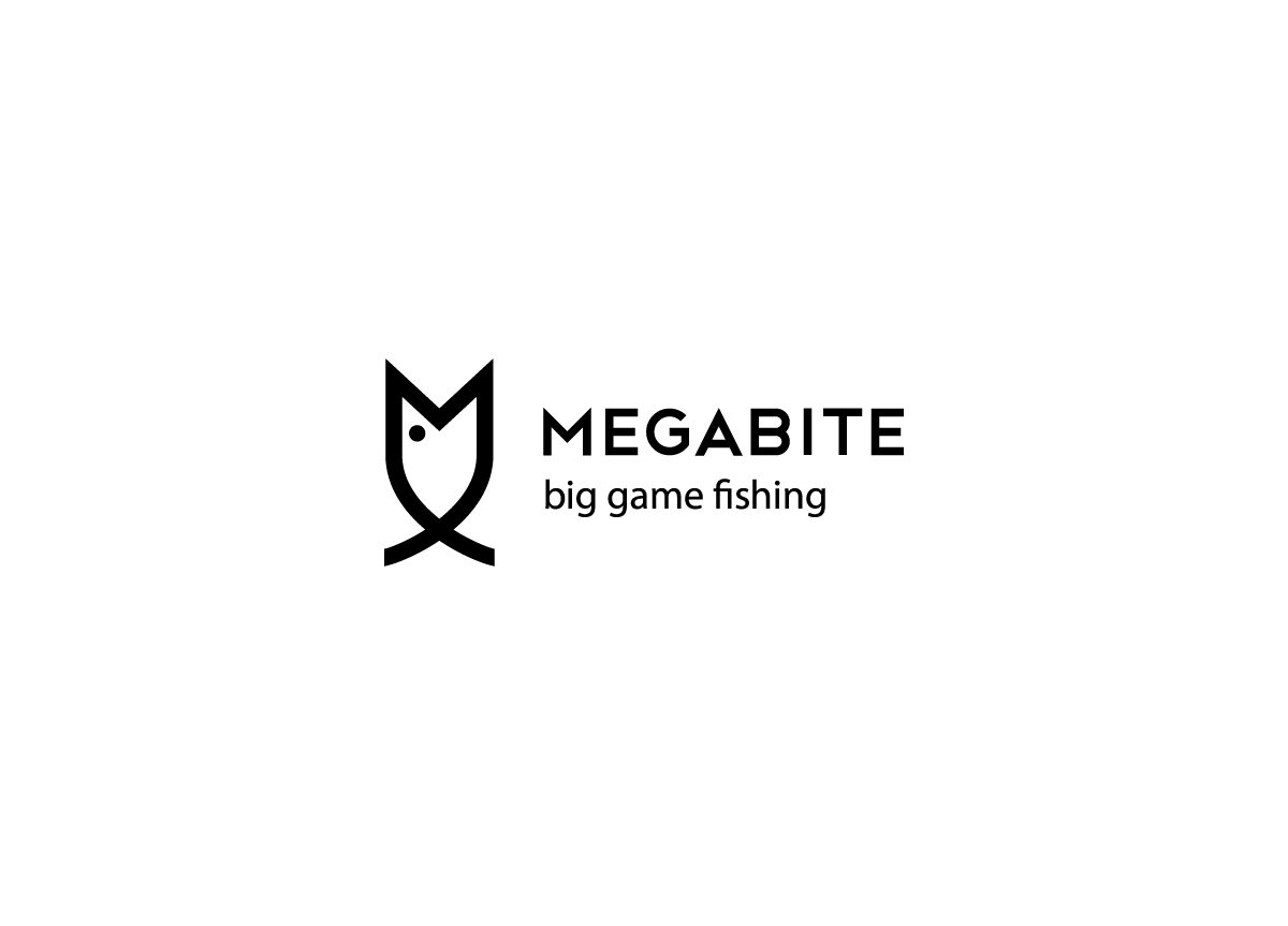
The letter M reminded us of a fish’s bite, and by extending the letter we could draw the fish in one simple step. It was important to us to make a simple, memorable solution, which will really stand out in the labyrinth of charters at the harbor. The logo is always used vertically so that the letter M is visible and emphasized as much as possible.

It was important for us to stand out among the numerous other charter services in Croatia. Our approach to the fishing charter business was to make it as professional and modern as possible to separate ourselves from other charters that mostly stagnate in their offer and quality. Our new logo tells this story really well. It is very simple, very memorable, easy to apply on any material we need, and cost-efficient due to its single color. Both we and our customers love it! — Boris Kosovec, Owner of Megabite Charter

Browse entries