CLIENT
A Singapore-based chocolate manufacturer that typically manufactures and packages chocolates and other confections for other brands. With Minette, they are looking to launch their own brand of chocolates.
BRIEF
Develop a brand that was whimsical yet luxurious to target the “fun-loving, white-collared demographic who appreciate the finer things in life.” The brand needs to work across various price points and have flexibility so that it works as an impulse buy as well as a chocolate gift box designed to impress.
APPROACH
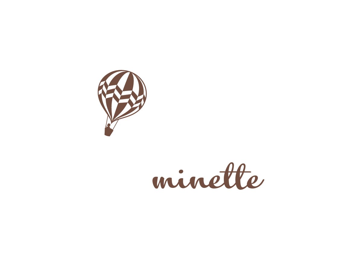
The logo and wordmark had to be versatile enough to work on different product lines and price points. The wordmark was designed so that it can come across playful or sophisticated depending on the context or packaging. We avoided being “luxurious” in the traditional sense of the word—the staid, ornate, or overly formal. The logo, a hot-air balloon, adds a touch of whimsy. It is also a symbol of freedom: being carefree, autonomous, able to act on a whim—the ultimate luxury for most.


