CLIENT
A well-known architect from Rio de Janeiro, Brazil. Currently his company has over ten architects, and their work varies from interior design to house construction to planning complex condos. They work mainly in Brazil and Angola, however their work may be found in other countries.
BRIEF
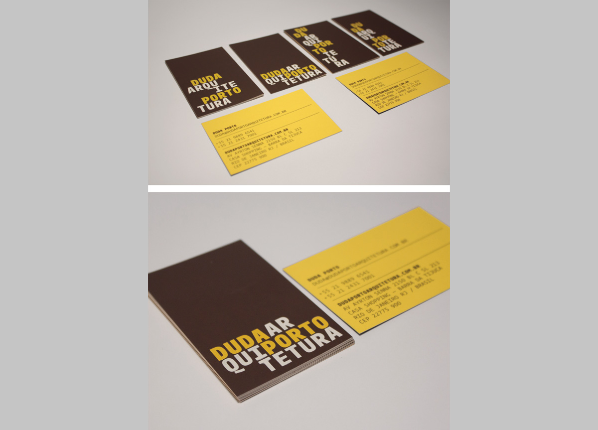
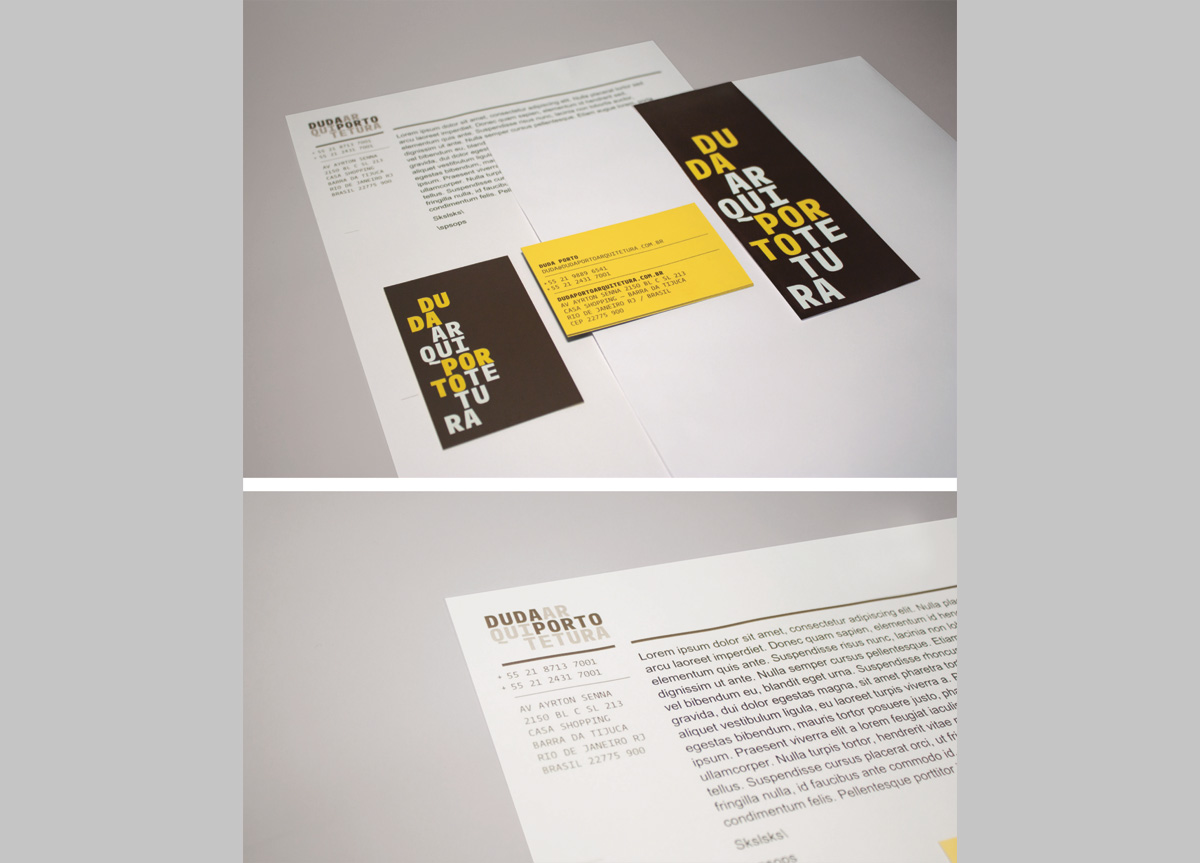
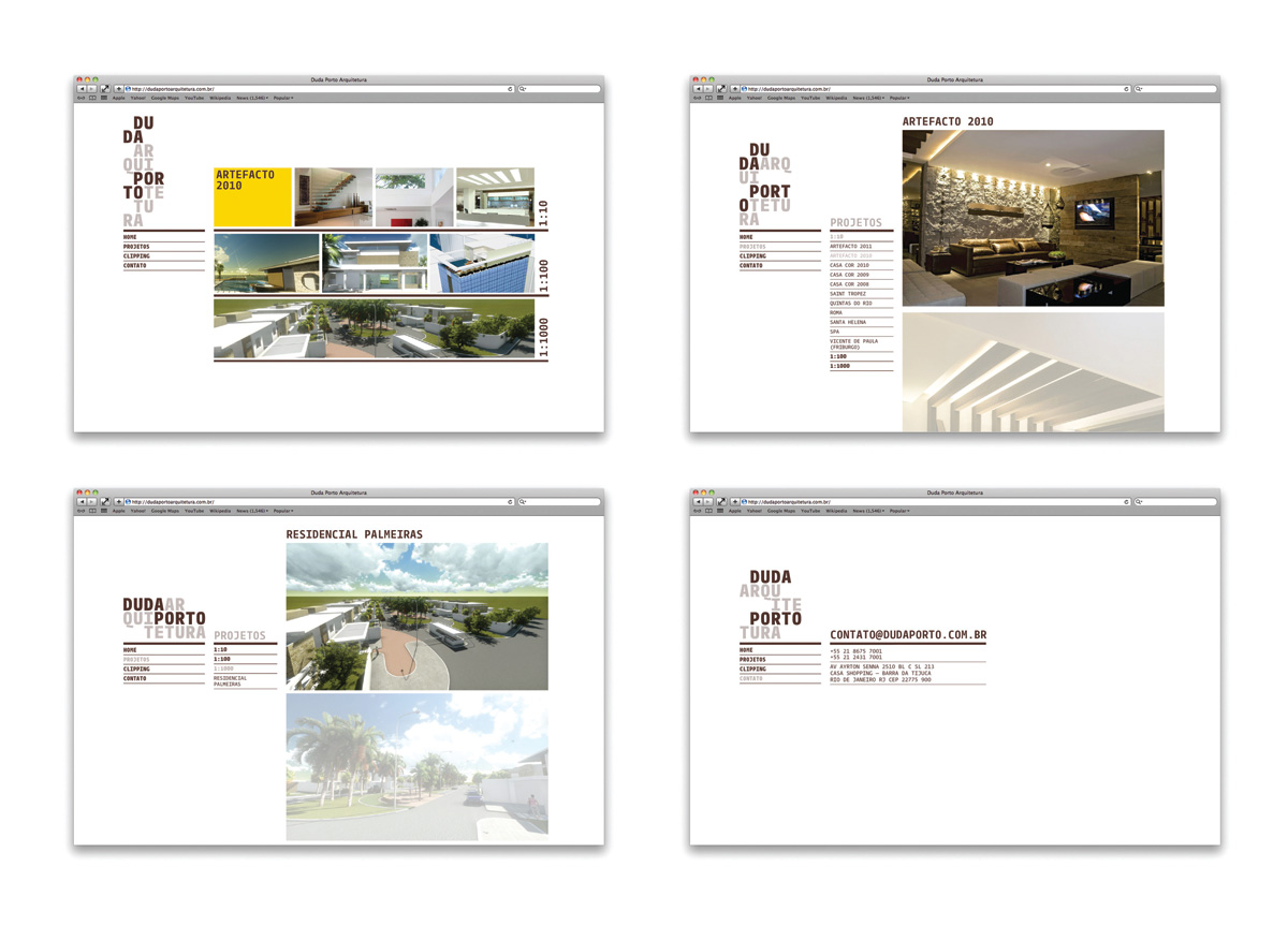
Create a new visual identity for Duda Porto’s brand and develop all communication materials, presentation cards, brochures, Moleskines, and rulers. Our main challenge in creating the new identity was to translate their capacity of working in different scales and complexity of projects.
APPROACH
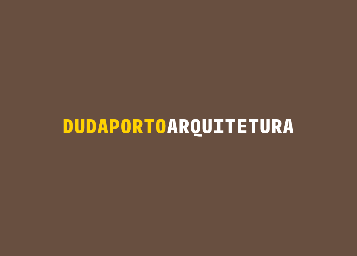
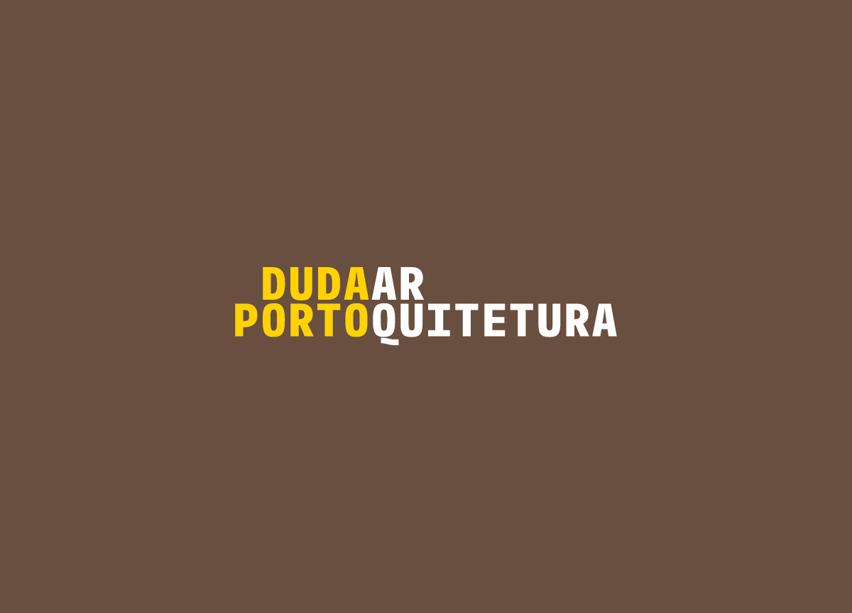
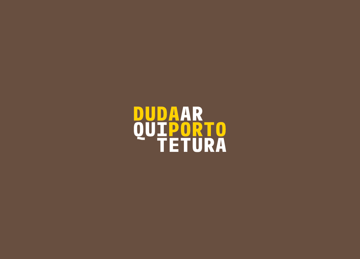
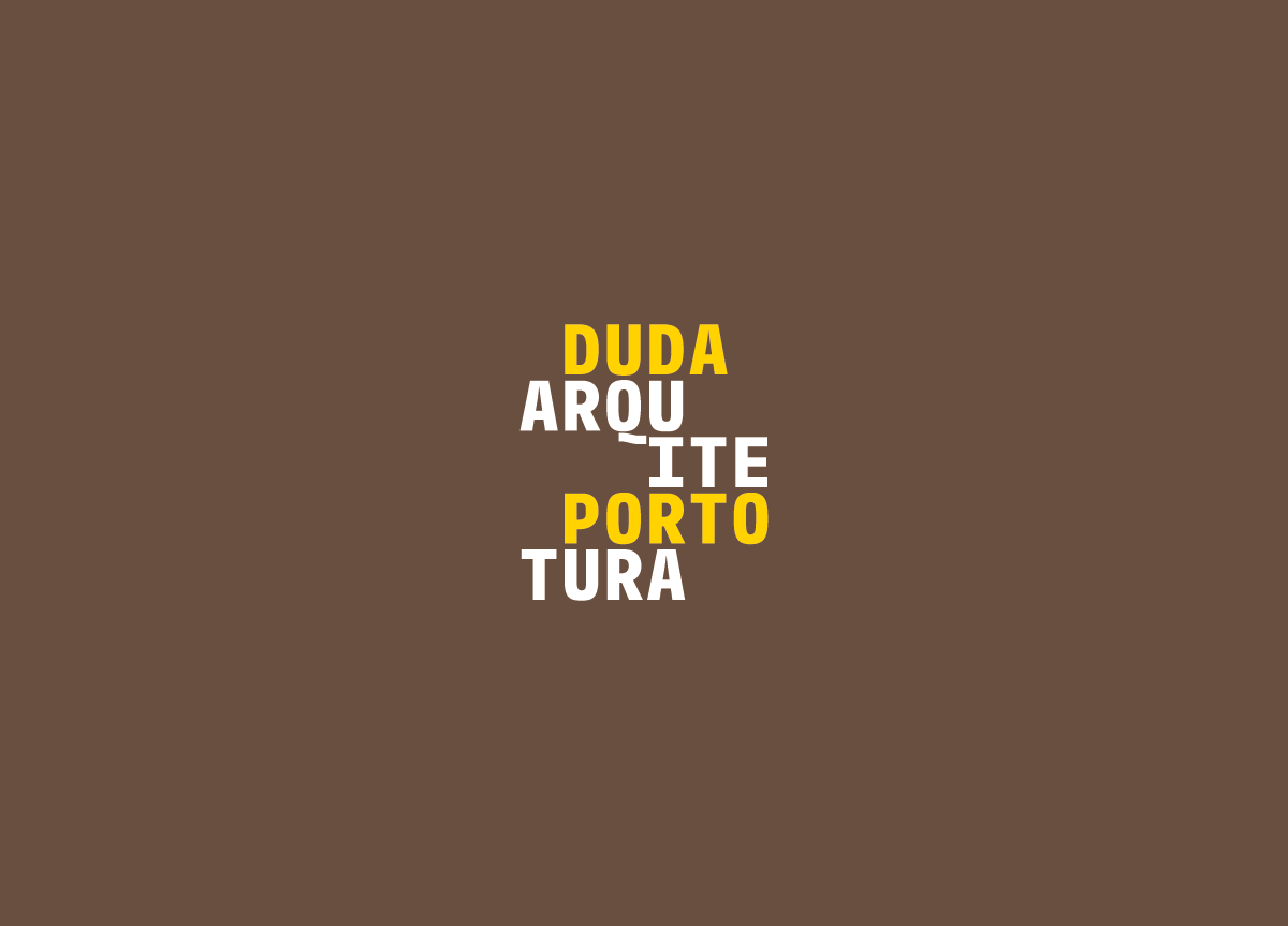
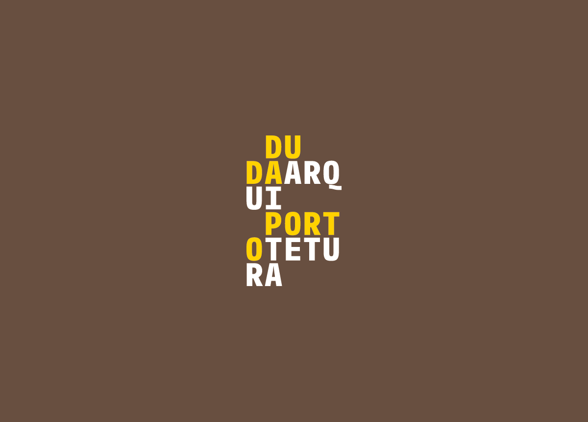
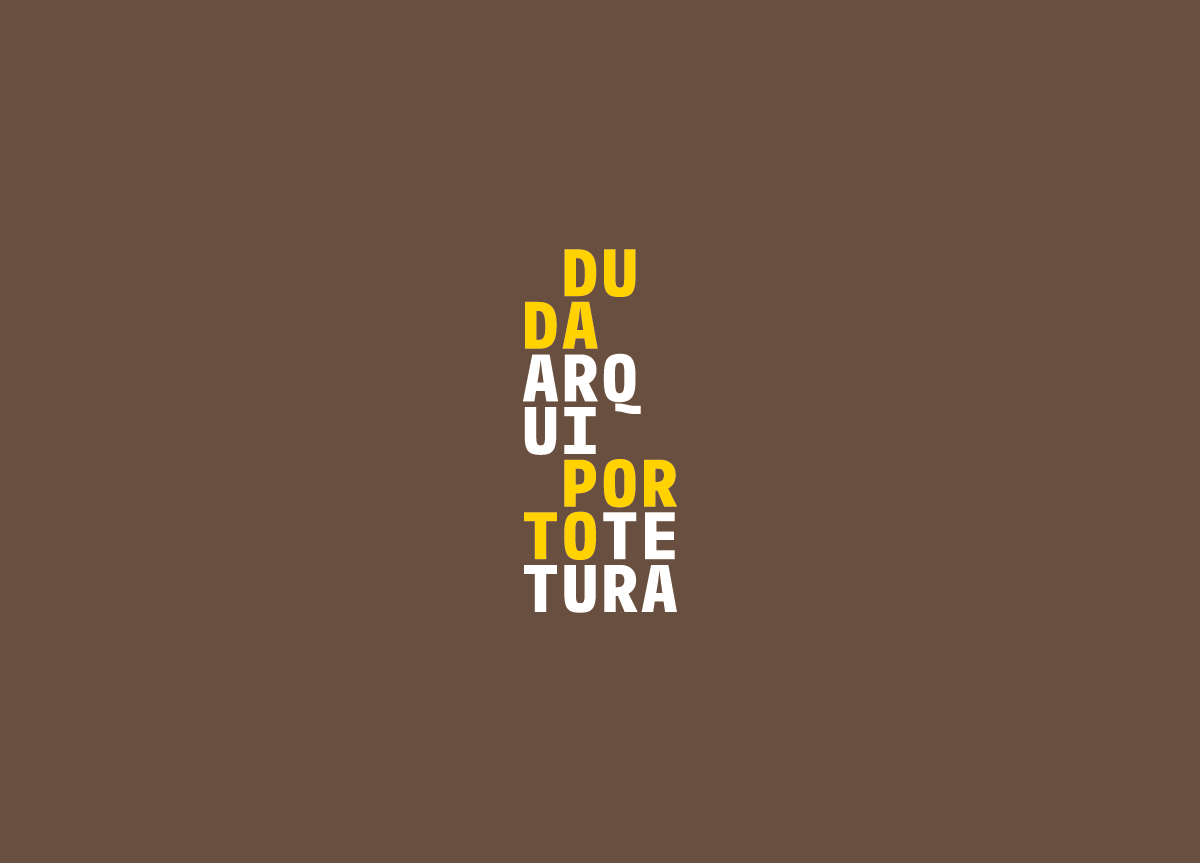
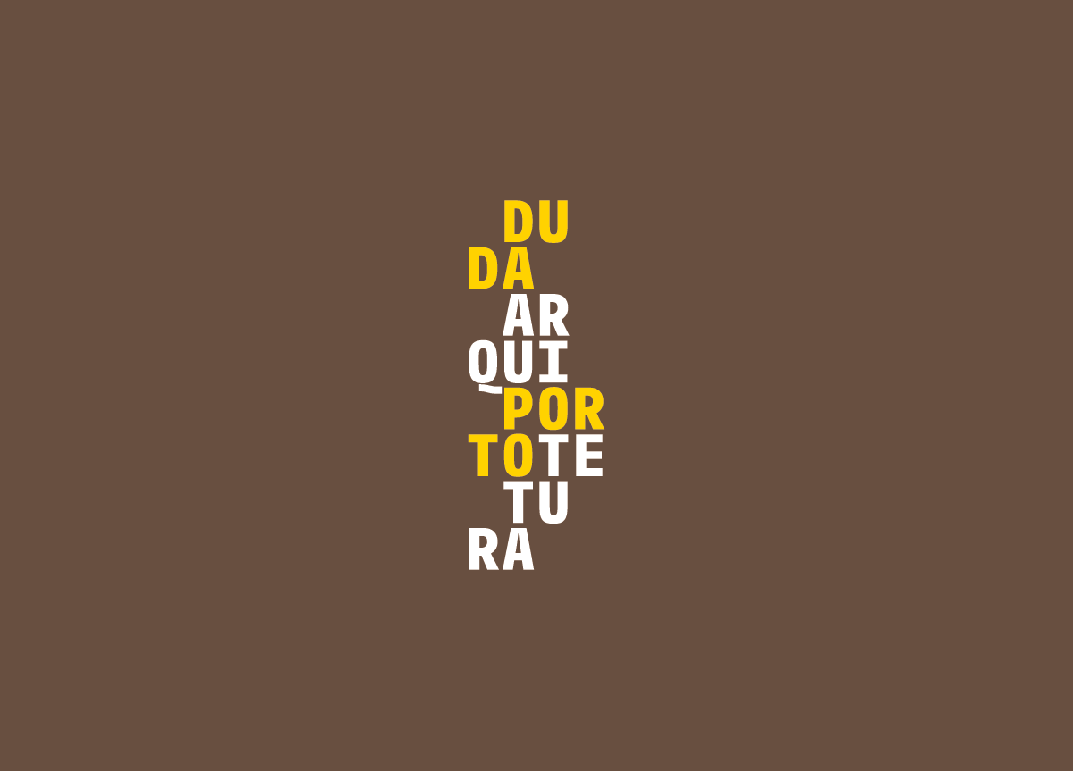
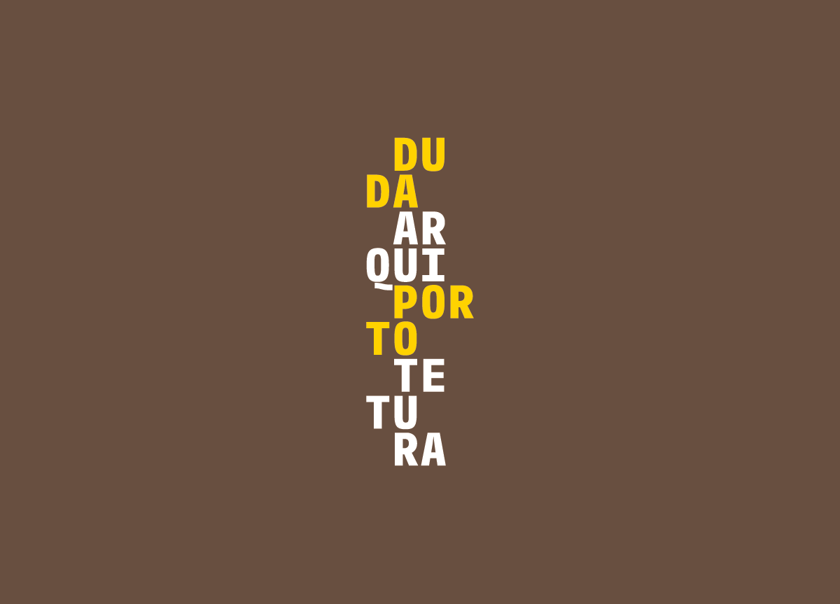
Our greatest limitation was the company’s name. They were called 2D, although all clients referred to them as Duda Porto Architecture. After studying the benchmark we managed to convince them to use Duda Porto Architecture. We decided to explore the idea of an architect’s scale ruler—a simple tool used by architects. We developed a systematic signature that would change randomly regardless of the media. This new signature represented their work with a modular type treatment that often changes. The color was selected to elevate the brand, and complement Duda Porto’s architecture. We used horizontal and vertical variations, breaking the words, as if they were construction bricks.


