CLIENT
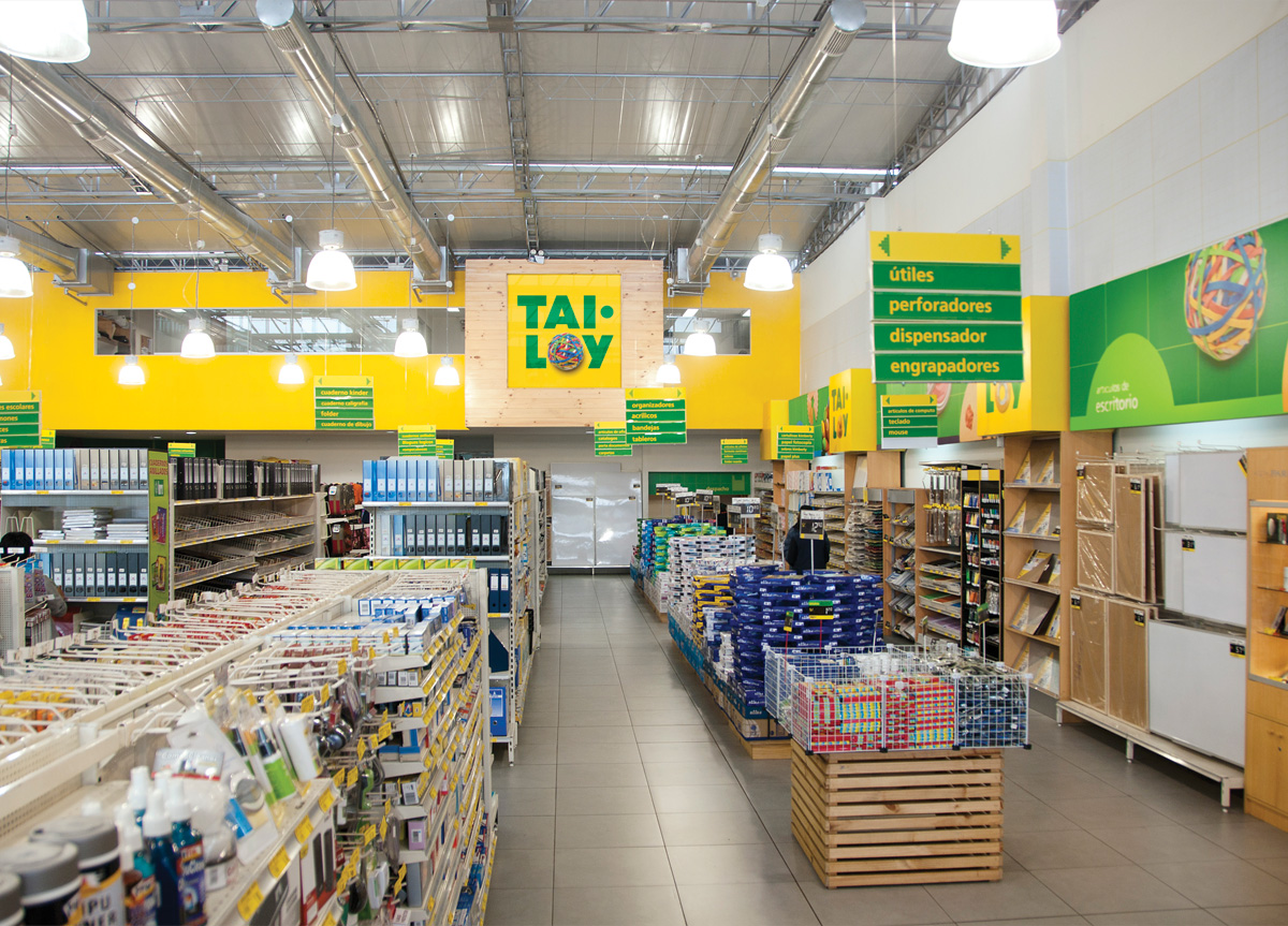
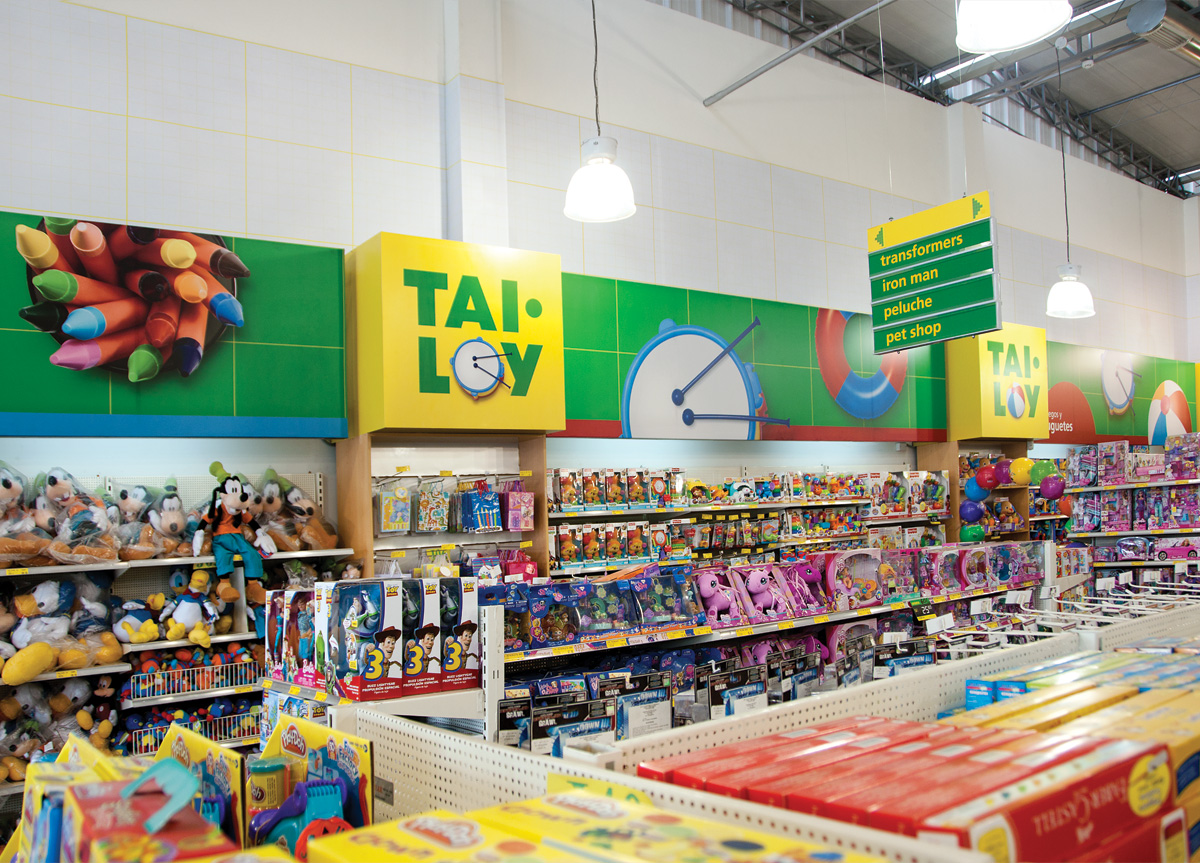
A Peruvian chain store specializing in stationery, office supplies and toys. They have been in the market for more than 40 years. Their audience is middle and upper class mothers who look for school supplies for their children, students and professionals in the arts and business offices.
BRIEF
Recently they realized they needed a complete overhaul of their identity because of the threat of the arrival of foreign competition. The new identity had to be entertaining and fun and it had to deliver the promise of a one-stop shop where you can find all the supplies you need.
APPROACH
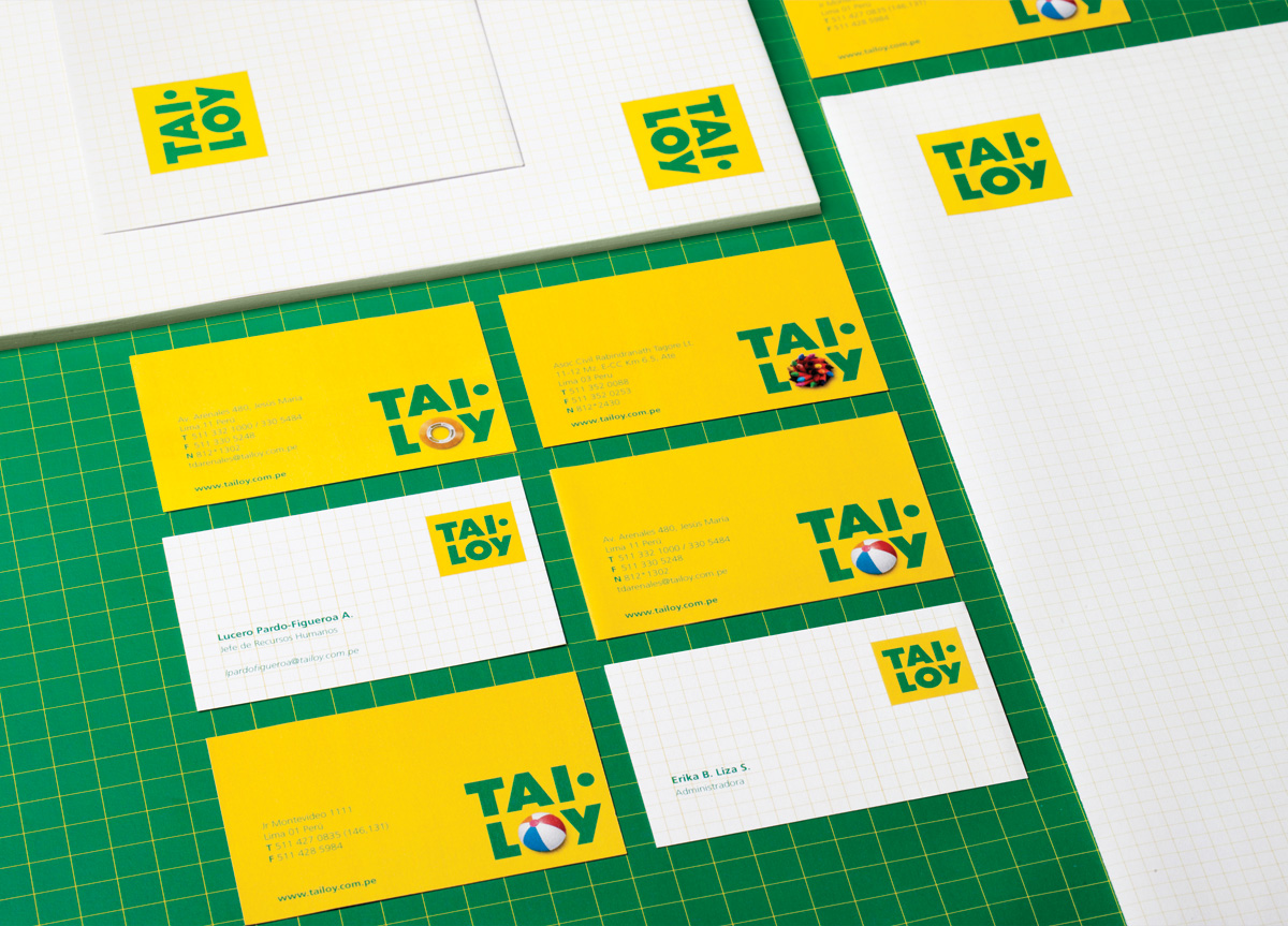
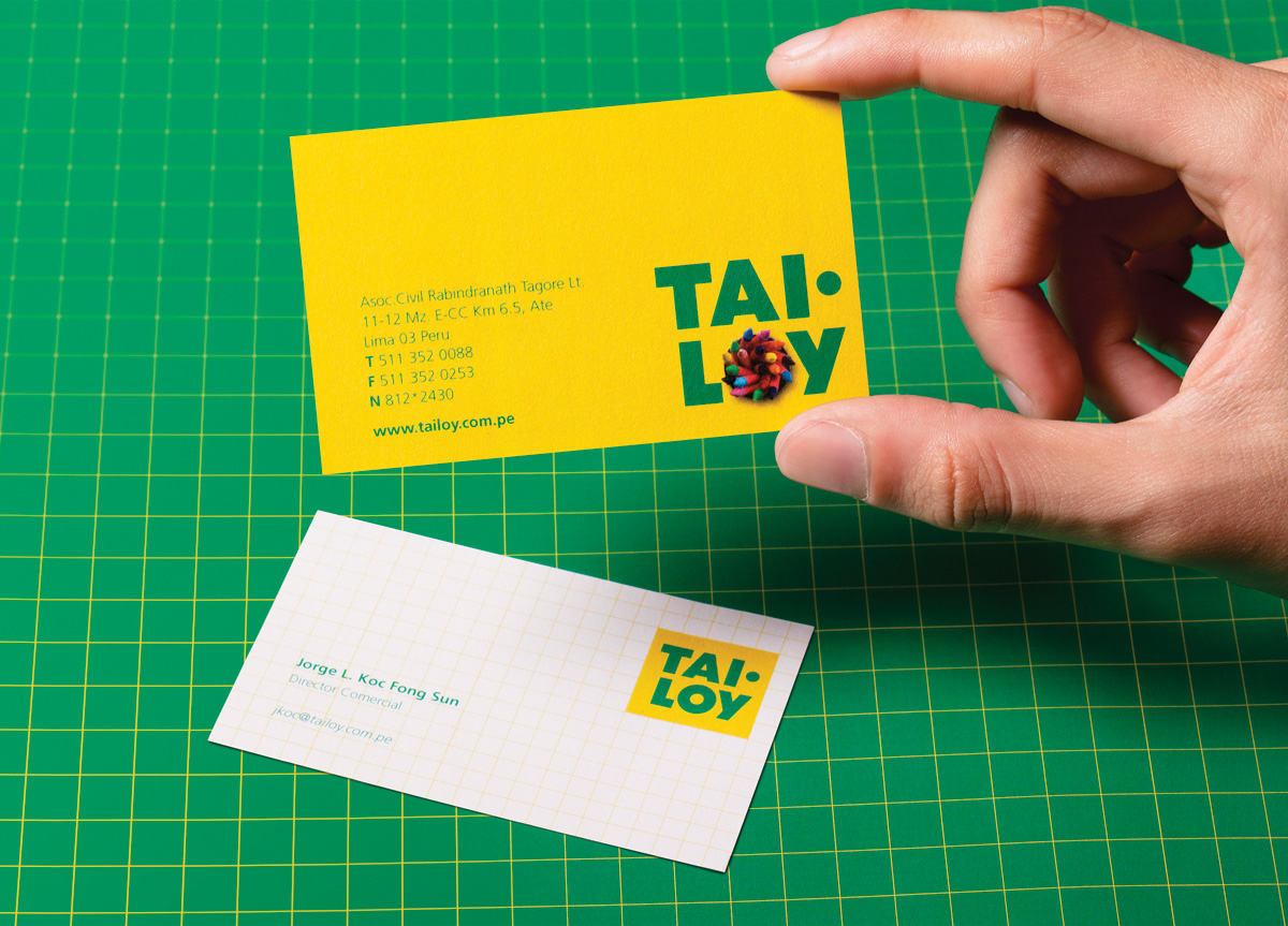
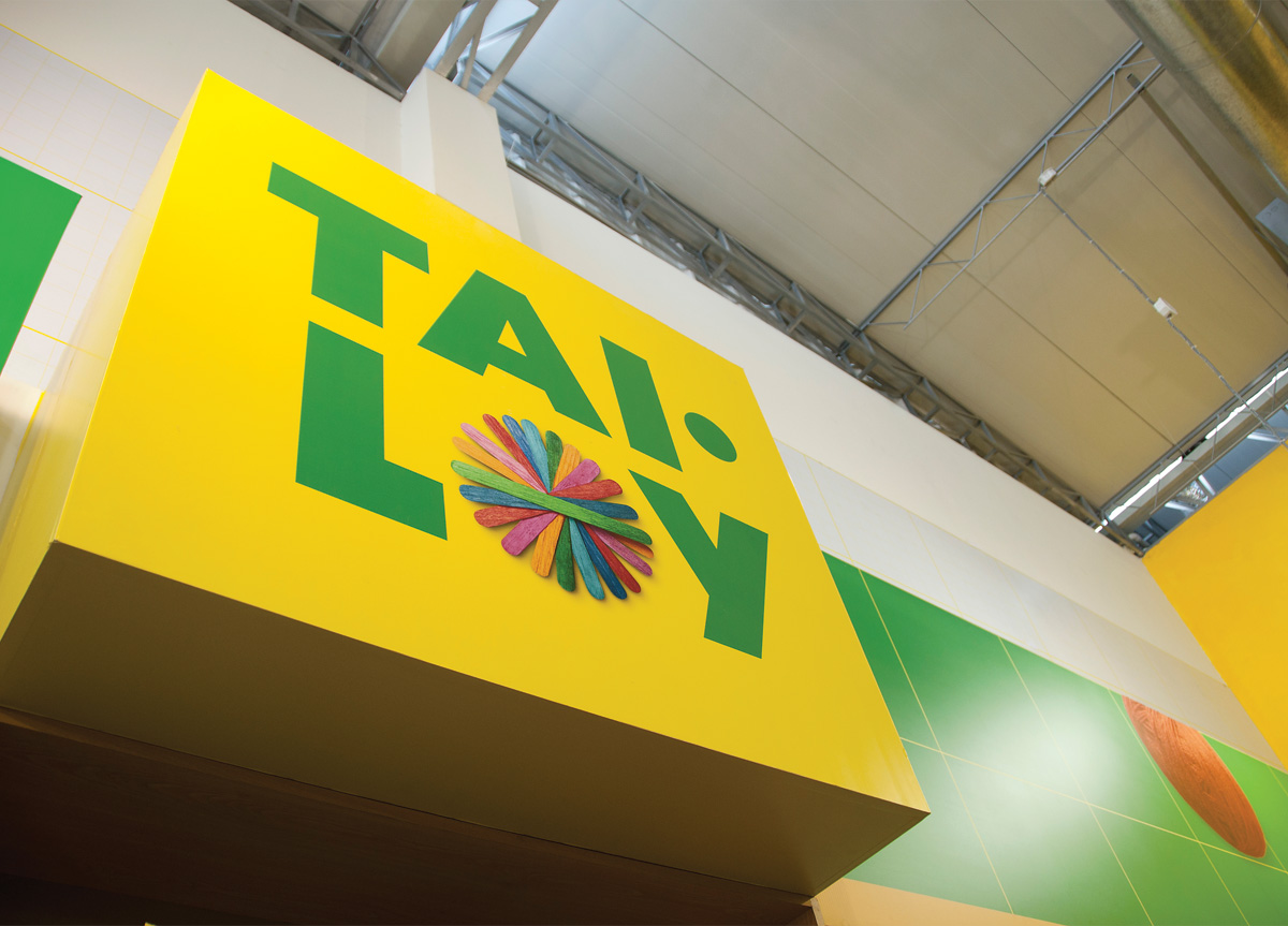
Only the name of the store and the basic colors were respected. Everything else had to be changed. The name Tai Loy was well remembered so we focused on a typographic solution inspired in basic shapes. We created several versions of the logo changing the “O” with products that you can find in the store. Also, this element served as a device to separate the products that the store offers and project the idea that every supply you need is available in Tai Loy. The results were extremely positive. Last year Tai Loy’s revenues increased by 50%.
