CLIENT
A restaurant that has defined modern Vietnamese food in San Francisco, CA, since 1995. Led by award-winning chef Charles Phan, The Slanted Door is situated in the Ferry Building overlooking the San Francisco Bay.
BRIEF
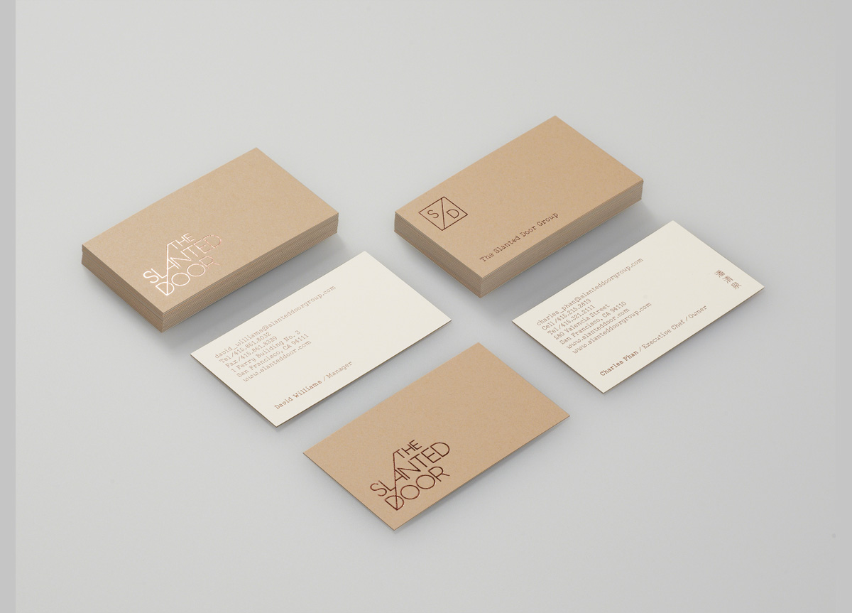
The previous Slanted Door brandmark didn’t live up to the sophistication of the brand, and lacked character. Charles Phan tasked us to create an identity that combined simplicity and sophistication with a contemporary edge. We worked closely with the Phan family to identify the values and personality traits of the restaurant before undertaking a redesign of the identity.
APPROACH
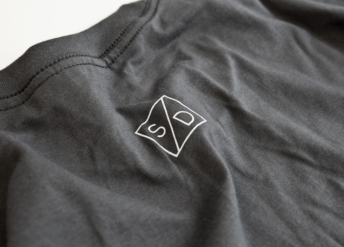
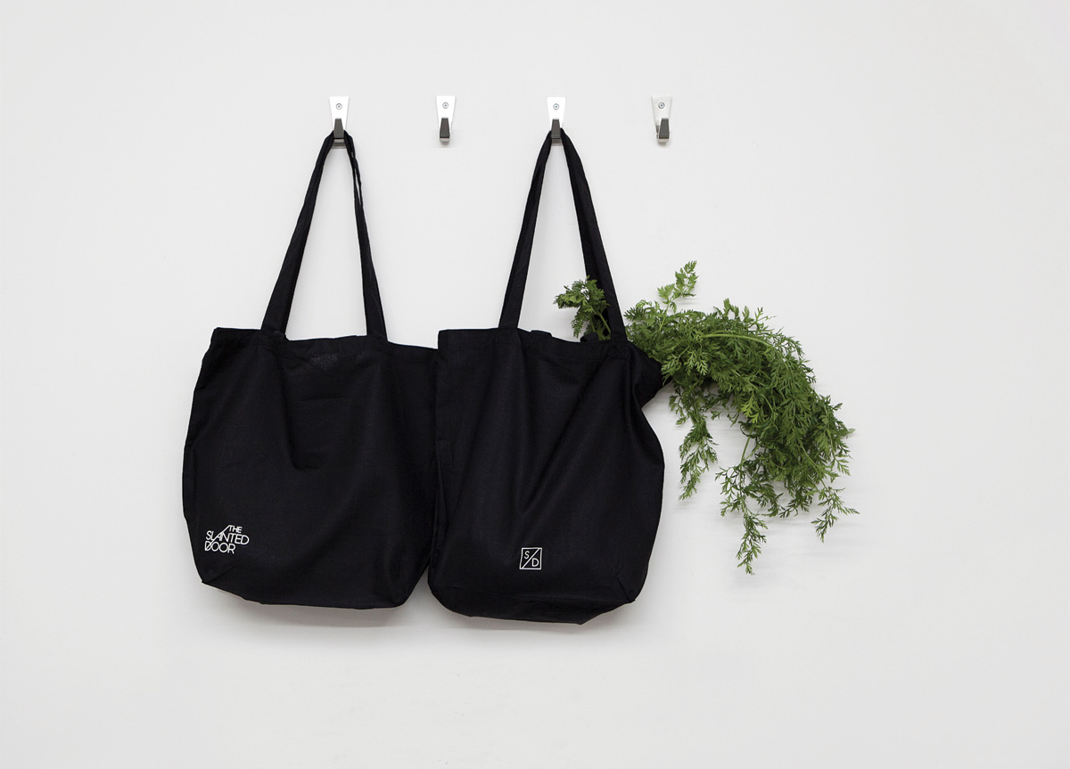
We developed a logo and associated visual language that is as modern and sophisticated as The Slanted Door’s food. The resulting mark references the “slanted” aspect of the name and utilizes a single line to bring a distinct and memorable element to the identity. Family is a core value of The Slanted Door Group, and this unifying line conveys the notion of that connection. A supporting monogram, bearing resemblance to a nautical flag, is used as a sign-off—a fitting connotation given the restaurant’s location at the water’s edge. This monogram is used on branded items, and to represent the umbrella company, The Slanted Door Group.


