CLIENT
A company that delivers brand experience effectively from the synergy of professionals in diverse fields such as marketing, user interface design, brand identity, graphic design, product design, and motion graphic design. Plus X connotes the message “We Add Experience for Your Brand.”
BRIEF
Plus X believes that brand experience design means providing consumers with valuable brand experience through consolidated online and offline designs based on s consistent brand strategy. In order to reflect the fundamental design philosophy of a company that designs brand experiences for diverse clients, the identity of Plus X had to be neutral and show potential and extensibility in a dynamic business world.
APPROACH
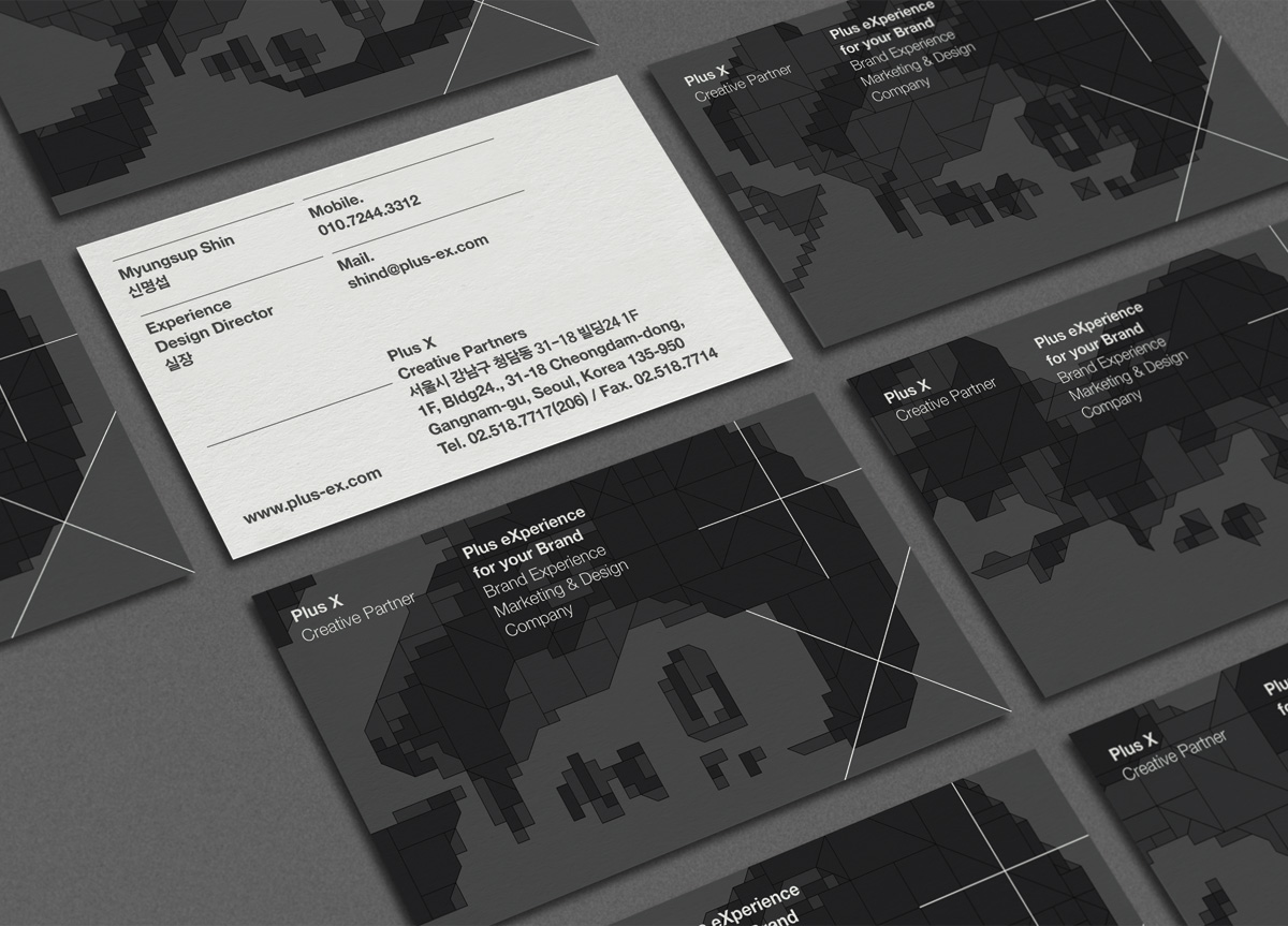
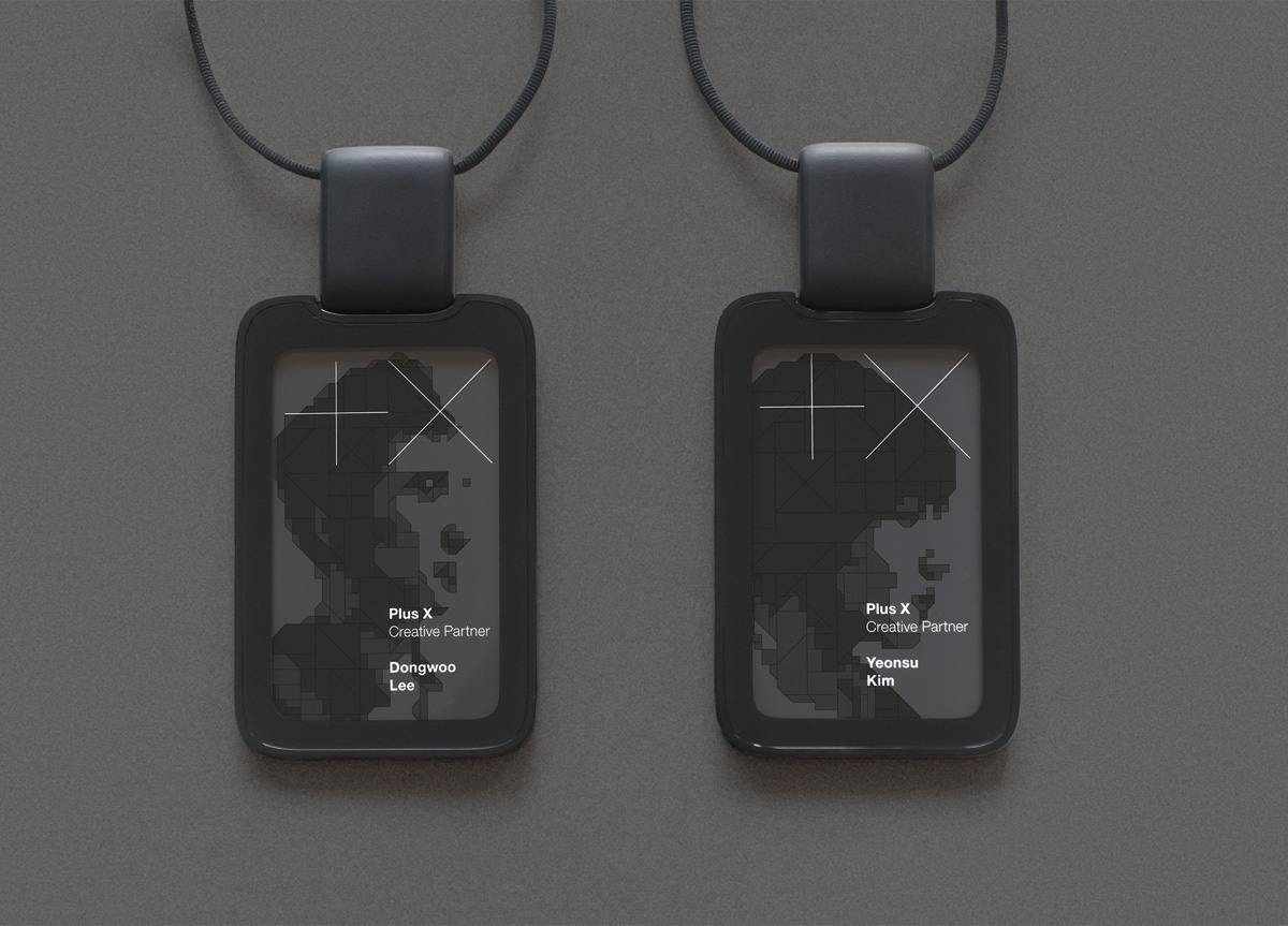
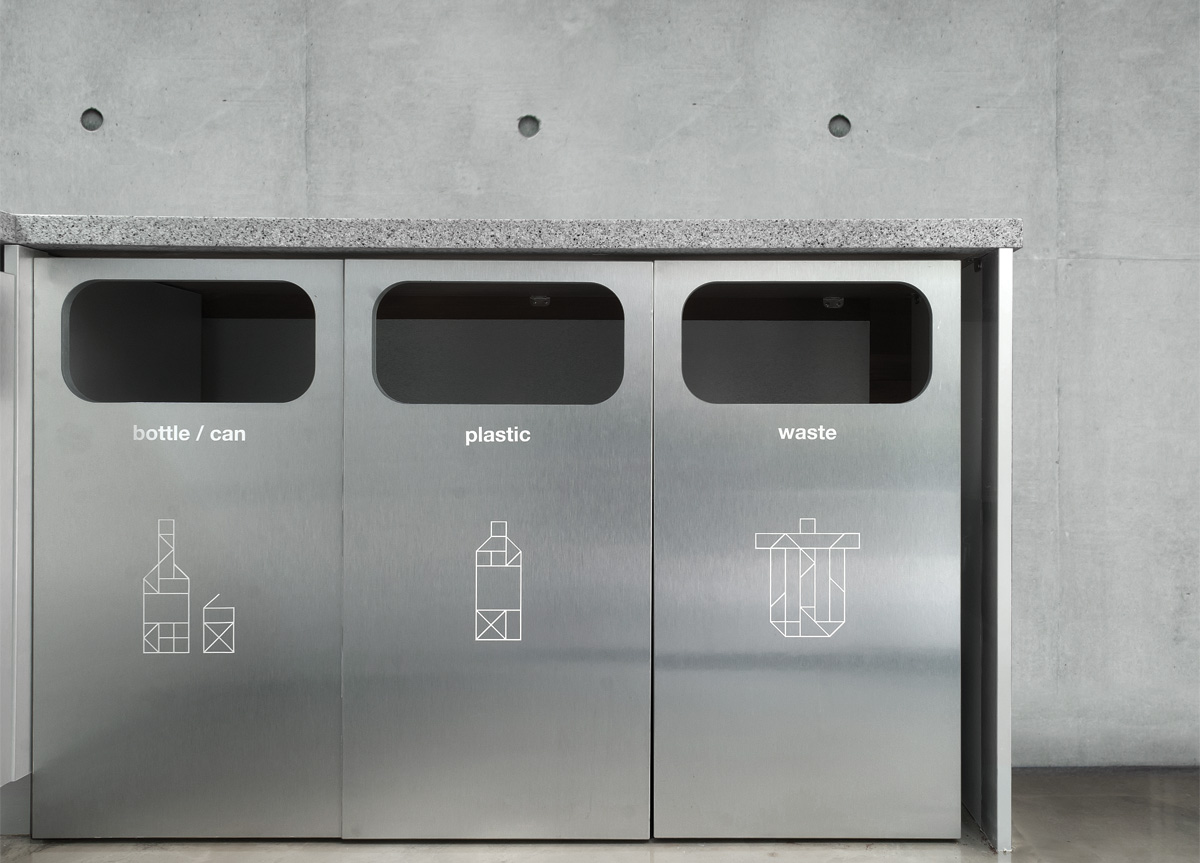
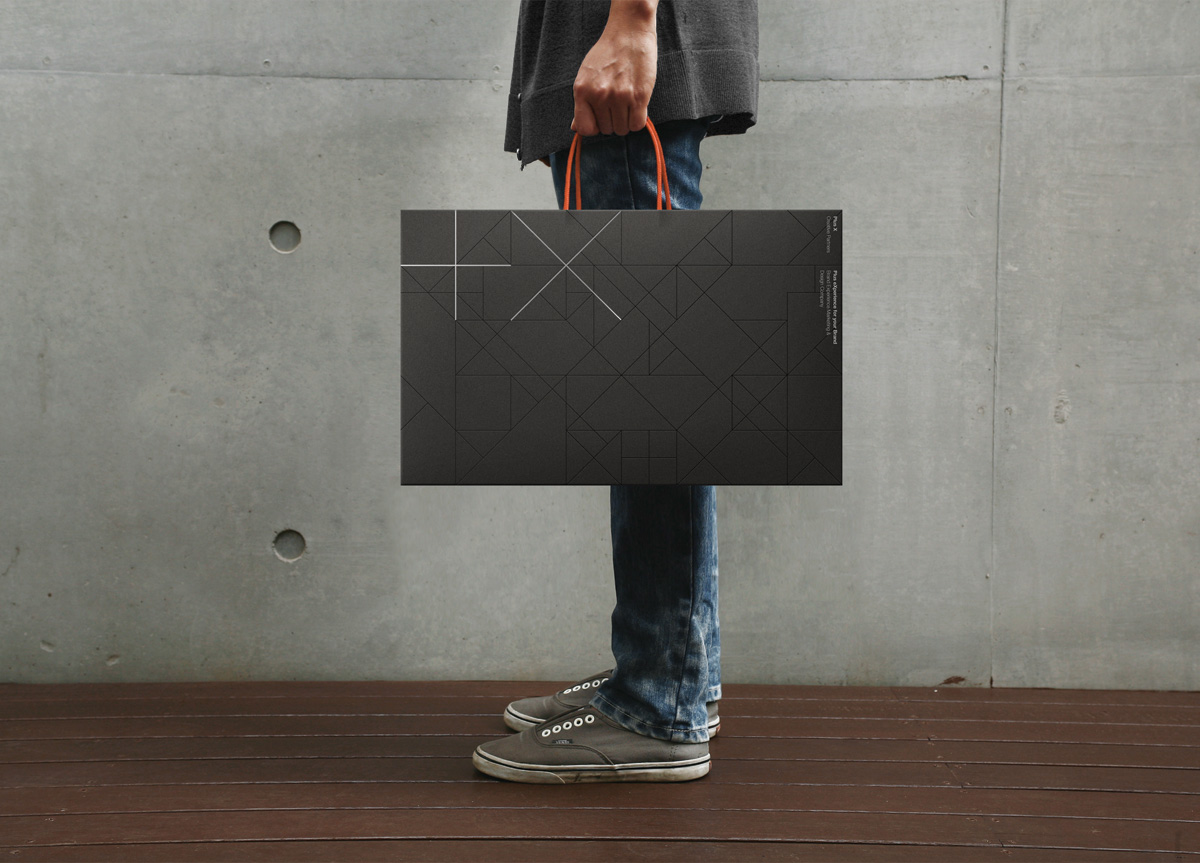
In order to symbolize the purpose of Plus X, the corporate symbol was designed with “+” and “x” which are considered the most fundamental signs. We tried to maintain “+X” for symbolizing the corporate identity, and black tones and neutral colors were used. Also, various pictograms and typefaces were created based on the fundamental design philosophy of Plus X. The pictogram was used as an effective signage at various spaces of the company, and the unique typeface was used in the interior design of the Plus X office. An illustration of each member’s face was printed on the business cards.


