CLIENT
One of Sydney’s oldest theatres, New Theatre is a small, but passionate company. A people’s theatre in the truest sense. This year New Theatre celebrates 80 years of being at the forefront of independent and experimental theatre.
BRIEF
New Theatre is one of Sydney’s proudest and most independent theatres, but their brand lacked clarity and cut-through. We were tasked with breathing new life into this tired theatre brand. Their ethos has always been about celebrating alternative theatre. They offer unique perspectives and unexpected twists, engaging experiences, and help to grow the careers of those involved. They already had a rich history, culture and purpose; we needed to help them express it all.
APPROACH
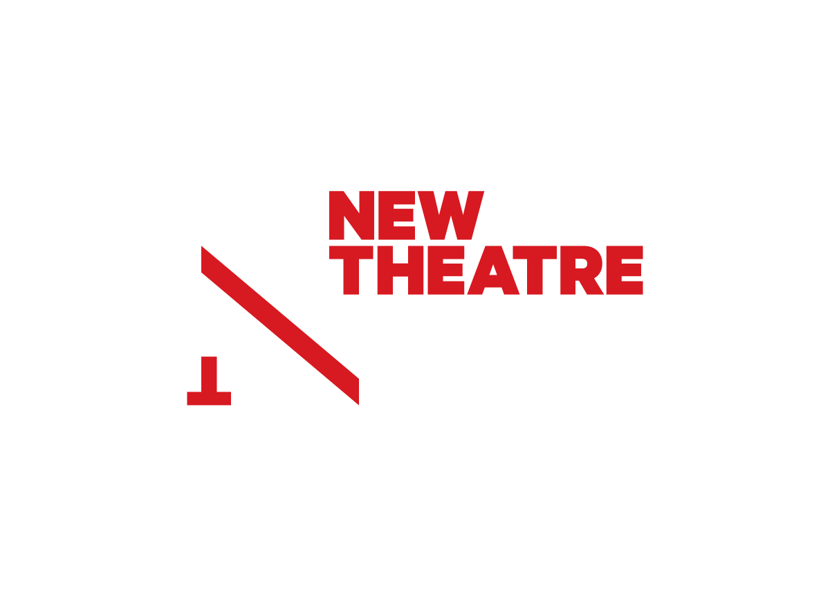
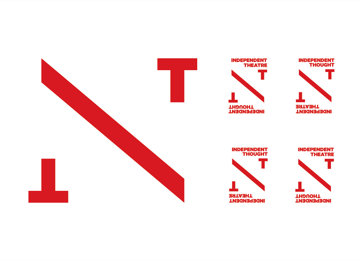
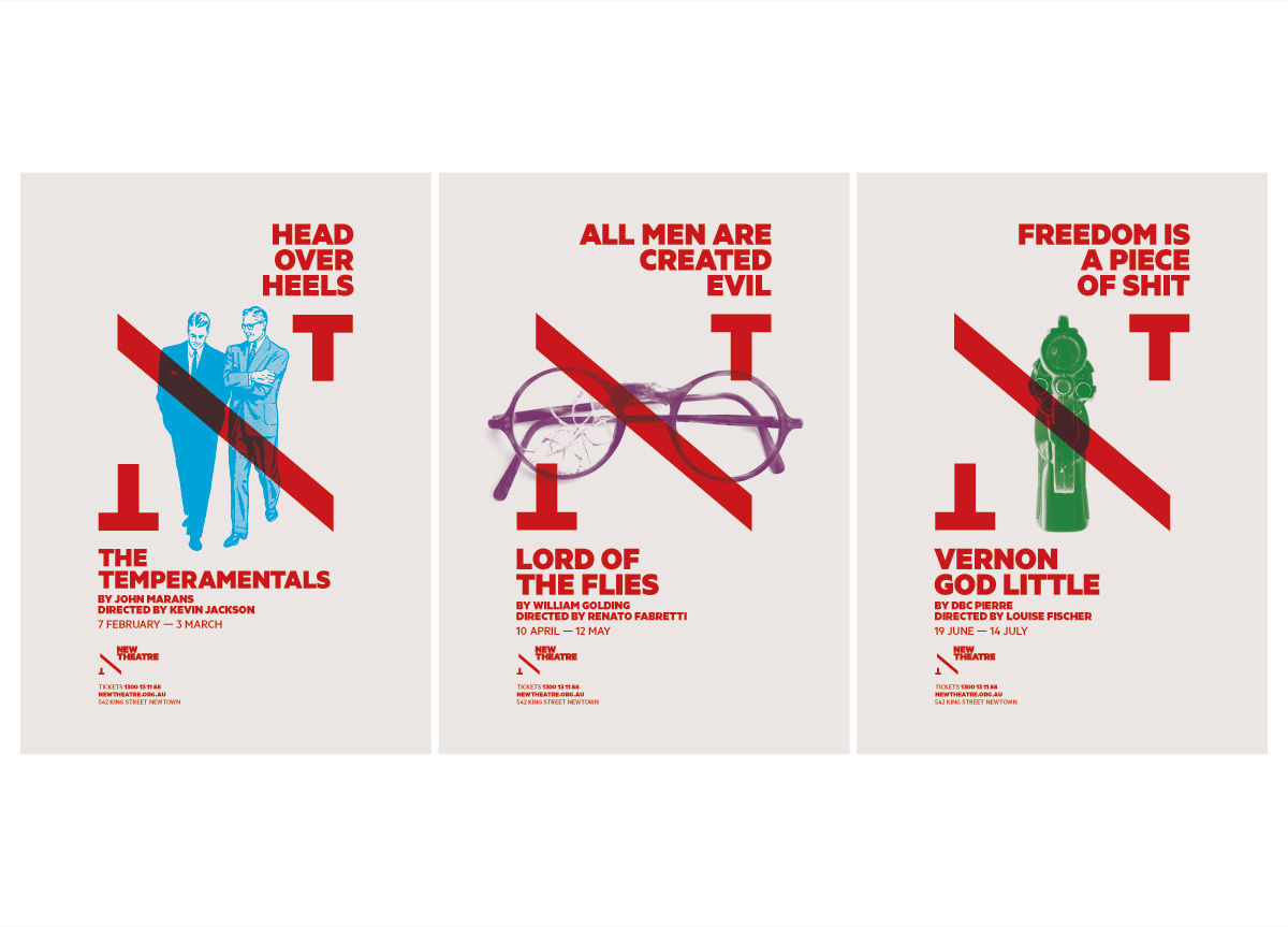
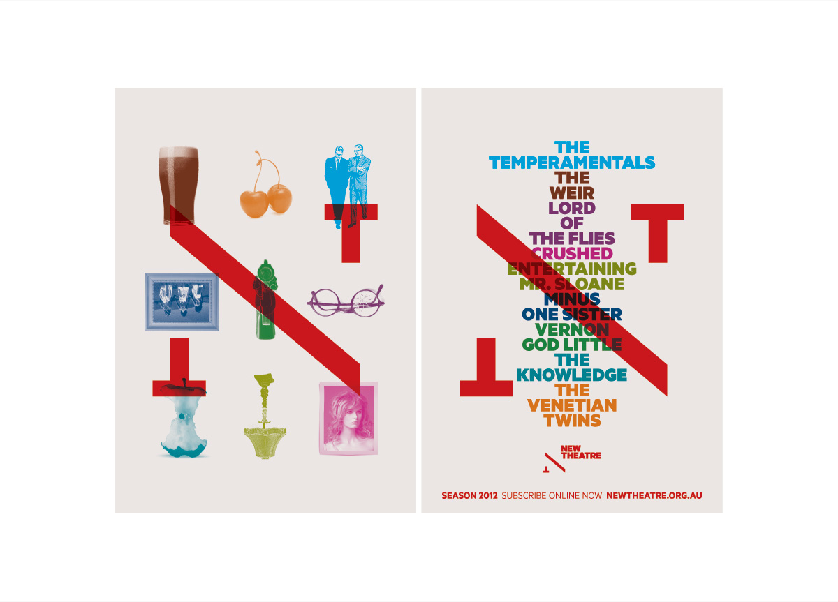
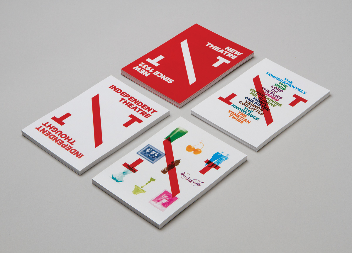
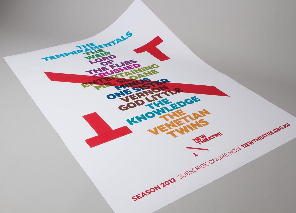
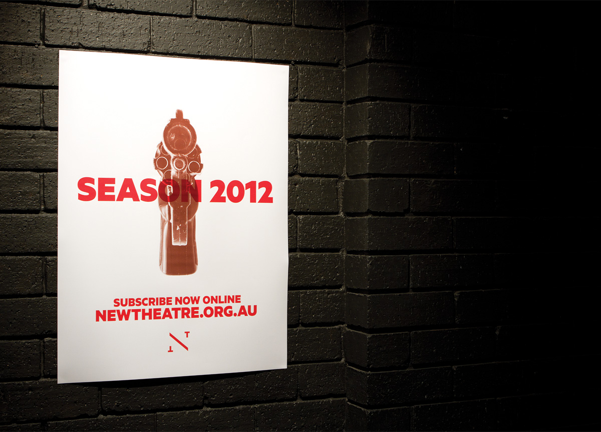
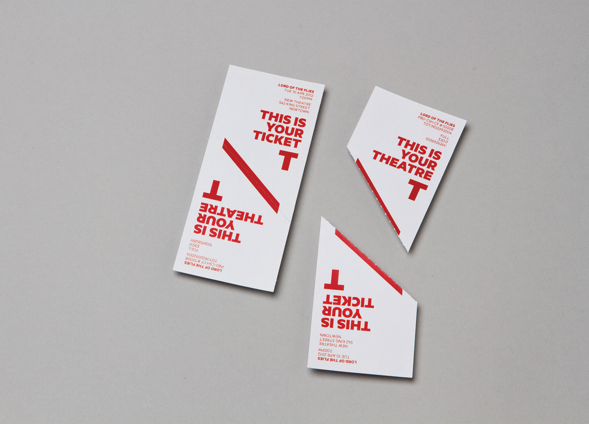
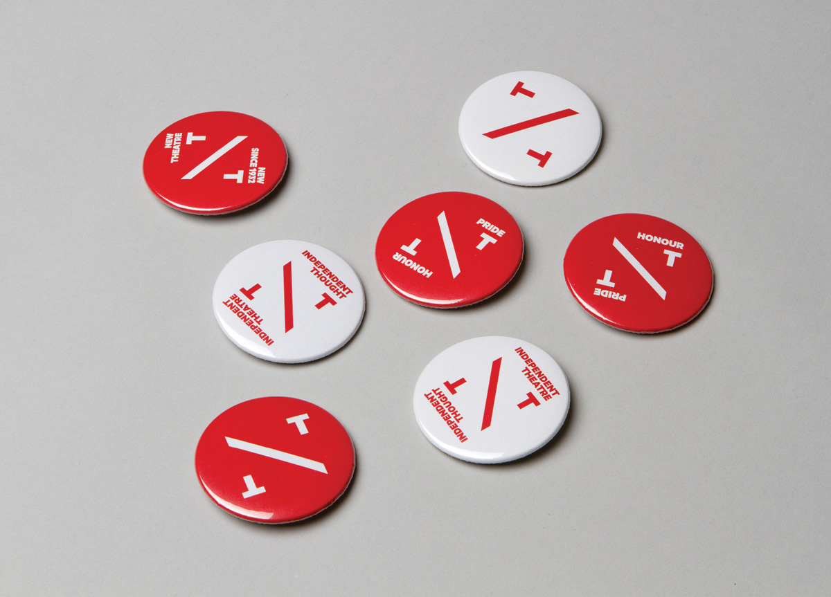
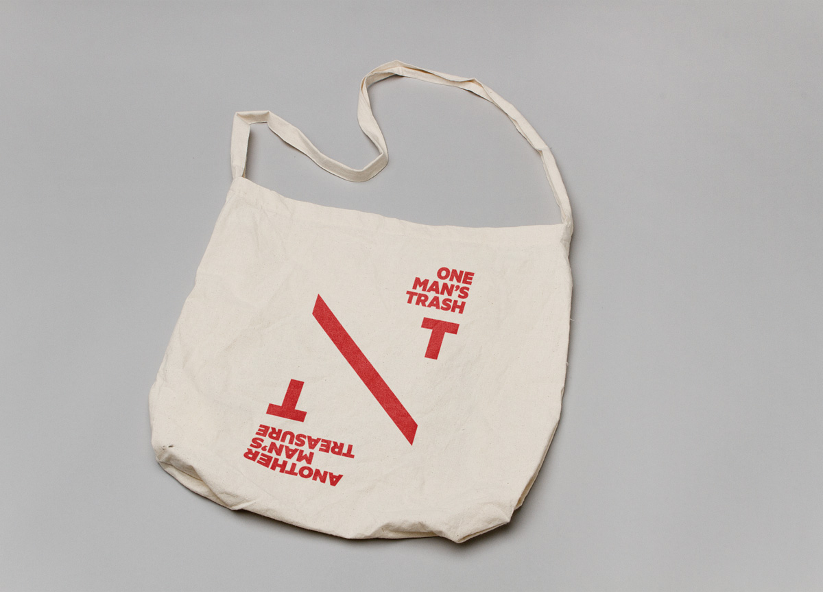
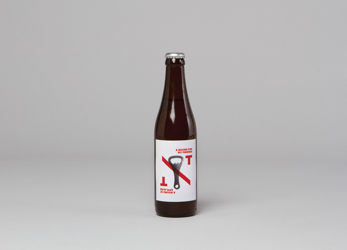
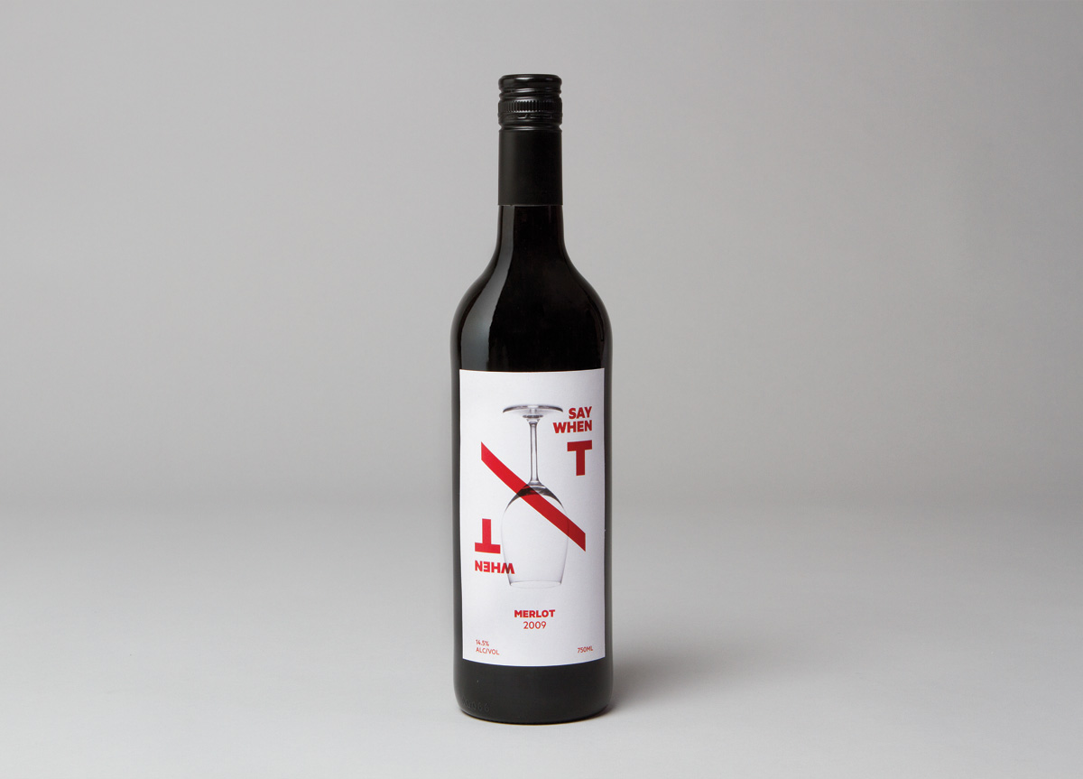
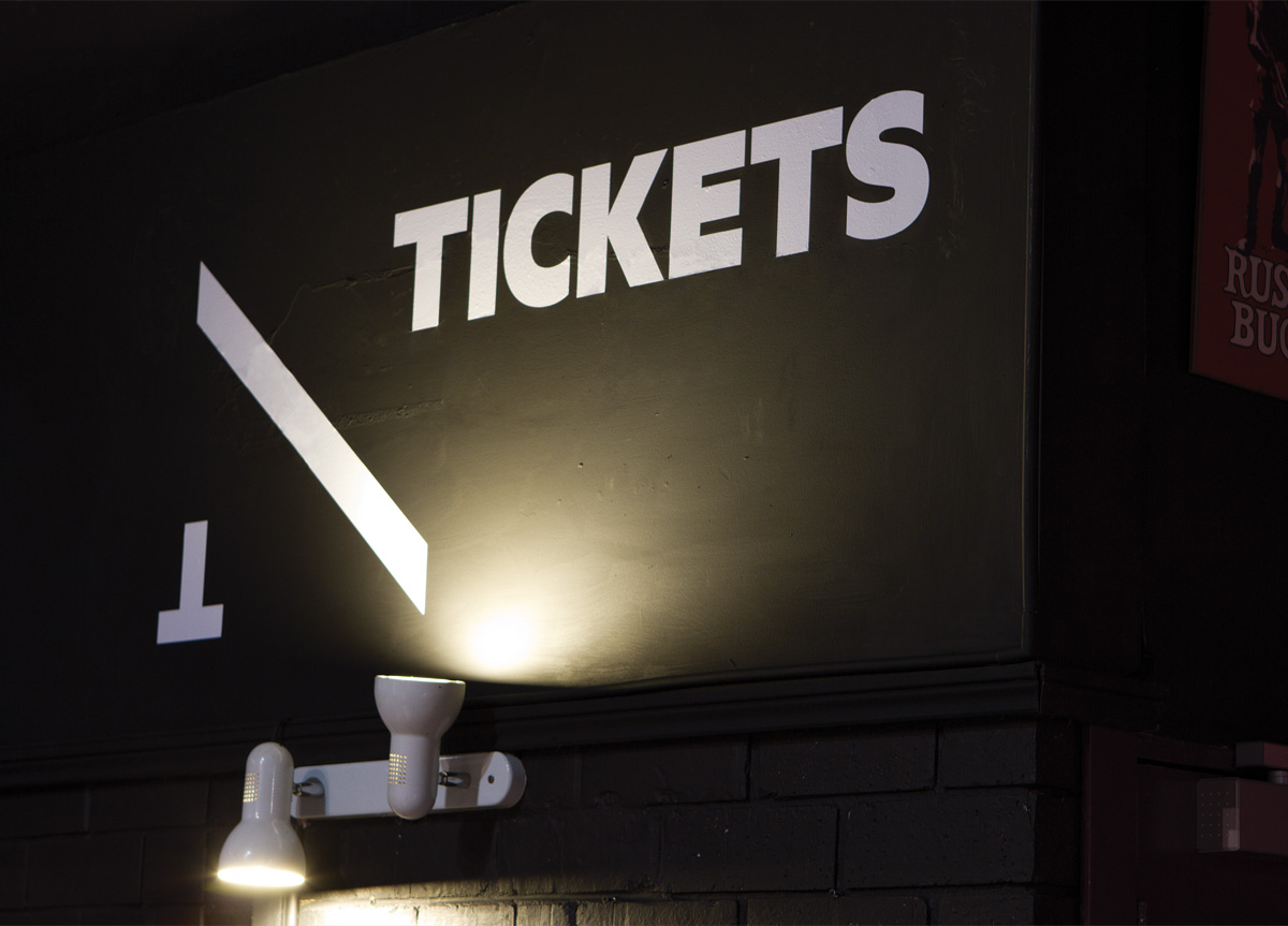
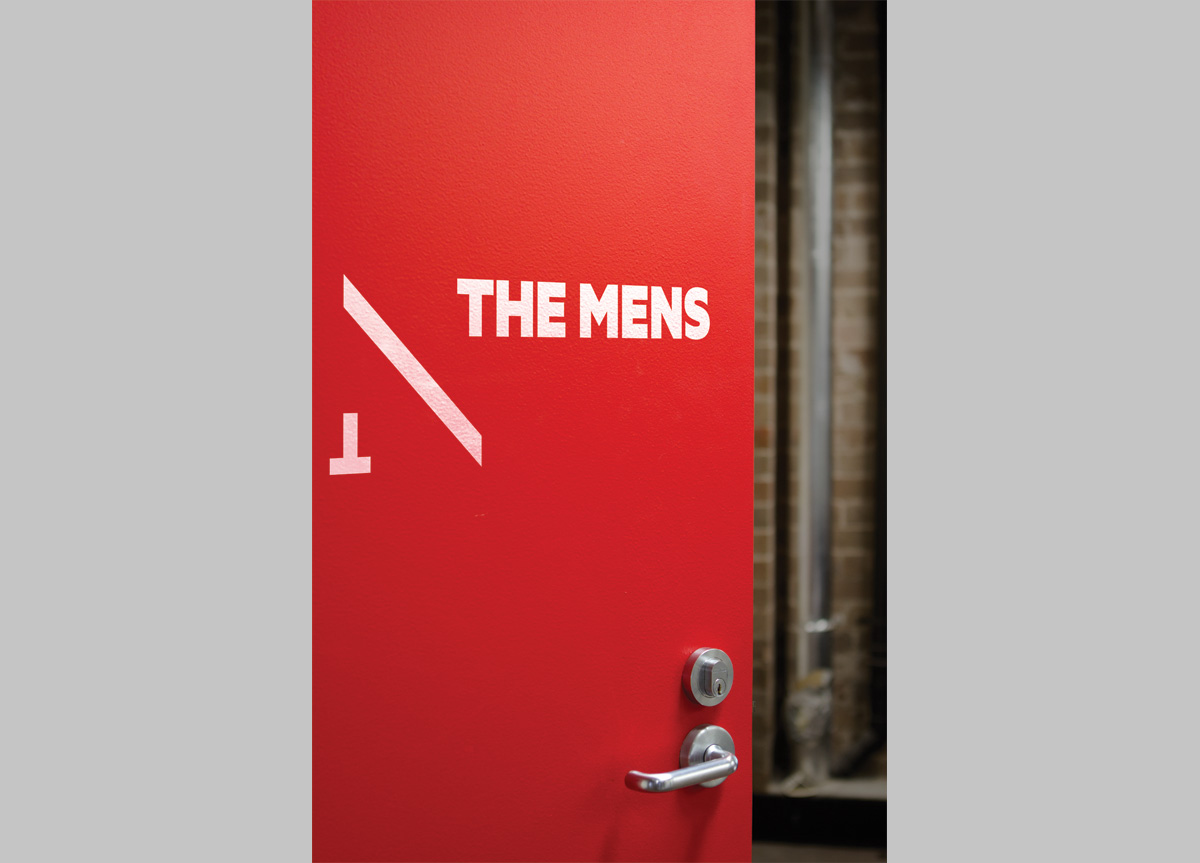
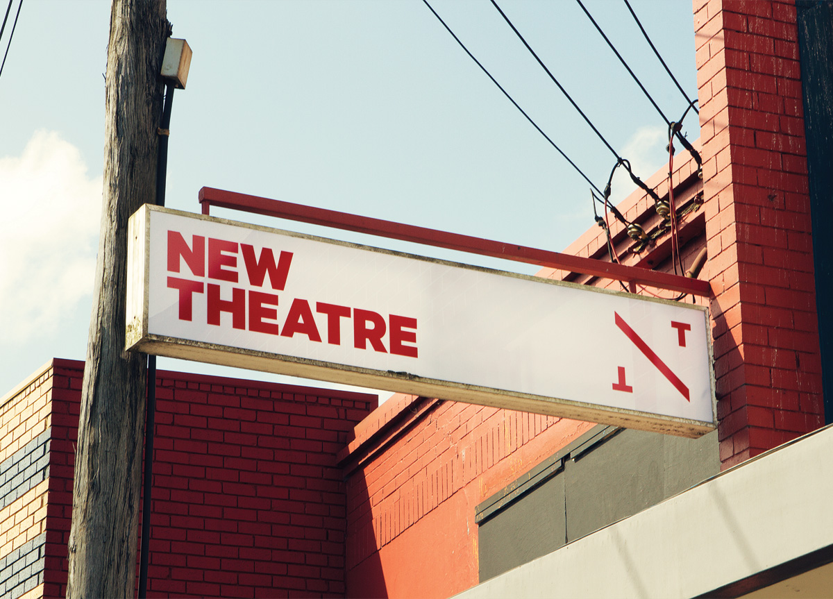
At the centre of the bold and unexpected new identity is the form of an “NT” device. The logo combines the three initial letters of The New Theatre into one simple mark. The unique mirrored structure allows applications and messaging to twist and turn, and the device is used to communicate the theatre’s aims for constant reinvention and alternative viewpoints. It allows New Theatre to sit proudly at the centre of their productions, literally stamping their mark on their shows and collateral, truly claiming them as their own.
In 2012, New Theatre celebrates its 80th Anniversary and Interbrand Sydney has been integral in re-energizing the company. The brand will not only change the way audiences view New Theatre, but allow the company to re-think how it views itself. They have created a fresh, powerful, and uniting identity for the theatre that captures the core of what New Theatre always has and always will be about, whilst ensuring that the company stands out within the ever-changing landscape of Sydney’s arts scene. Interbrand has succeeded in putting the ‘new’ back into New Theatre. — Luke Rogers, Theatre Manager of The New Theatre
Judge’s Comments
Although a tough choice, the New Theatre stood out for me. A very strong idea that reflects the “New” by using two diagonally opposed “T“s. The way that the diagonal “border” is appliedis very effective and only amplifies the idea. It makes for a very effective, playful and beautiful identity, that is very appropriate for a theatre. — Michiel Schriever / This was Schriever’s Judge’s Pick
This branding exemplified a “dramatic” execution of typography and layout. The letterforms became the entertainment of the identity system, acting and dancing across the surfaces. — Ellen Glassman
This is a spare, elegant, perfectly realized identity. All details are beautifully handled and the result is a strong contemporary image for a modern theater. — PAULA SCHER
I didn’t see the “N” at first, but that’s okay as it still works as a wonderful, bold wordmark and the upside-down “T” is a nice touch for a self-proclaimed “non-conformist” group. — andrew blauvelt
I respect identities that have the quality of being “peripherally iconic.” The combination of typography, imagery, language, design elements, and layouts convey a real spirit that you canjust sense, even if you’re just walking by it. The “NT” device is a flexible and memorable graphic anchor. — BRETT WICKENS
