CLIENT
One of Memphis’ oldest and largest Pediatric Medical Groups. Comprised of over 30 doctors at six locations, they serve both state and private-insured families.
BRIEF
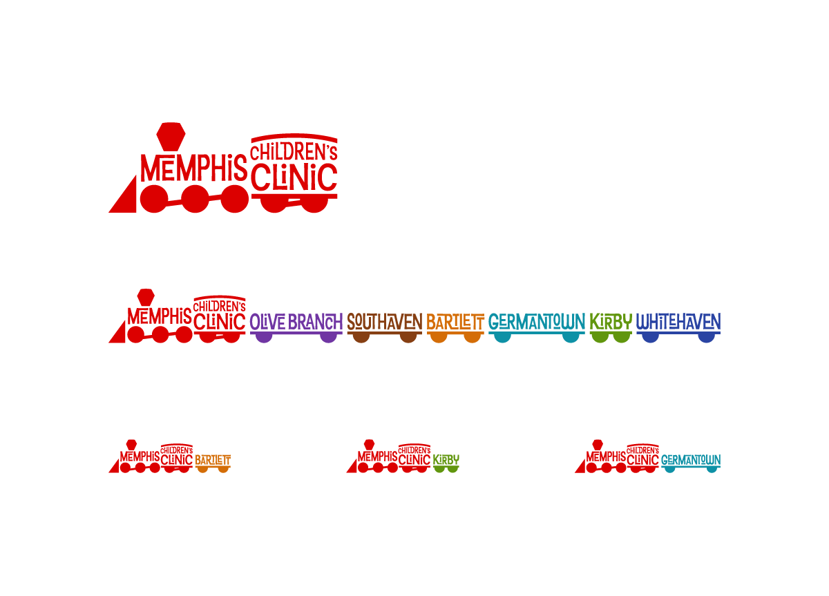
The Doctors of the MCC wanted a fresh identity that equally served two very different demographics: upper middle class, suburban families, and low-income, urban-dwelling families. The identity had to be flexible enough to show distinct lock-ups displaying any number of their six regional offices.
APPROACH
Client meetings at several different MCC offices gave me valuable insight into their demographic. For instance, the interior of the Whitehaven office, serving primarily low-income families, is cinder-block-walled, industrial feeling, and painted in primary colors. By contrast, the Germantown office, serving primarily upper middle income families, is located in a state of the art hospital, professionally interior-decorated, and suburban homey. The solution is an identity that is colorful, fun for children, and contains a mix-and-match identifier function—allowing any combination of typographic train cars to hook up to the primary logo.


