![]()
![]()
CLIENT
Kwelia is a a startup that faced the same problem as many new ventures: they had a great idea, team, and product but didn’t look the part. Kwelia needed a graphic identity that legitimized them in the face of potential investors and clients alike.
BRIEF
Kwelia is a a startup that faced the same problem as many new ventures: they had a great idea, team, and product but didn’t look the part. Kwelia needed a graphic identity that legitimized them in the face of potential investors and clients alike.
APPROACH
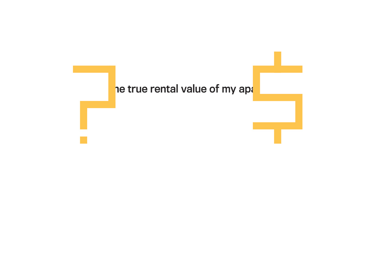
Kwelia’s logo is informed by its nature as an online platform that deals with the urban real estate market. These key elements pointed to a solution, based on a grid system, that refers to pixels as well as a city grid. The heart of Kwelia’s service is simply stated in its tagline, “What is the true rental value of my apartment?”, which is abstractly illustrated by the question mark and dollar sign that form a simple urban skyline. The name Kwelia is derived from the Swahili word for truth, so keeping a simple distilled aesthetic was a priority throughout the process.


