CLIENT
A conceptual product line geared towards broadening the audience’s understanding of color theory. Using authentic color pigments and materials Hue brings the audience back to the essence of how to use color. This product is marketed towards the developing artist of every generation.
BRIEF
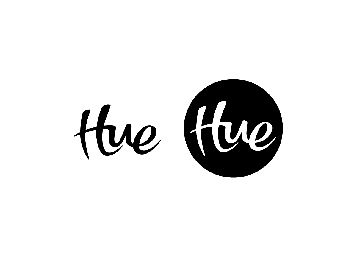
Create an organic and simple logo that is more sophisticated than Crayola but less technical than Prismacolor.
APPROACH
The concept for the Hue wordmark was for it to look as though it was created using any artistic material. After experimenting with an upper and lowercase variation of the wordmark, I intentionally chose to move forward with the upper and lowercase composition to convey an empowering brand. The final mark remained black, adding emphasis to its strong line weight and simple structure. Overall, the Hue wordmark reflects a bold product through its simple composition and strong presence.


