CLIENT
A feisty start-up in Karlsruhe, Germany that completed the world’s first manned flight with an electric multicopter.
BRIEF
The client, at first, simply desired clean, professional product identities for their first two flying machines. During our initial strategic survey, we found that an extremely important environment for the logos at this stage in the company’s growth—beyond physical placement on the products—involved digital presentation environments. There were not only a powerful tool for book-ending digital presentation meetings and events, but also more deeply communicated event atmosphere and pacing, and called out important attributes that set e‑volo apart as a high-tech, highly nimble and energetic creator of a new flight category.
APPROACH
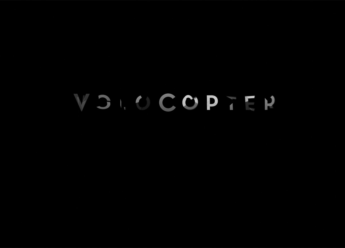
Taking cues from cinematic tones favored by the client in their digital materials, Danny Warner designed the product identities with their eventual translation into motion media in mind. Our motion reveal of the VC1 logo was designed with the intent to achieve four goals:
1. Echo the form and geometry of the rotor action at the heart of the flying machine.
2. Communicate in a fast, memorable way that“VC”stands for the flight category “VoloCopter.”
3. Set a fast-paced and cinematic tone for the company’s informational materials.
4. Reinforce, through the animated reveal, the company’s position as a highly energetic, high-tech start-up that has managed to birth a new flight category.”


