CLIENT
A non-profit organization that provides financial support, services and leadership to the Canadian amateur high performance sport community. It is responsible for all aspects of Canada’s involvement in the Olympic Movement, including the Olympic, Youth Olympic and Pan American Games.
BRIEF
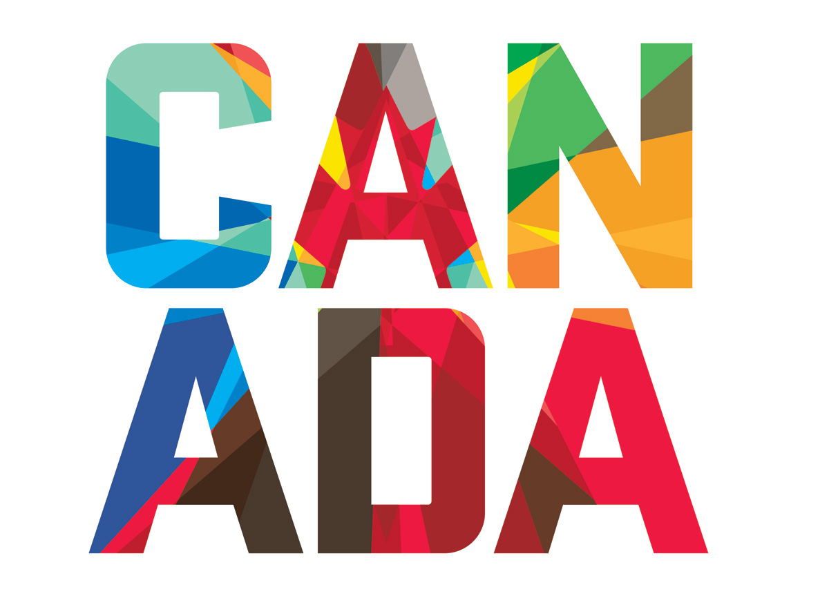
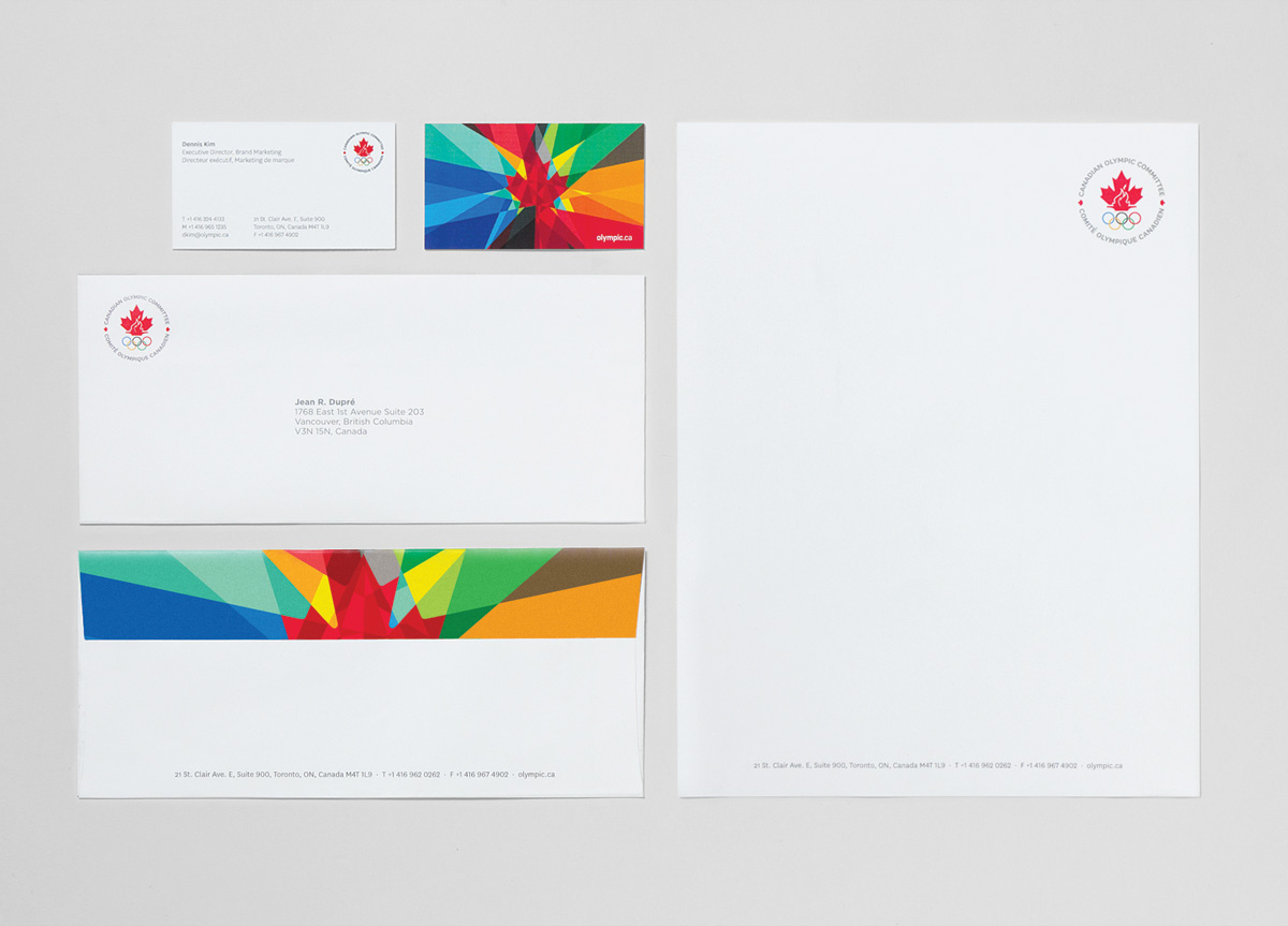
Position the Canadian Olympic Team as a classic sports brand: athletic, iconic, youthful, and authentic. Restructure the brand architecture. Consider how the various Canadian Olympic Committee programs, teams, corporate partners, and associated federations could be better aligned to form a more unified and memorable brand. Develop an identity system that will age gracefully while ensuring aesthetic and strategic relevance today. A system which translates impeccably across all mediums—from screen to print to merchandise and beyond.
APPROACH
Over a century of stories, themes, and iconography influenced the comprehensive rebrand. In-depth research lead us to libraries, historians, and Olympians. The brand strategy was repositioned to focus on the Team rather than the Committee, and our goal was to deliver a classic sports brand with fresh appeal.
In everything we did, we attempted to balance classic versus current aesthetics and themes. In communications, we looked to balance imagery and stories of today’s Olympic heroes with legends from decades past. From creative brief to research, sketches to final art, writing to production, guidelines to launch video, our small design team delivered on every aspect.
