CLIENT
The women’s leadership forum Watermark (formerly Forum for Women Entrepreneurs and Executives) launched in 1993 in the San Francisco Bay Area, with the aim of connecting exceptional women leaders with people and ideas that enhance their impact on the world. Watermark fosters collaboration plus connections between its members.
BRIEF
Create a new identity that would underpin their positioning as a community of accomplished women leaders leaving their mark on the world. Furthermore, the identity must work to advance their key business objectives of geographic, financial and membership growth.
APPROACH
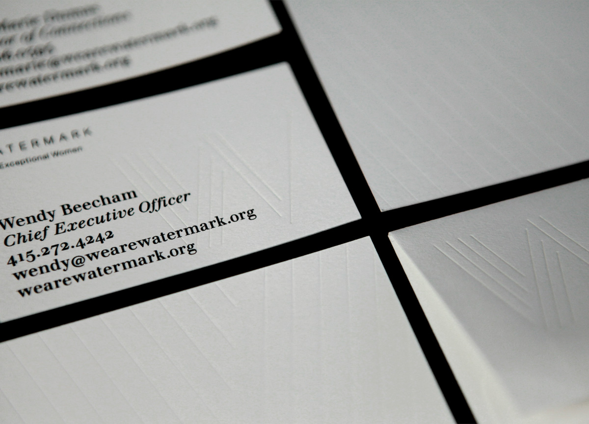
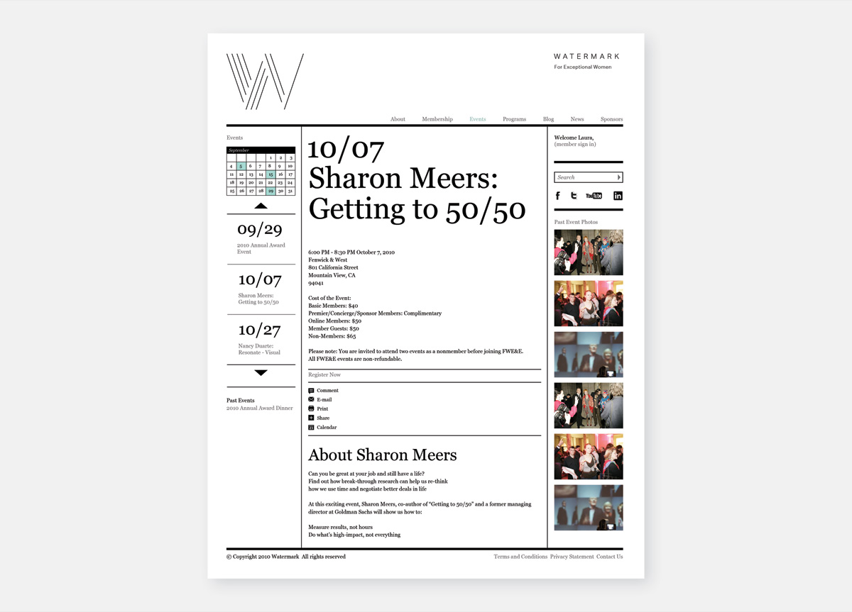
Building on our brand strategy work, the concept of “emanating” guided our visual direction. The way a drop forms ripples in a pond, or the way a boat causes a wake in its trail, both became strong images to convey the sense of emanating, as well as referencing their new name. The mark represents this sense of emanating as it grows, from one line to four, as in a ripple effect. The brand identity system included symbol, wordmark, color, type, imagery, animation, and film as well as marketing and communications plans to ensure the correct messaging and tone of voice.


