CLIENT
A Japanese company renowned for its unique and highly collectible toys. Their BE@RBRICK series has achieved great popularity not only among traditional toy collectors, but also across a wide range of consumers.
BRIEF
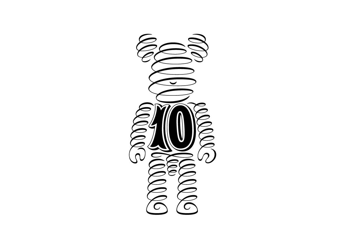
Development of an anniversary logo commemorating ten years of producing one of the company’s most popular offerings, the BE@RBRICK line.
APPROACH
The shape of the logo closely follows the silhouette of the BE@RBRICK toy itself. Drawing from seventeenth- and eighteenth-century English copybooks, the ornamental pen-work suggests the formality usually associated with anniversary marks. This approach also hints at MEDICOM TOY’s practice of regularly inviting various artists to create their own customized version of the BE@RBRICK figure.


