CATEGORY

Guideline Documents

LEVEL

Professional

RANK

Best of Category

DESIGN CREDITS

Creative development/direction, on-air system design, writing, research, animation, photography, typography

Matt Eller
Bill Morrison

Project partner, direction

Lee Schulz

Production, Design

Willie Bogue


TAGS

, , , ,


LINKS

feelgoodanyway.com
ifc.com

IFC by Feel Good Anyway


CLIENT

A cable television network that creates and champions authentic, original content and has cultivated television programming that challenges the conventions of storytelling since 1994.


BRIEF

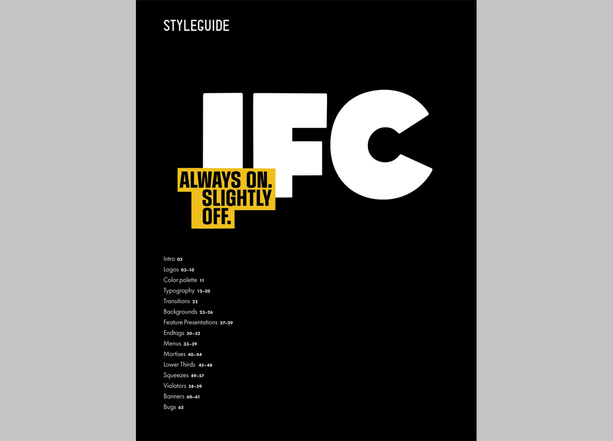
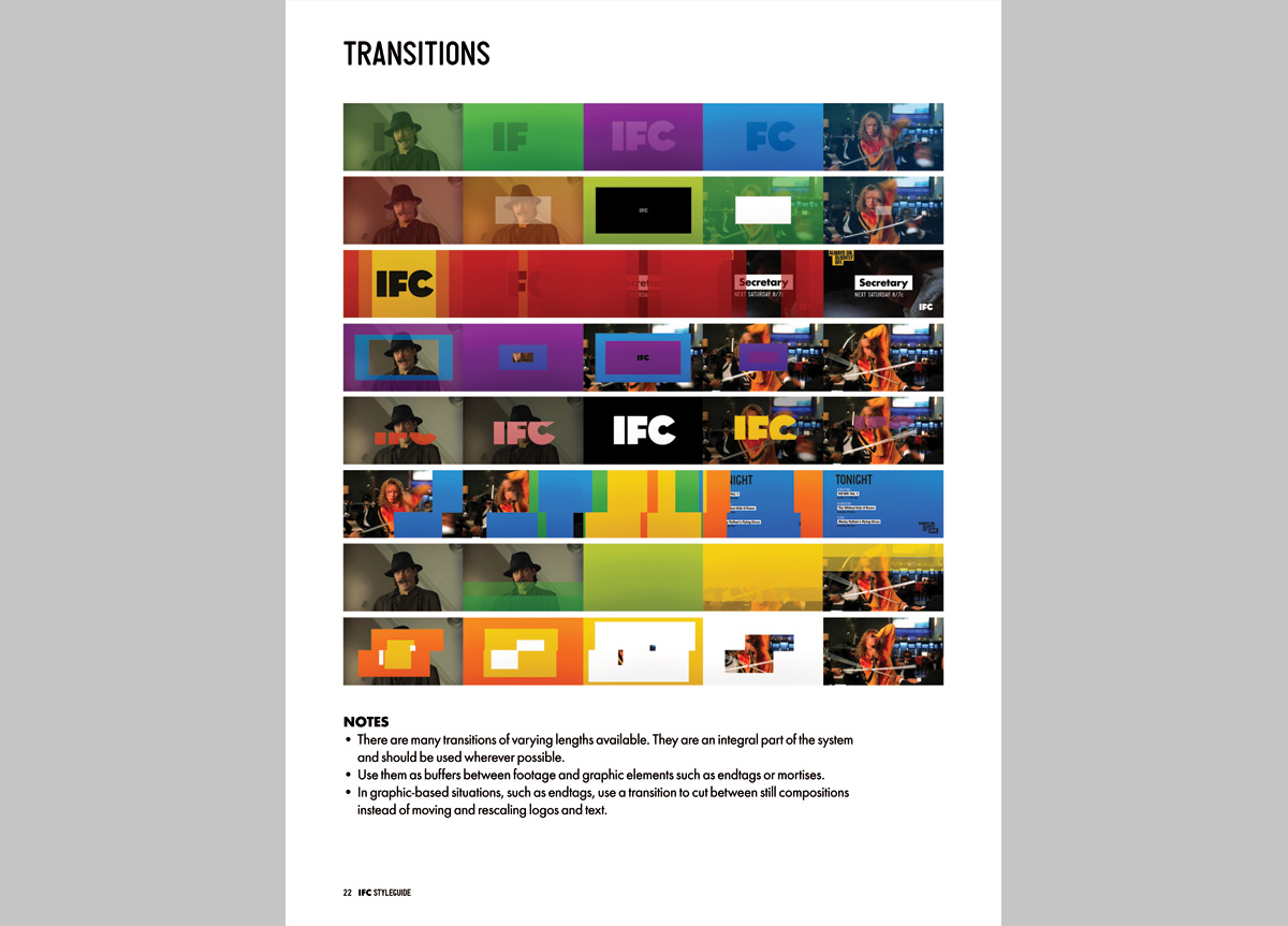
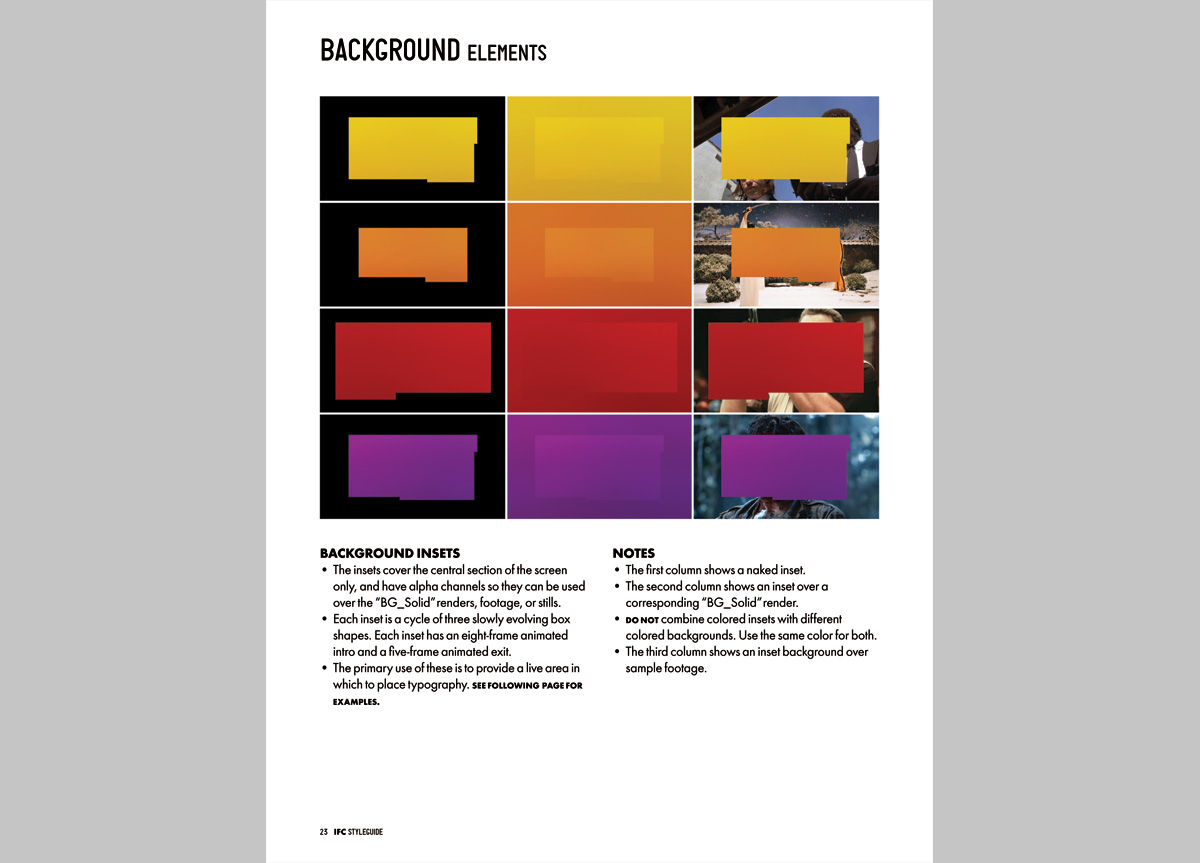
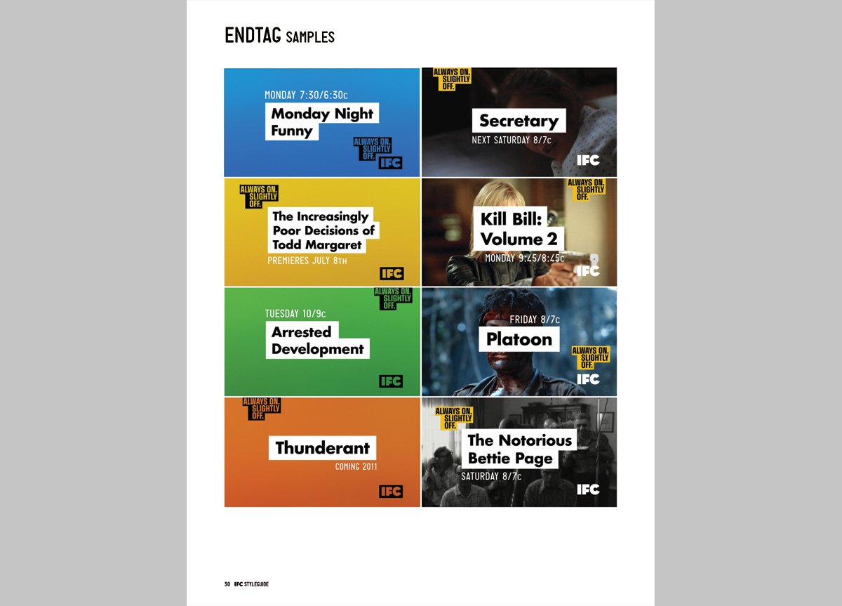
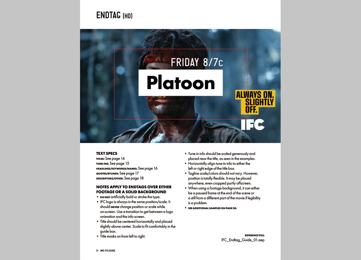
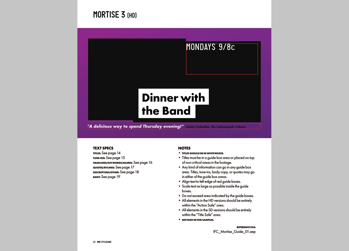
Rebrands, like small children, need strict boundaries or they’re liable to sprout all kinds of undesirable traits. Our guideline document lays out all the important Dos and Don’ts for making good-looking, well-behaved IFC graphics. In a perfect world, every project would deliver with an actual human being to guide the client through the ins and out of the system. Ideally, this Design Minder would have an exhaustive knowledge of the work, and the combined temperaments of an English schoolmaster, Marine Corps DI, and Paul Rand. No doubt, scientists will someday create a being or an app with these characteristics, but until then, we must make do with pictures and words. 


APPROACH

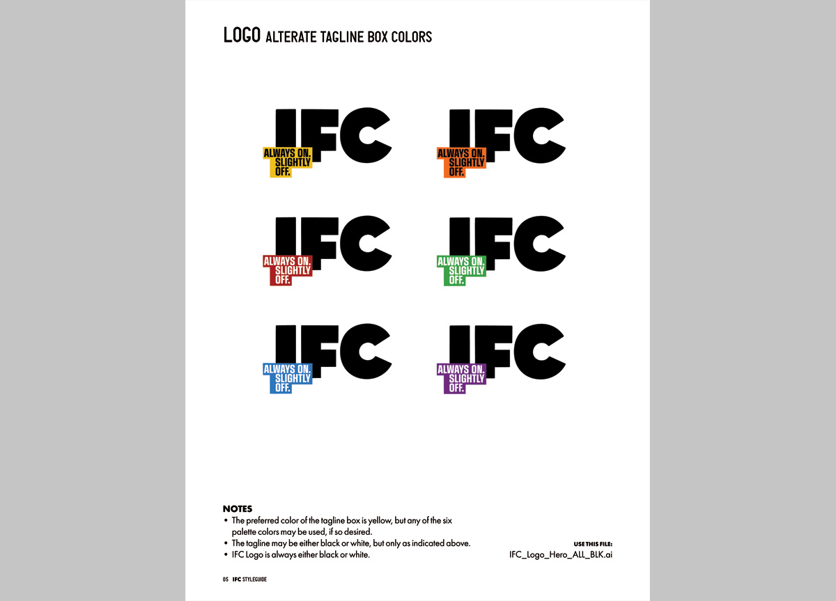
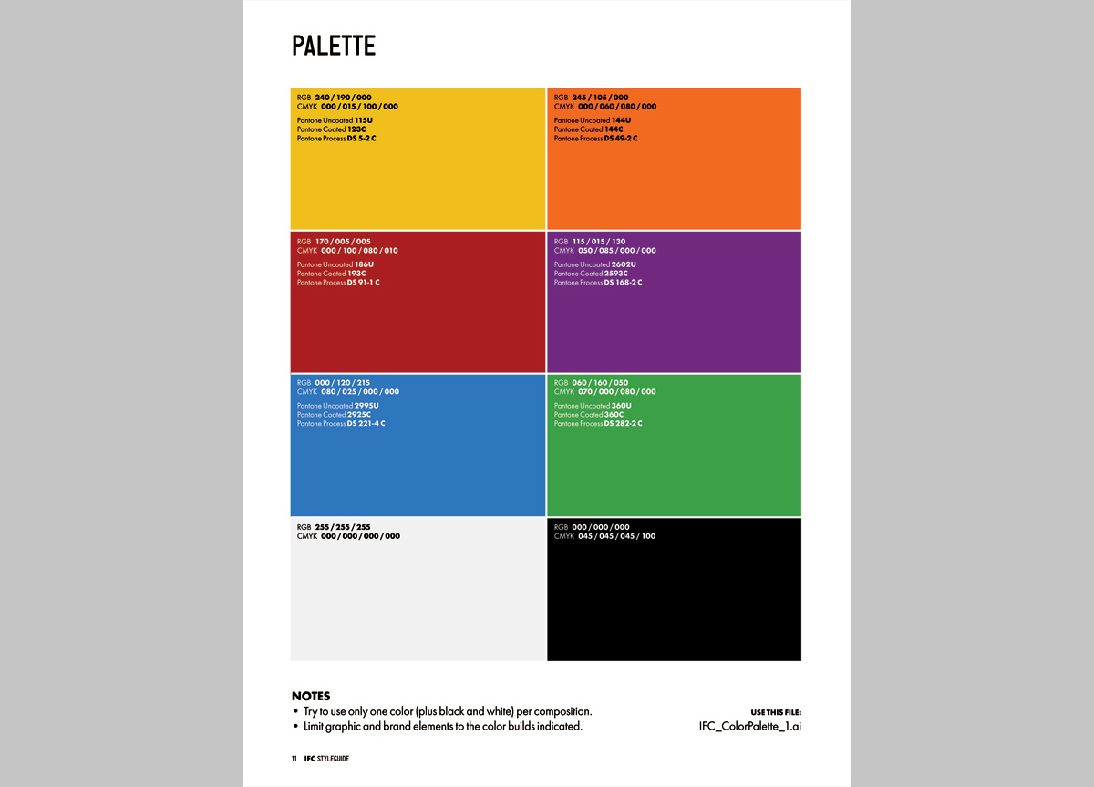
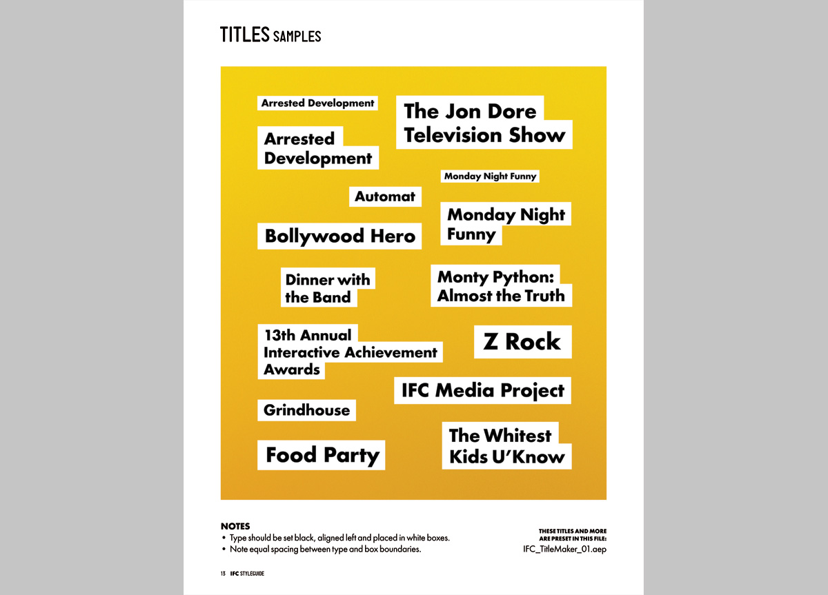
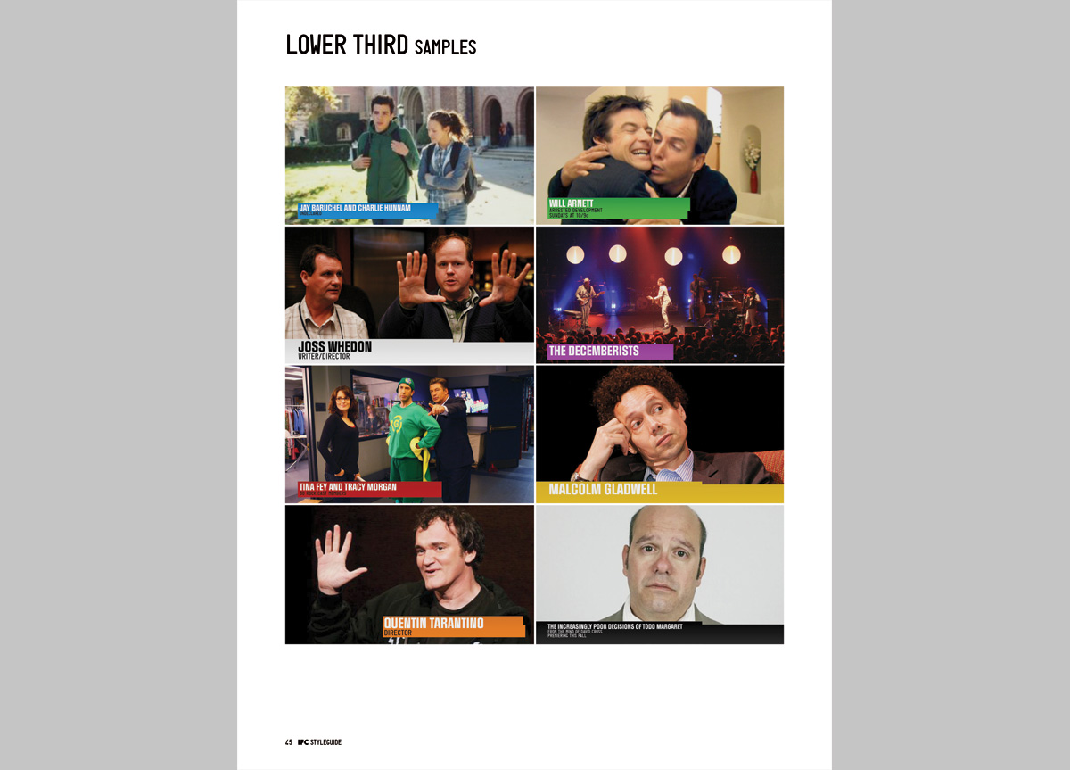
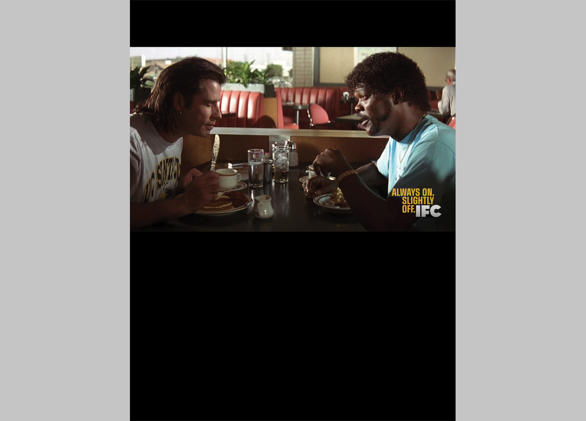
Our main goal was to create a document that could be easily understood by a wide range of users with very divergent levels of design savvy. On a project as large as this rebrand it’s very easy to get overwhelmed by all the assets (several hundred at last count), not to mention how all those assets best fit together. The IFC guidelines take a building-block approach, first explaining the individual elements (logo, color palette, typography, etc.) and then showing how these elements are to be properly mixed and matched. In general, we strove for clarity and concision.
As part of IFC’s 2010 rebrand, FGA created this guideline document to help us implement the new system across all media. It’s a wide-ranging document that explains how to assemble the individual parts into a cohesive whole. I sleep with it under my pillow. — Kevin Vitale, vice president creative, brand creative director of IFC

Judge’s Comments
Tone of voice is crucial to IFC and somehow they’ve found a guidelines copywriter that gets it. What is usually stale comes alive. People might actually read this one. — Jennifer Kinon

IFC’s guidelines are very complete, they deal with all the possible uses by taking into account all of the constraints. — Claudine Félix-Janneau

The styleguide for IFC has the same no nonsense attitude as the logo and graphic system. Very strong, simple, and well written. I quote: “Our Style Guide lays out all the important Dos and Don’ts for making good-looking, well-behaved IFC graphics.” — Steff Geissbuhler

Browse entries