CLIENT
A Seattle, WA-based law firm, primarily dealing with employment law and worker’s compensation. They not only focus on small businesses, but also represent individual and family matters throughout the Puget Sound region.
BRIEF
The client was interested in a simple re-branding of their identity, something that was stronger and more memorable than their existing material. They wanted to capitalize on a typographic solution, rather than a pictorial mark to represent their service. Their complaint was a basic unhappiness with their existing identity program, yet they had trouble explaining why this was. Not being “visual” people, they were trying to find something that was timeless, yet approachable by their broad audience.
APPROACH
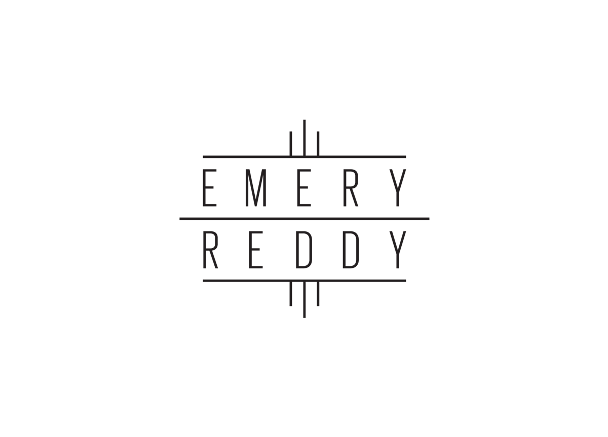
Fortunately, the letter-count in the two names happened to be equal, leading to a starting point for typographic studies. After generating the expected stacking and symmetrical solutions, the epiphany came when I decided to capitalize on where these attorneys were located and who they represented: Seattle. What about Seattle could be translated into a simple form? The Space Needle. This well-known landmark became the inspiration for the final solution. Abstracting the form into a typographic structure, a harmonious logotype was achieved.


