CLIENT
Manufacturers of eco-friendly, plant-based household cleaning agents. Their audience are predominately females 30 to 50 years old, probably with young families who are in a higher salary bracket. They are responsible for cleaning duties and have a concern for keeping the earth green for future generations.
BRIEF
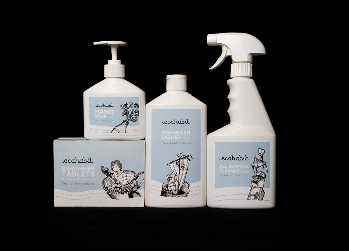
The challenge was to communicate an eco-friendly look and feel that looked clean, natural, positive, and friendly, with a lighthearted twist. The other challenge was that the products and logo needed to primarily appeal to women who would rather spend a little more on a product, knowing it would be beneficial in the future to their children.
APPROACH
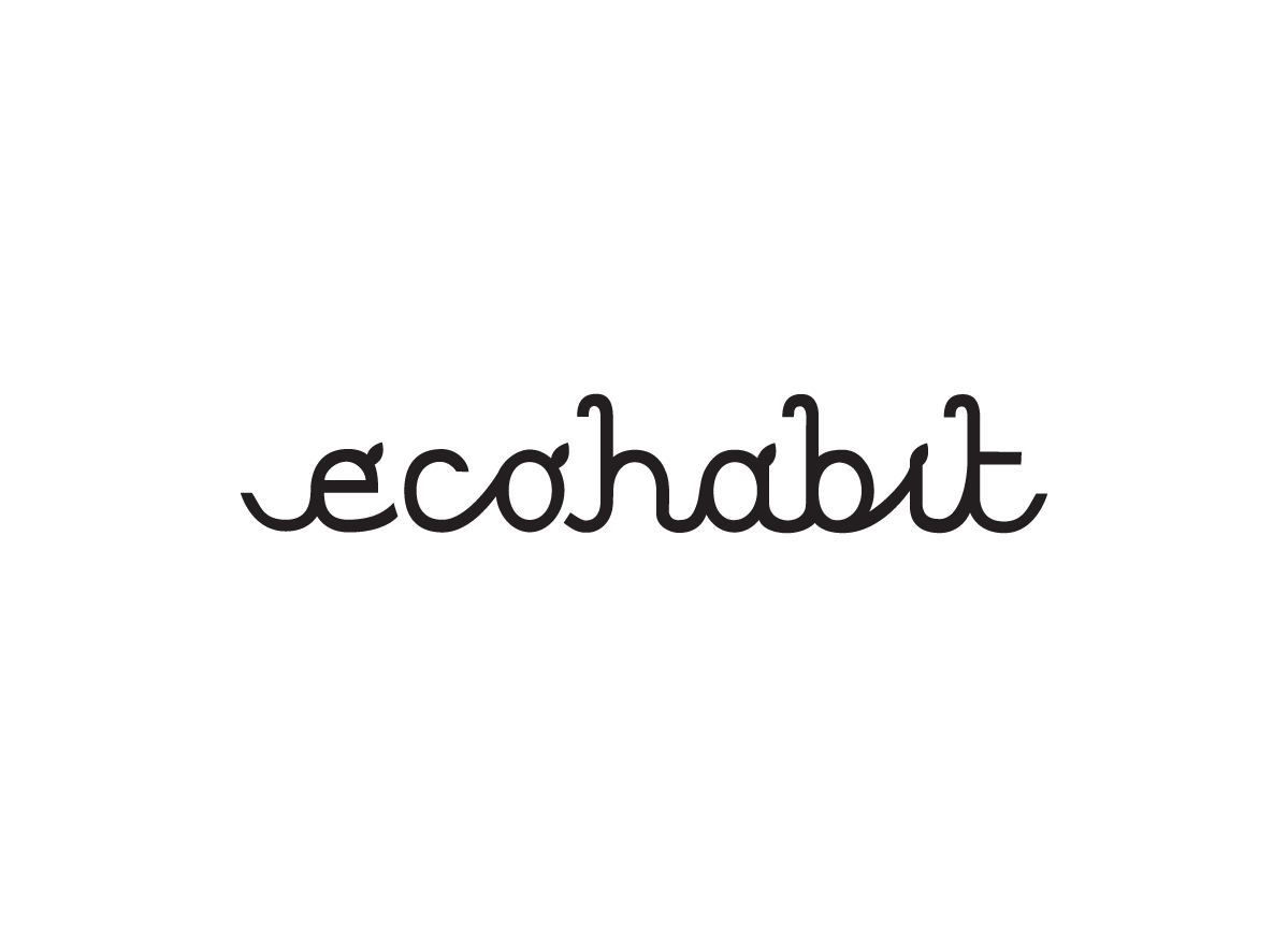
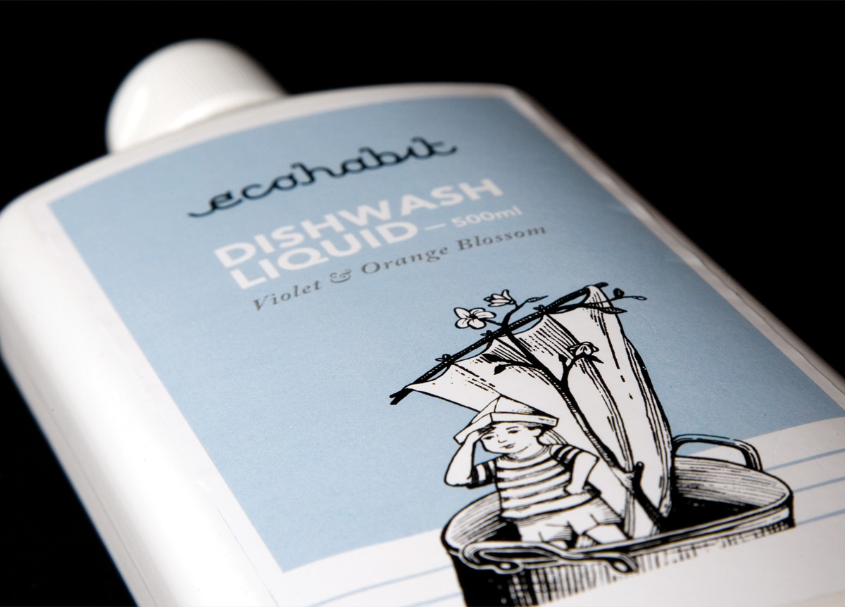
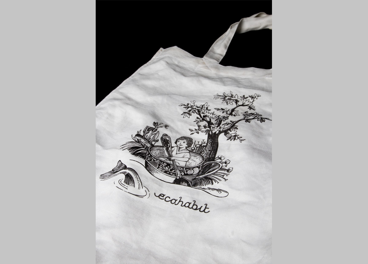
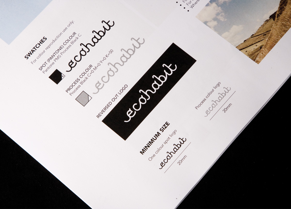
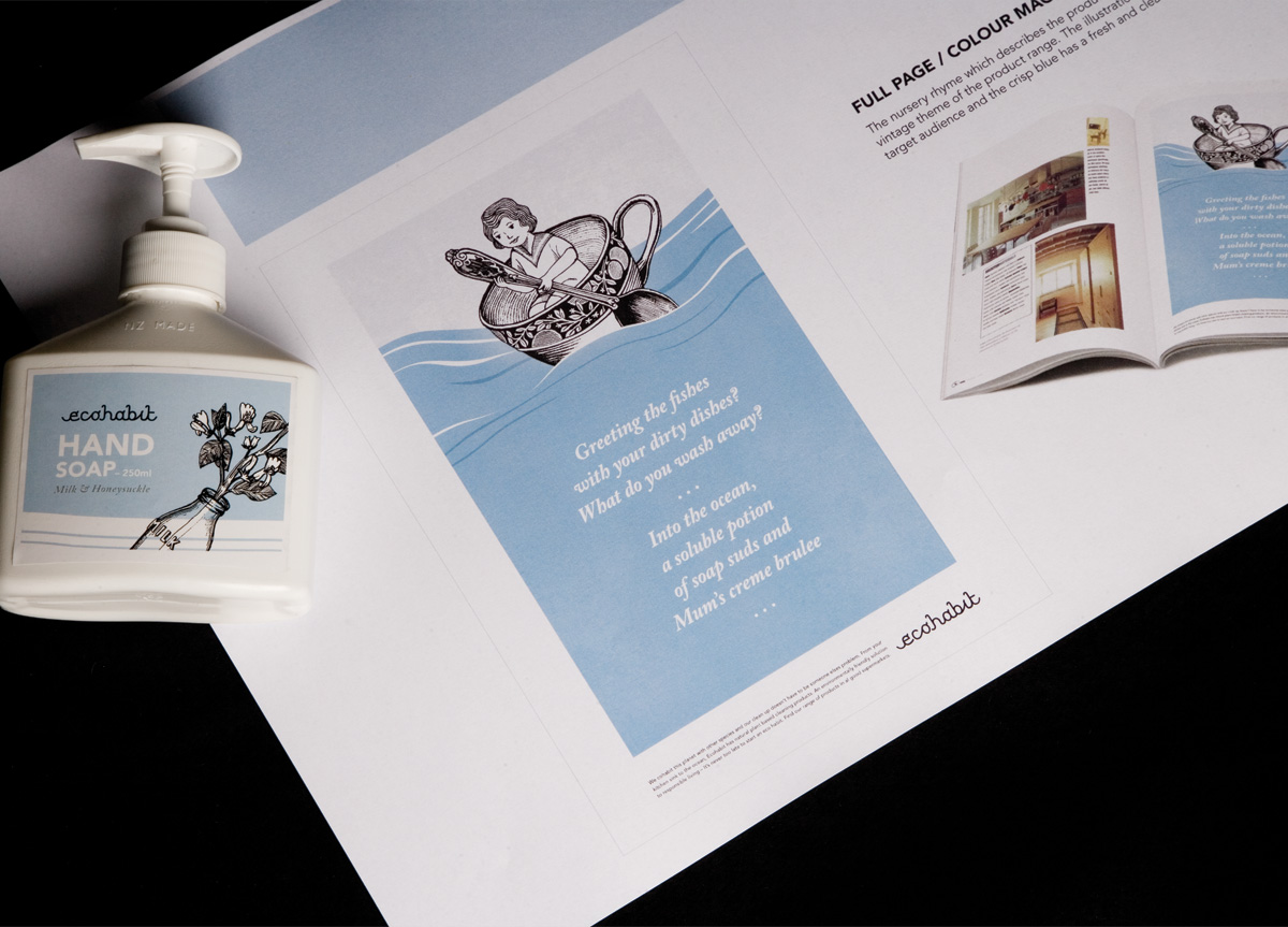
The logotype has a sensitivity to it, in that it feels organic and sweet, with the soft undulating curves and lowercase treatment. By using just two colors on the packaging, the products look deceptively inexpensive and eco-friendly by not appearing wasteful or extravagant. The white space feels clean and modern, and the supporting italicized serif type gives an air of elegance. The quirky illustrations bring a smile to your face yet have a gentleness and whimsy in the line and subject matter. The logotype and elements feel like they’re working harmoniously to communicate an overriding environmentally friendly message.
