CLIENT
A coffeemaker whereby the coffee comes in contact only with the scientifically designed filter and nonporous glass. The target market is sophisticated, smart coffee connoisseurs who enjoy gourmet food and art.
BRIEF
The project required a much-needed logo redesign. The coffeemaker was designed by a German chemist in the 1940s and has earned a place in the permanent collection of the Corning Museum of Glass in New York State. The challenge was getting the logo and supporting collateral to communicate the thought of science meeting art.
APPROACH
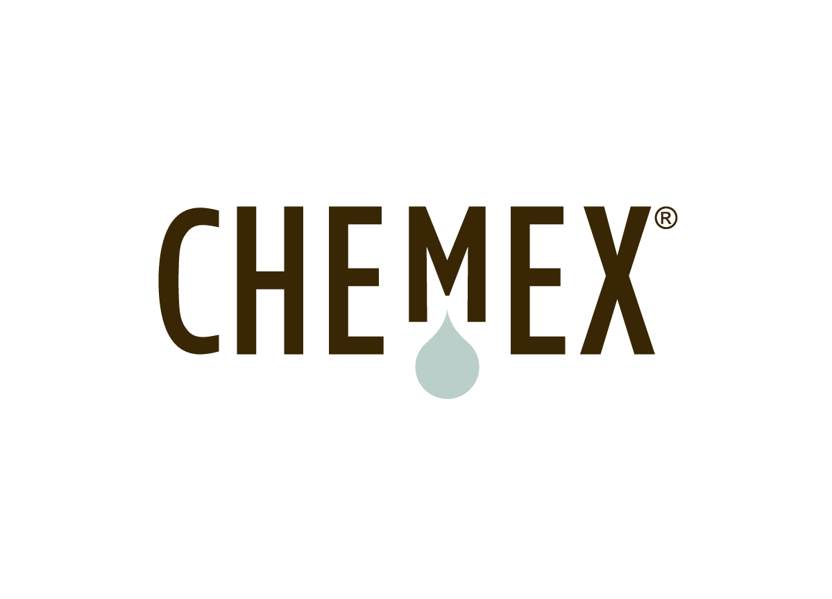
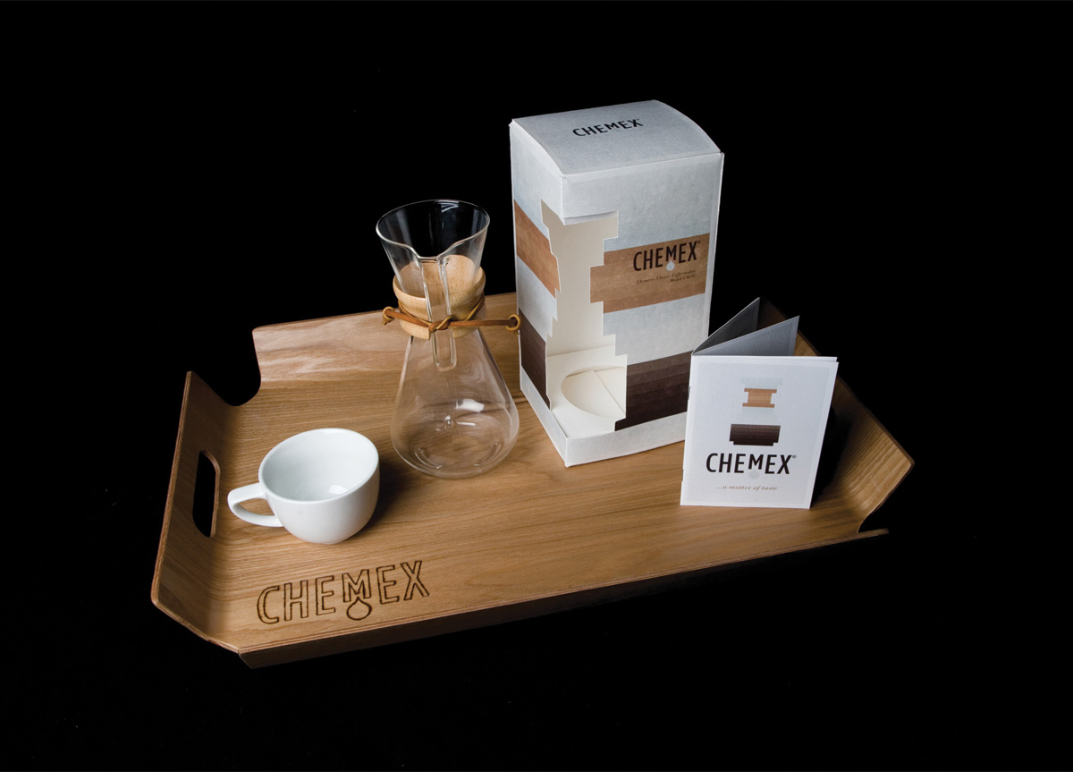
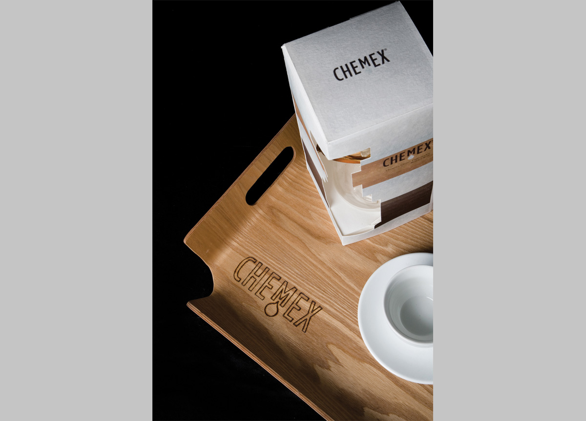
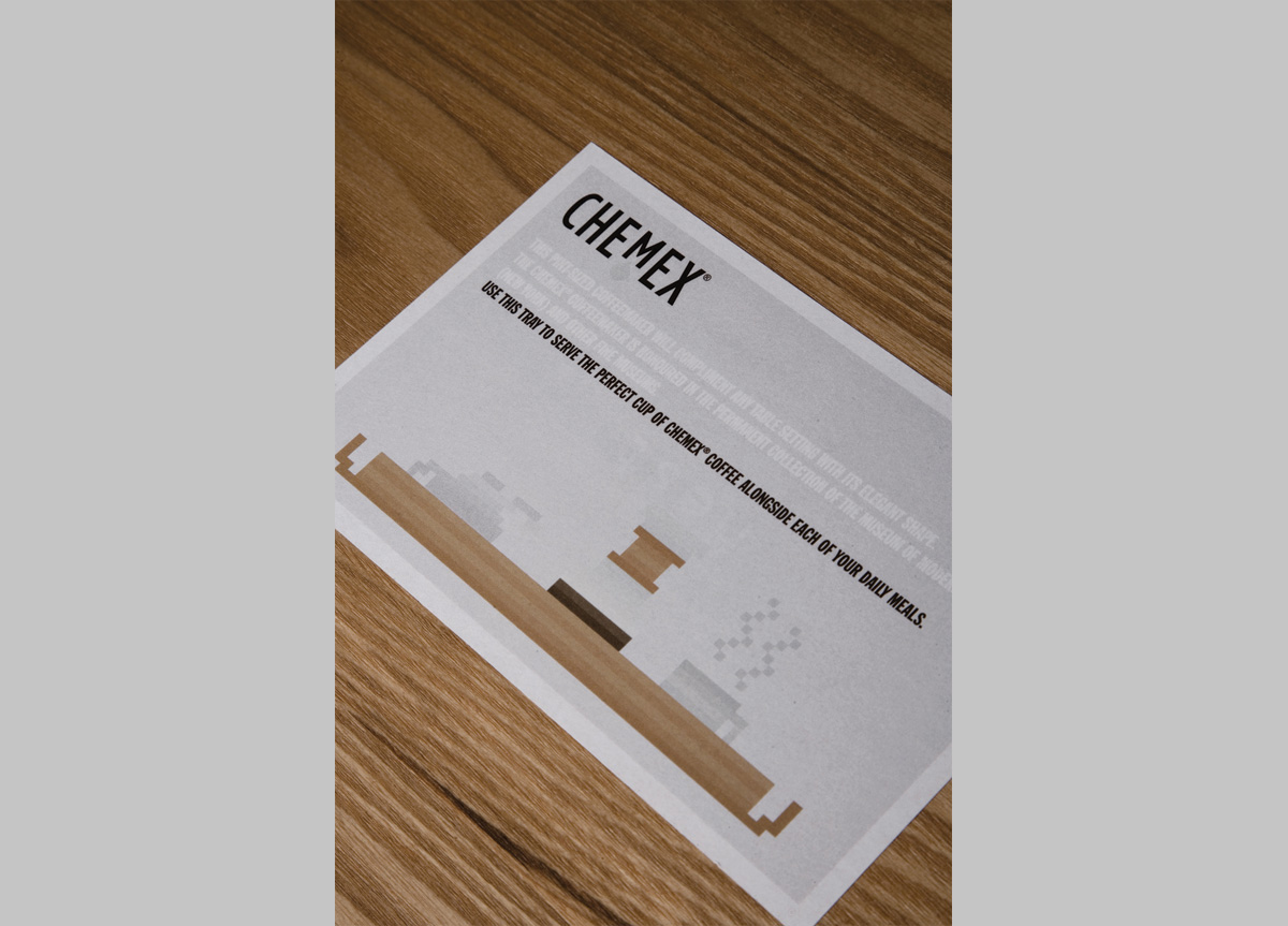
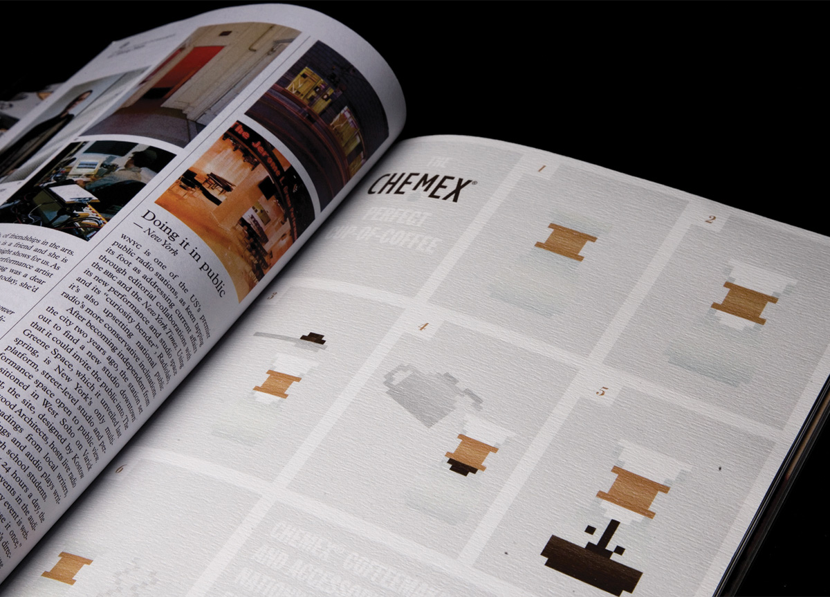
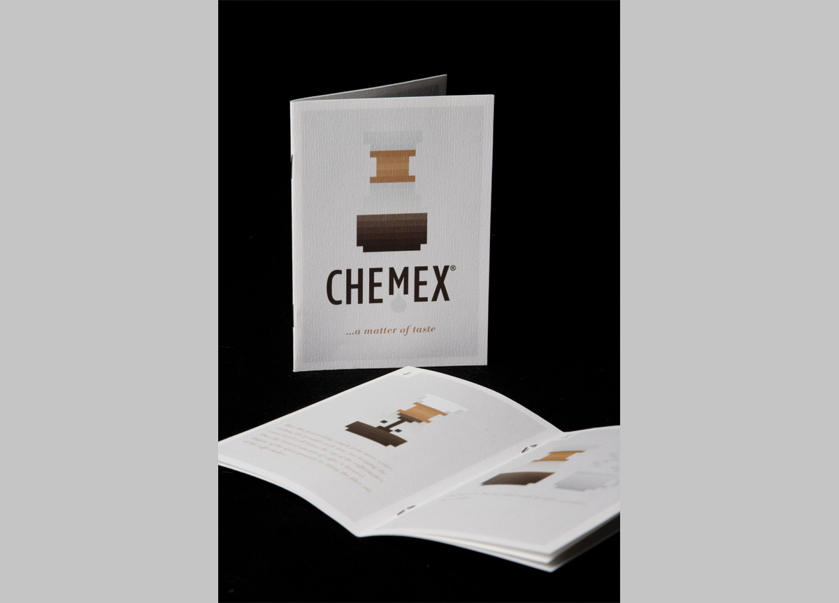
The logotype is heavily influenced by designs reminiscent of those from the 1940s and 1960s. The raised M in “Chemex” alludes to the coned filter system. The illustration style of the supporting collateral is a nod to the structure of the periodic table. The color palette is conservative and drawn from the materials used in the Chemex product itself: wood, glass, rawhide, and coffee. It brings about a natural, quiet, and sophisticated tone.
