CLIENT
The Colt brand is associated with the taming of the Wild West and revolutionizing 19th-century manufacturing. Colt was a leader in firearms manufacturing, and the name conjures up images of power, courage, and innovation.
BRIEF
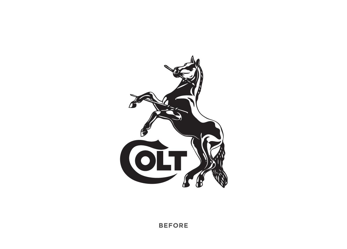
In recent times, the Colt brand has lost its relevancy, and their products have simply become imitations of older models and far from innovative. The challenge was to breathe new life into the brand and to restore the brand’s former glory as it moves toward a new direction.
APPROACH
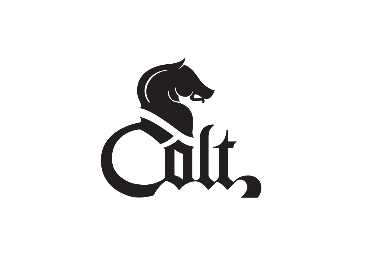
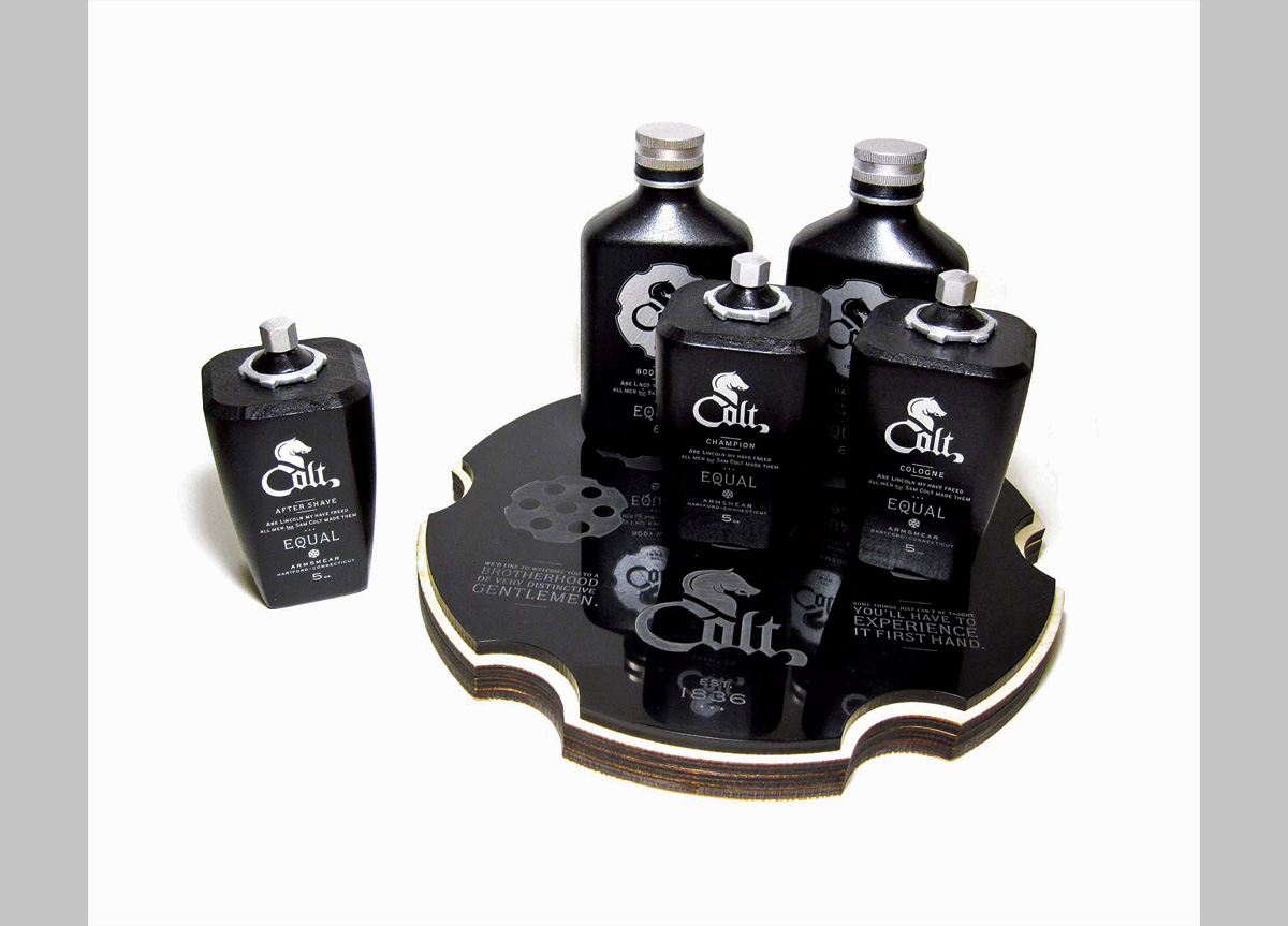
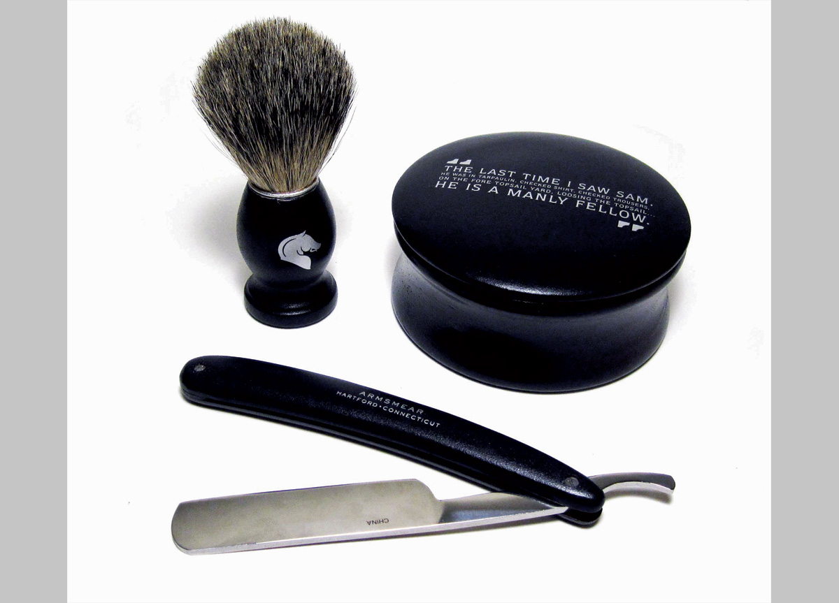
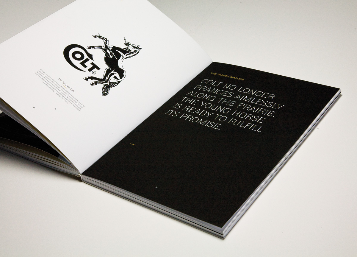
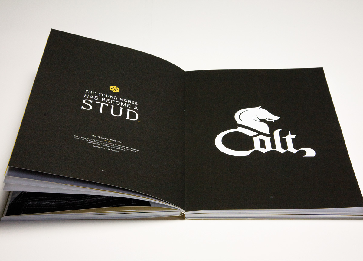
Colt’s new direction is inspired by its celebrated founder, Sam Colt, an innovator who wouldn’t take no for an answer. He was also one of the wealthiest and most influential men of his era. Colt’s new mission is to instill power, confidence, and innovation from within. Our goal is to transform you into an exceptional man, like Sam Colt. I wanted to communicate power, elegance, and innovation, while giving tribute to Colt’s historical significance. The blackletter logotype is an homage to the Colt name’s English origins.
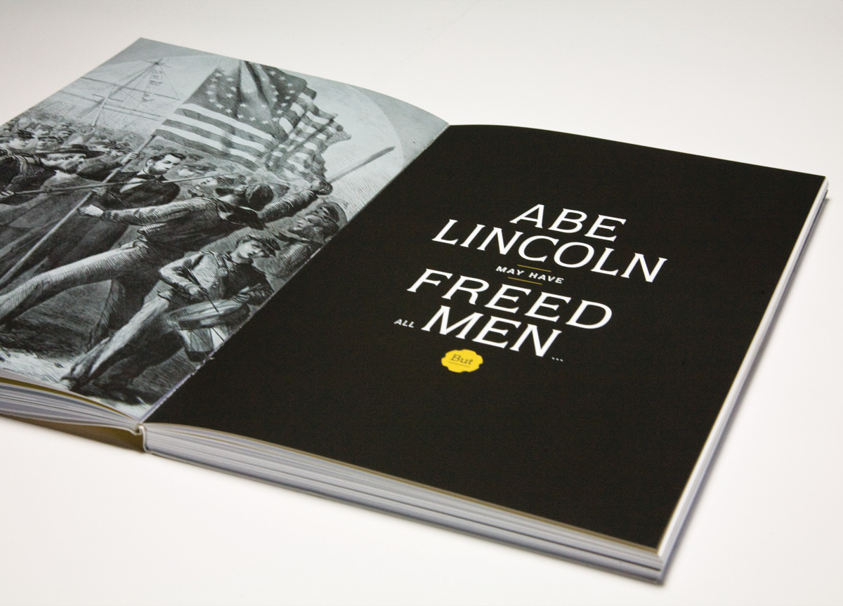
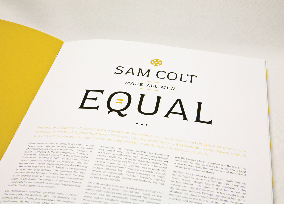
Astra’s vision for Colt was a brave one. He wanted to take an arms manufacturer and transition it to a lifestyle brand. He did this well — and the place that this is embodied best is through the narrative of the brand book itself. He casts Samuel Colt as a hero and an innovator — both industrially and culturally (“Abe Lincoln may have freed all men, but Sam Colt made them equal.”). Lots of research went into the creation of the robust narrative, which almost overshadows the already fantastic mark he created of the stallion’s silhouette. It at once looks bold and free as well as stoic, statuesque, and chess-piece-like (alluding to the fact that one can be bold but, at the same time, a strategic player in a complex game). The type and icon in the mark itself was a product of weeks of fine tuning and hand lettering. The overall tone of the book is very classic — pointing to vintage-esque type and a subdued color palette. — Hunter Wimmer, instructor at Academy of Art University
Judge’s Comments
This redesign is very well done. It looks like it has been around for a long time. The combination of type and image is totally natural and forms a perfect unit. — Steff Geissbuhler
I’m embarrassed to say that I did not know Colt made guns, but I saw this and knew it was a masculine, metal‑y and aggressive brand. — Jennifer Kinon
This is carried out perfectly. The elegance of the drawing confers on the mark a feeling of continuation and quality. By keeping the horse element of illustration but preserving only the head, the symbol is poised and is there to last a long time. The drawing of the letters makes it contemporary. — Claudine Félix-Janneau