CLIENT
The first classical music radio station in Peru. It was founded in 1983 as a non-profit organization and its objective is to spread culture through its broadcasting. Their target audience is people of all ages who love culture.
BRIEF
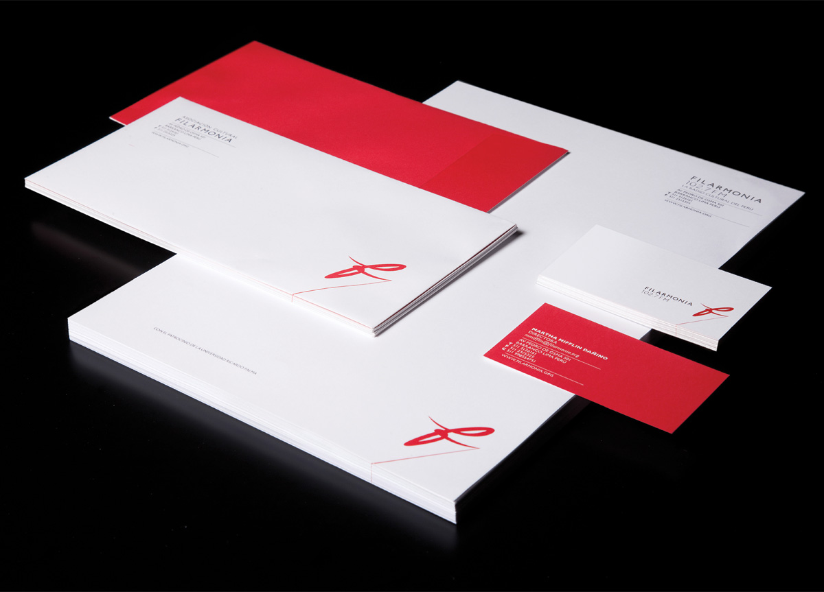
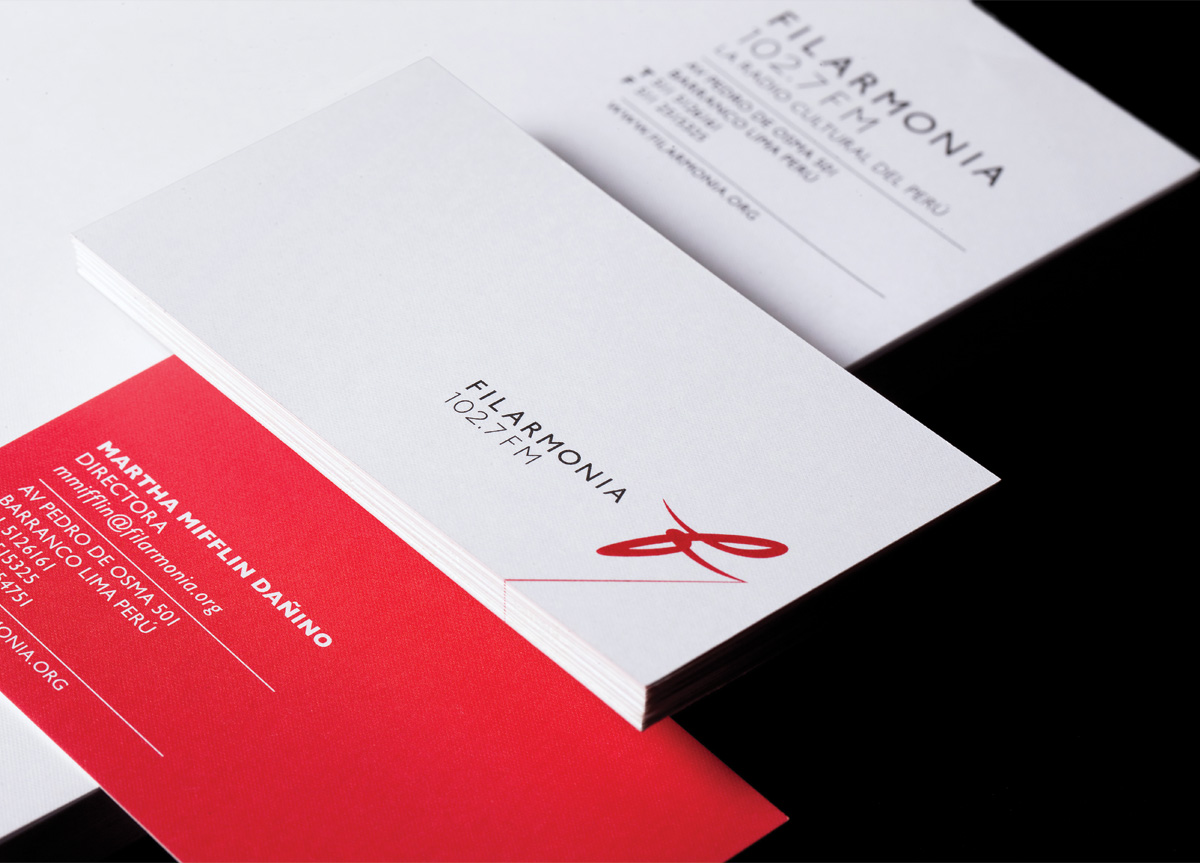
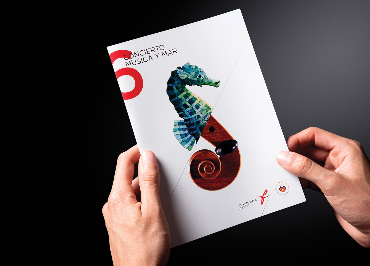
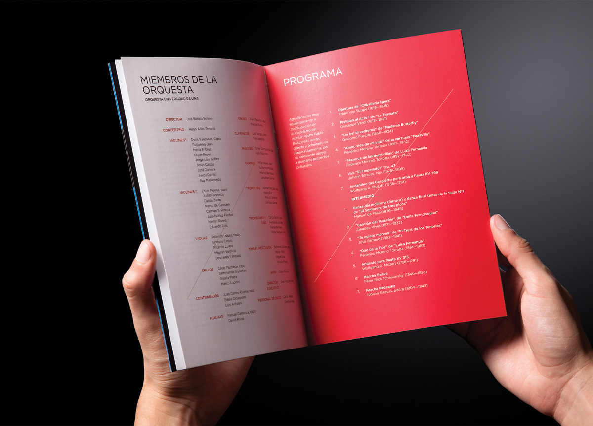
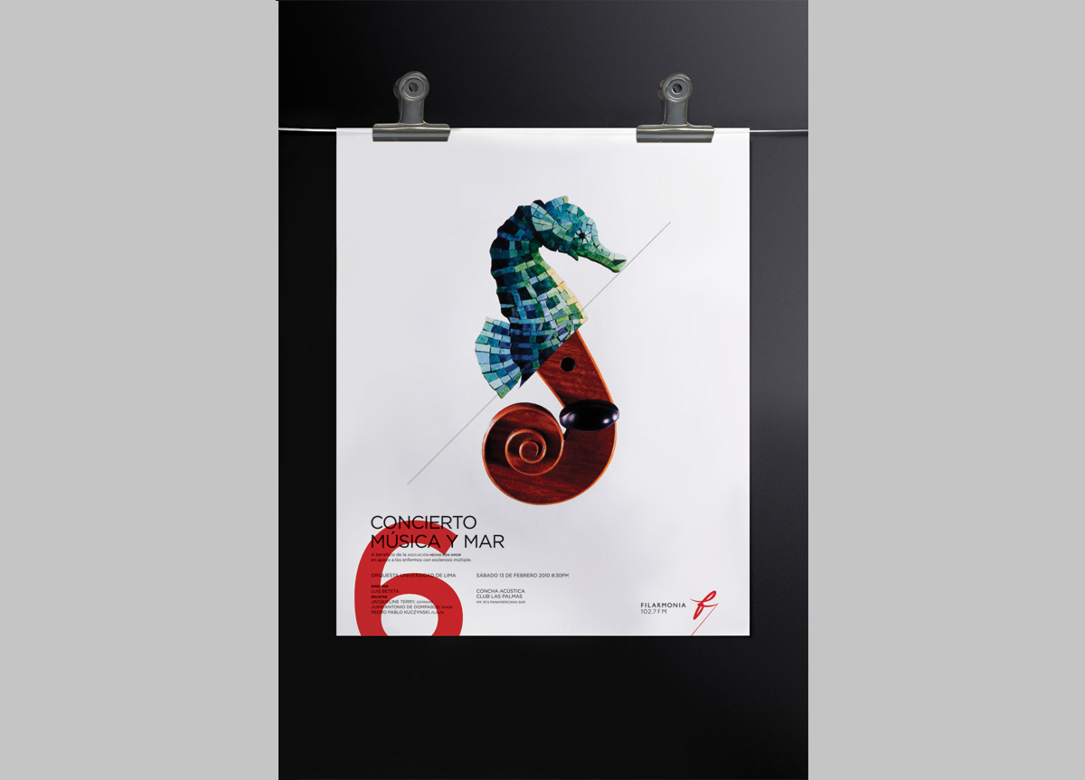
To formalize their organization was the first challenge. We were also asked to create a design system that would allow the client to produce additional design pieces in-house. They wanted the identity to be modern, young and contemporary so that it would reach more people.
APPROACH
In the category, most logos are formal, traditional, and complex and are often portrayed as old and highbrow. Filarmonía wanted to be a young and contemporary radio station so that they would reach people of all ages. Because of this, we decided not to use a font with serifs and chose a more modern font. Filarmonía’s logo is inspired in the movement of a baton, as this element identifies Filarmonía as the director of a unique radio station.
