CATEGORY

Offset

RANK


PRODUCTION DETAILS

Quantity

2,500

Page Count

68 + cover

Number of Colors

CMYK

Binding

Saddle-stitched with rubber band

Dimensions

8.75 × 11

Paper Stock

Cover Mohawk Via, Vellum, Cool White, 80lb
Interior Mohawk Via, Vellum, Cool White, 70lb

Special Techniques


DESIGN CREDITS

Creative Director

Chris Campbell

Design Director

Alan Lum

Senior Designer

Ross Clugston

Designers

Meg Beckum, Jessica Vernick

Photographer

and Retoucher Dave Todd


PRODUCTION CREDITS

Binding

Abby Bindery, Erik Wicker, Cristina Russo, Miguel Rivera

Direction

Terry Kerr


TAGS

, , , , , ,


LINKS

interbrand.com
apnyc.com

Magazine for Self-promotion by InterbrandMagazine for Self-promotion by InterbrandMagazine for Self-promotion by InterbrandMagazine for Self-promotion by InterbrandMagazine for Self-promotion by InterbrandMagazine for Self-promotion by InterbrandMagazine for Self-promotion by Interbrand


CLIENT

Inter­brand New York is wide and diverse. Strate­gists to design­ers, mar­keters to finan­cial man­agers. They are music junkies, food­ies, and from all cor­ners of the globe. Each depart­ment is iso­lat­ed by their respon­si­bil­i­ties to their clients and ven­dors, but joined togeth­er by a com­mon love for brands.


BRIEF

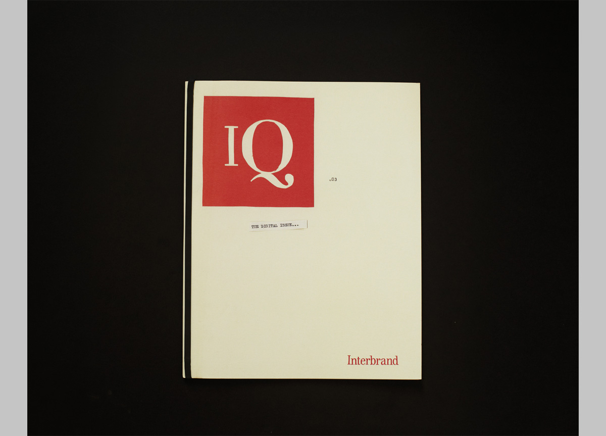
IQ” is a print plat­form devot­ed to new think­ing in the field of brand­ing. For The Dig­i­tal Issue, we need­ed to cre­ate an edi­tion that accu­rate­ly expressed and sup­port­ed the clien­t’s dig­i­tal point of view in a way that would appeal to C‑suite exec­u­tives, new clients, and employees.


APPROACH

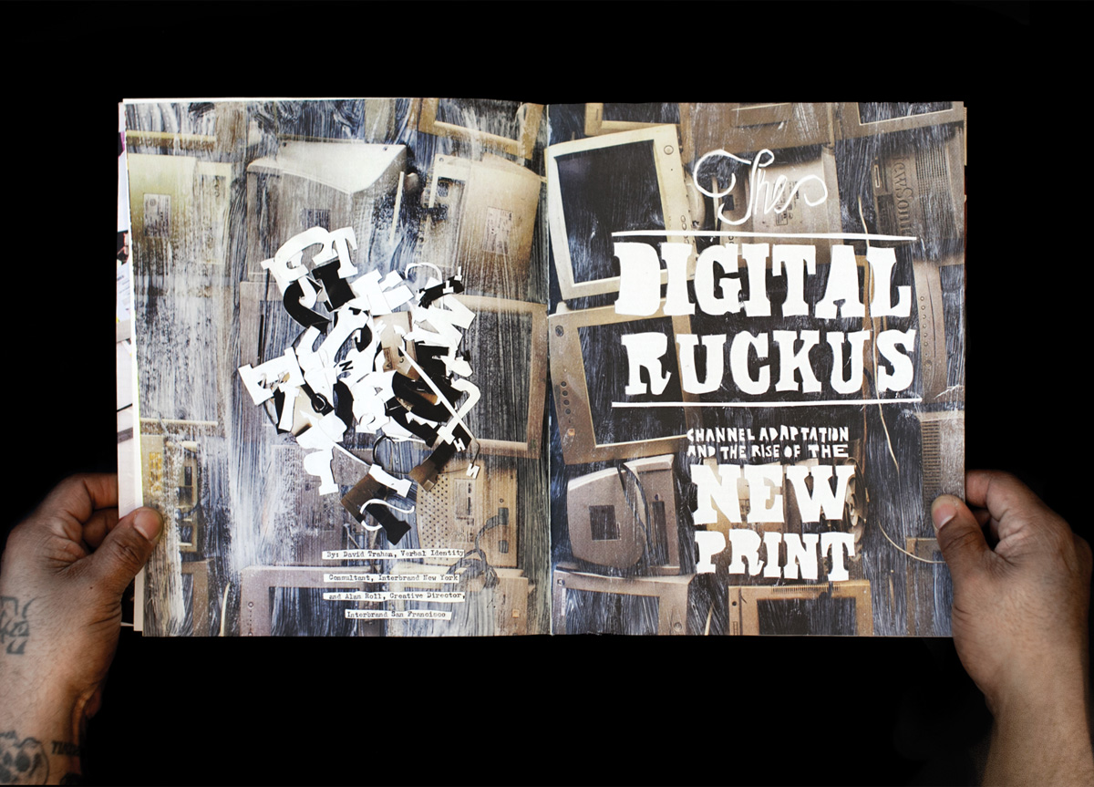
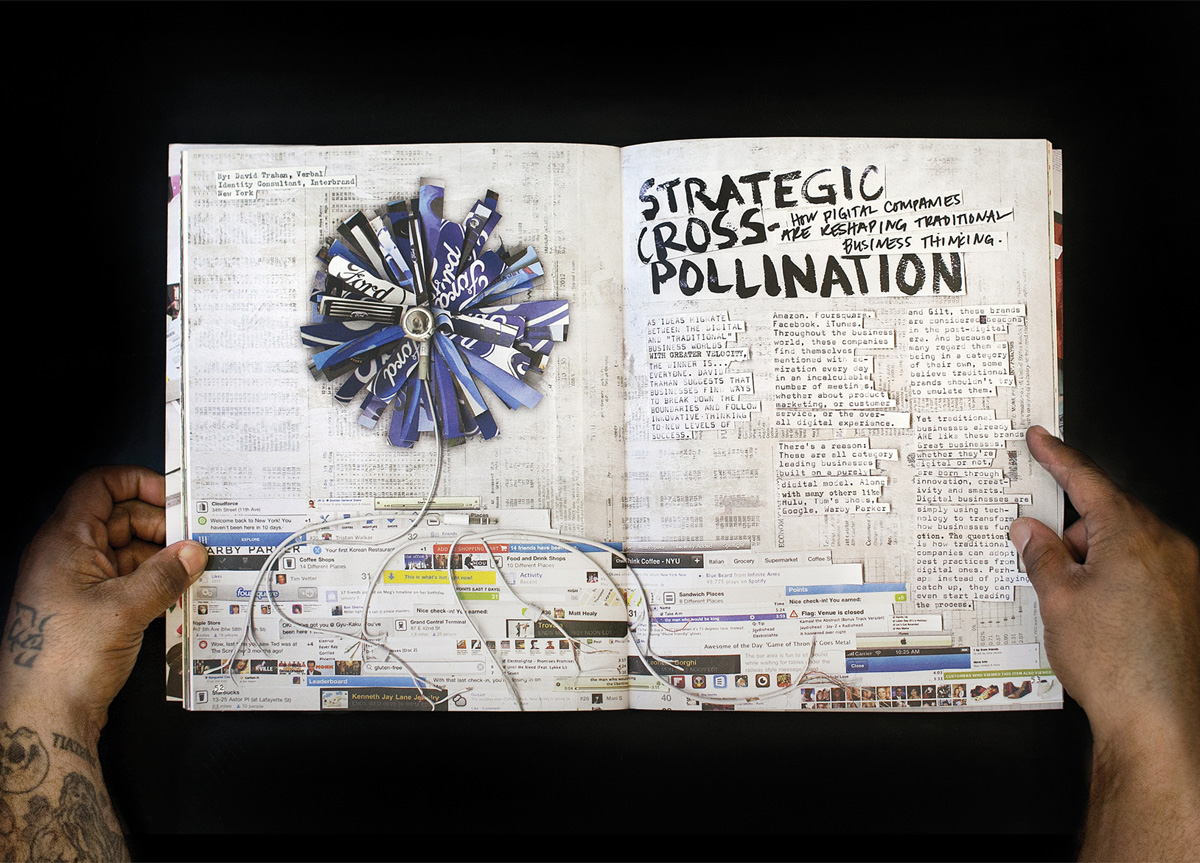
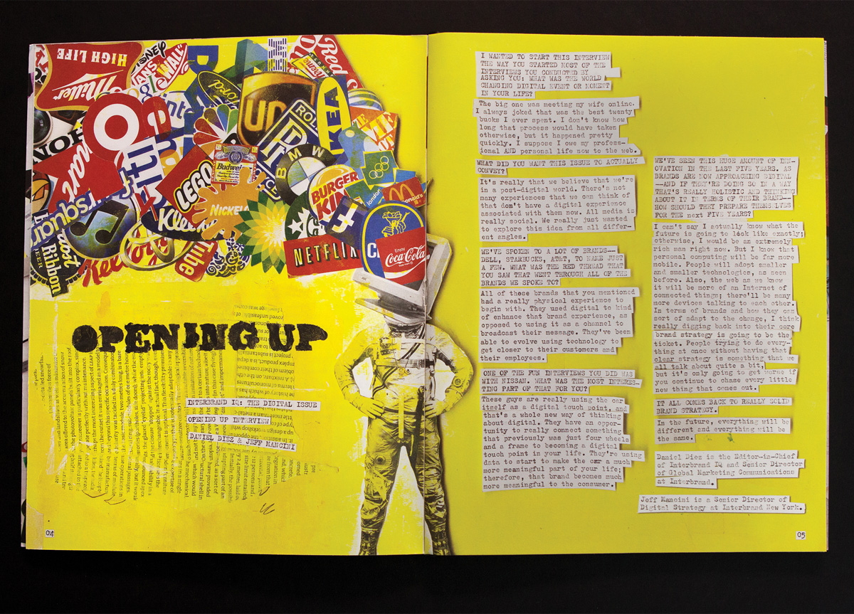
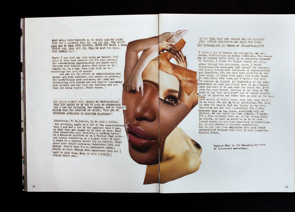
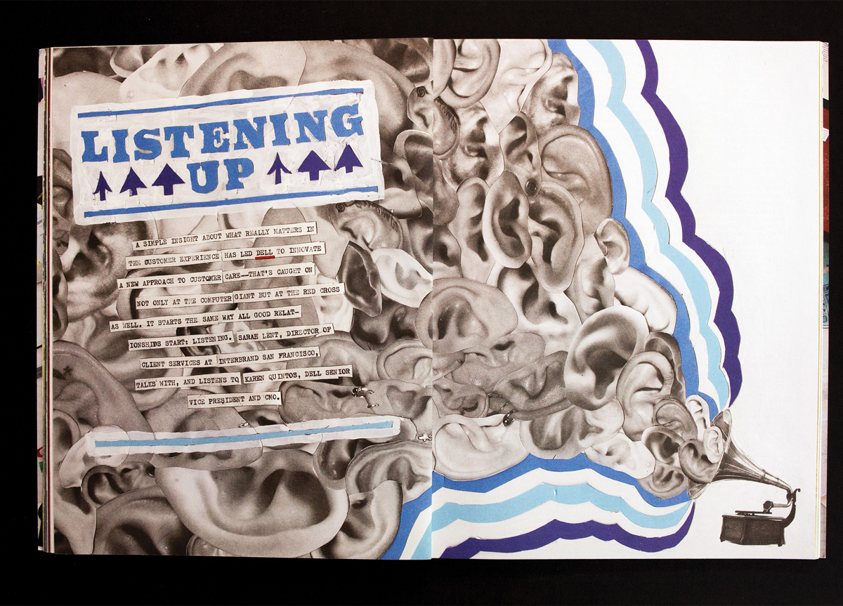
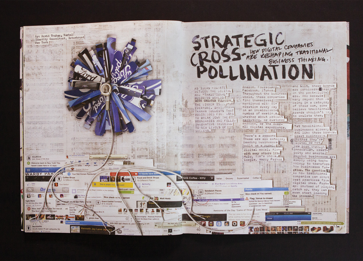
The goal of The Dig­i­tal Issue, specif­i­cal­ly, was to show­case the most inspir­ing think­ing in dig­i­tal print­ing, but the chal­lenge was to do so in a way that was unex­pect­ed, true to IQ’s print tra­di­tion, and cre­ative­ly answer the ques­tion, “Why did you print the dig­i­tal issue?” Cre­at­ing The Dig­i­tal Issue pushed the bound­aries of IQ fur­ther than ever before. 72 pages, every word handcrafted—either hand-drawn or typed on ana­log type­writ­ers. This engag­ing, phys­i­cal brand expe­ri­ence embod­ies our dig­i­tal point of view.

PRODUCTION LESSONS

We used flatbed scanners after discovering our two-day photo shoot was not a success. Flatbed scans gave us consistent detail, shadows, and greater depth of field. Typesetting the 68-page document with two typewriters was nothing short of torture. Proofreading in situ was a challenge as re-typing and re-shooting were the only forms of correction. 35 high-resolution scans meant our document file size presented further printing hurdles.

Table of Contents