CLIENT
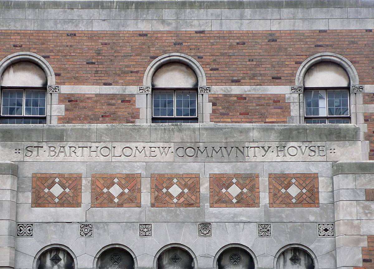
An Episcopal Church—affectionately known as St. Bart’s—located on Park Avenue and 51st Street in New York, NY. The Romanesque structure is unique among its peers.
BRIEF
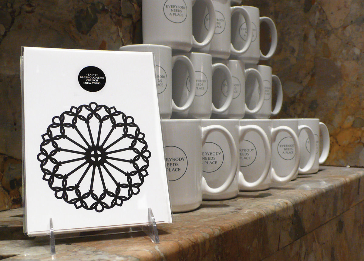
We worked with church leadership to clearly articulate St. Bart’s spirit. The outcome was “Everybody Needs a Place.” St. Bart’s warmly welcomes all people to participate freely and without judgement.
APPROACH
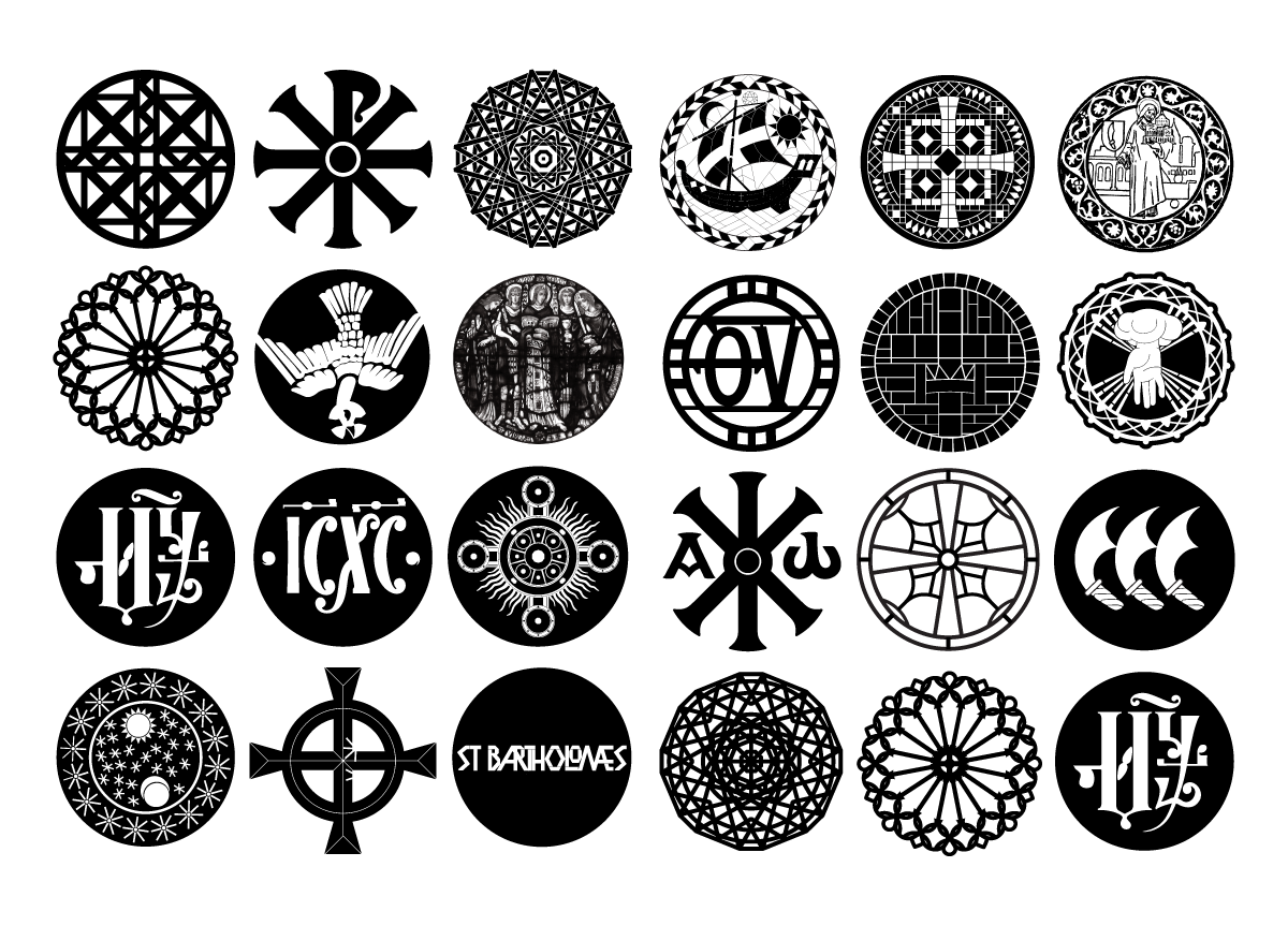
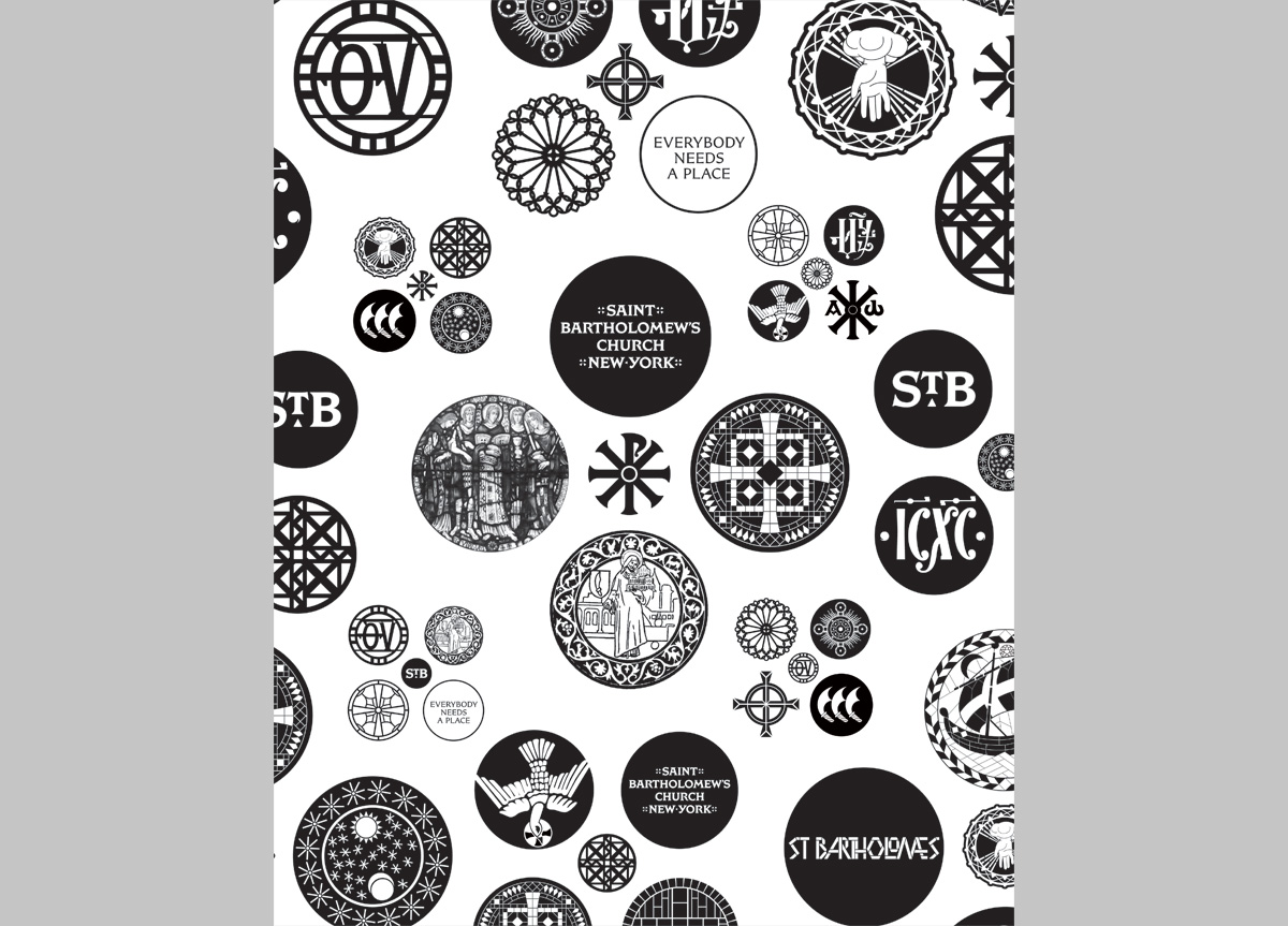
We seized on the idea of tradition with counterpoint. It’s about being beautiful but robust and always accessible. The identity system had to speak clearly in a minimum of three voices: historic, religious, and public. The Romanesque architecture, a style characterized by circles and arches, offered up nearly inexhaustible design inspiration. The church interior is made up of an eclectic mix of mosaics, stonework, and stained glass windows that are stylistically disparate but relentlessly unified by the circle. They are everywhere, impossible to fully catalogue.
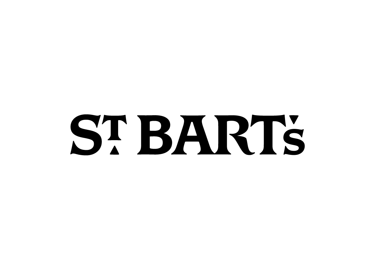
OCD amazed us with their approach to St. Bart’s identity challenge. Their multiple tours of the church itself and their penetrating interviews with clergy inspired a design concept that uniquely reflects both the rich heritage of St. Bart’s and its smart contemporary outlook. OCD’s solution included the creation of St. Bart’s own typeface, a stunning array of icons inspired by features OCD found in the church itself, and hip new expressions like the “St.B” logo applied to tote bags and other branded merchandise. Speaking for St. Bart’s clergy and parishioners, we couldn’t be more thrilled. — Keith Reinhard, Sponsor and Project Director of St. Bartholomew’s Church
Judge’s Comments
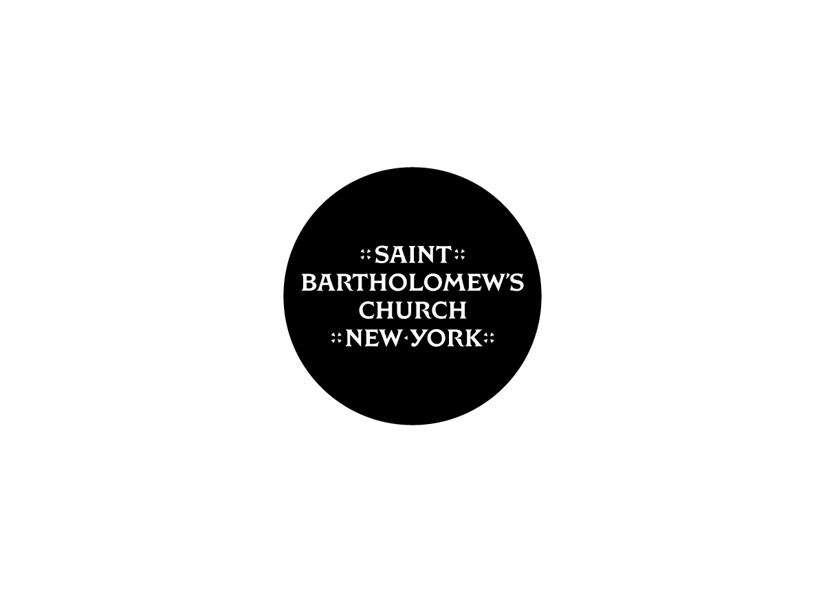
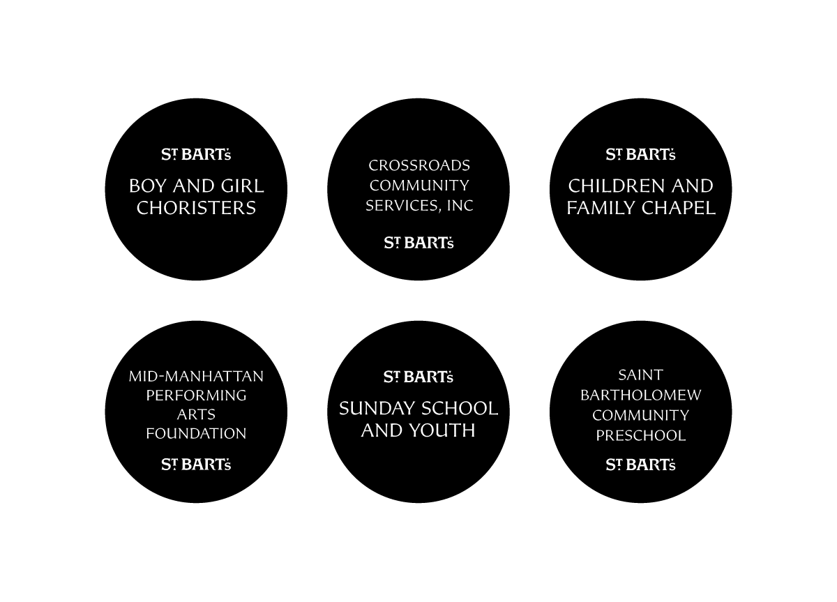
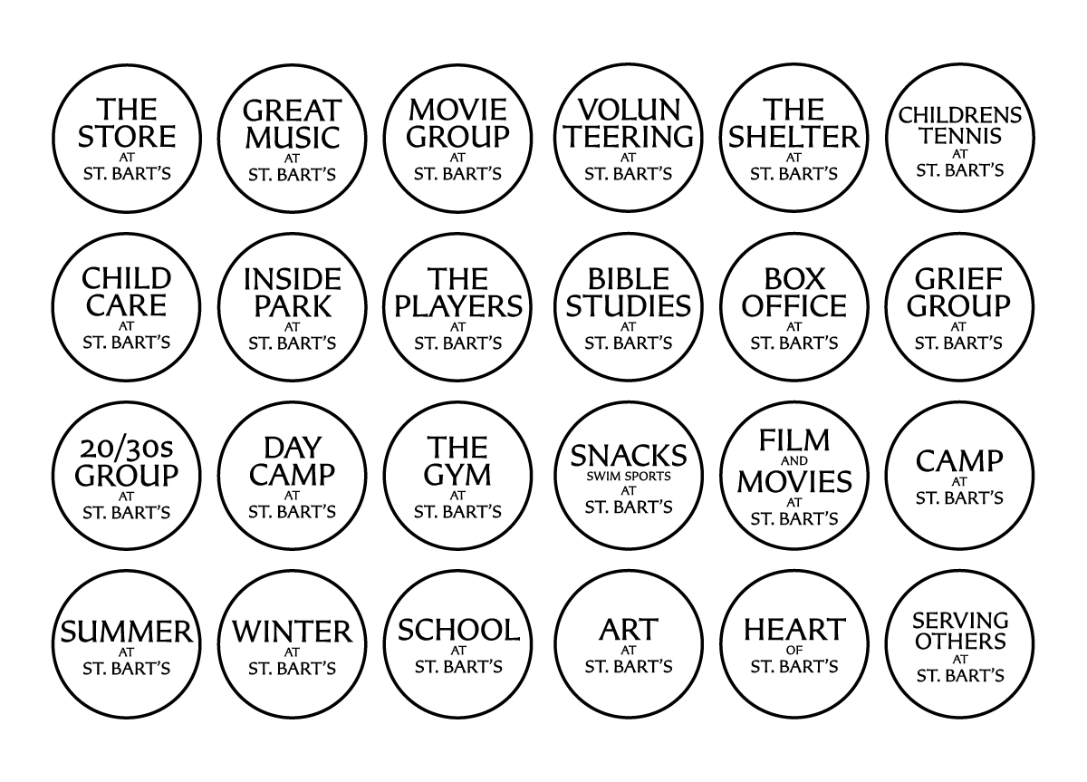
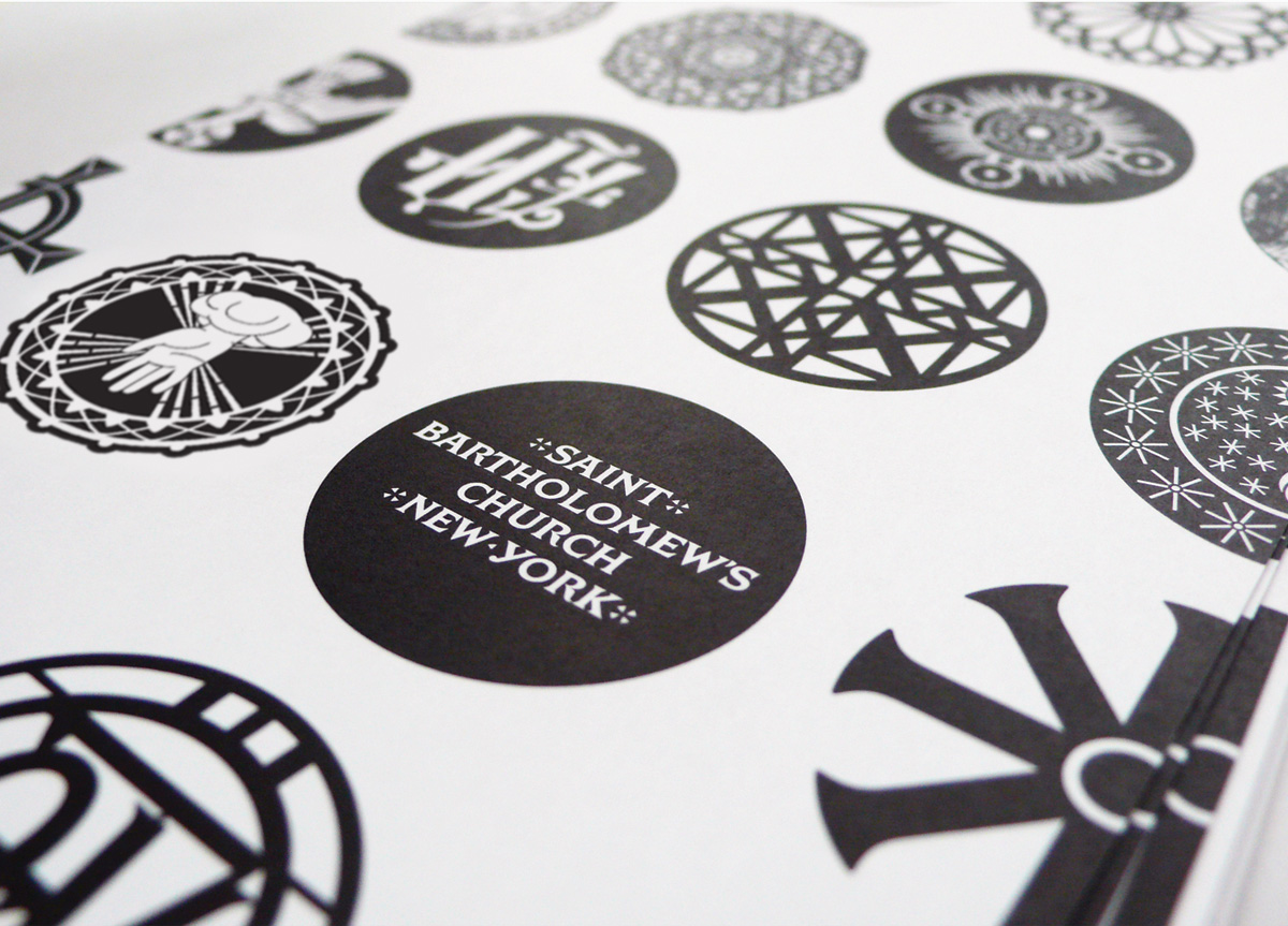
This design was “blessed” with a beautifully lettered stone inscription that was part of the Church’s architecture. Translated into the digital realm, the wordmark retains an authenticity and dignity that befits the client yet, typographically, it feels fresh and even hip. Using the circle as the basis for its identity program, the St. Bart’s system allows for both formal versions (indicated by white lettering reversed out of black) and informal messaging (black lettering in outlined circles). As the designers note, the circle has a long history in ecclesiastical and religious iconography. This design solution found something simple and intrinsic to the client and wasn’t afraid to use it and transform it into something beautiful and smart. — andrew blauvelt / This was Blauvelt’s Judge’s Pick
This identity effectively communicated the spirituality of the subject matter while presenting a flexible, modular system. Typographic inventiveness and contrast of modern layouts with medieval-inspired letterforms marked this as a standout of the competition. — Ellen Glassman
This is a contemporary take on Gothic, complete with stunning neo-gothic typography, gorgeous religious icon stamps all in glorious black and white, and with the most extensive kit of parts of any identity program. It’s so well done it almost makes me want to pray. — PAULA SCHER
The depth at which this identity has been explored is astounding. Even though the initial design did not appeal as much to me, the application and body of work makes this a deserved co-Best of Show. — Michiel Schriever
Simply put, a beautiful and cohesive system built on the traditions of the church’s history and graphic language, and formally expressed in a respectful way. — BRETT WICKENS


