CLIENT
An artisan producer of premium quality local English honey and the finest beeswax products. Located in Sheffield, a post industrial city in the heart of the United Kingdom, known in the past as the Steel City, but now has a sweeter side.
BRIEF
Create a new identity that would stand out from, and stay clear of, the sticky stereotypes associated with honey brands, including the request of “NO BEES.” It was vital that the identity communicate Sheffield’s industrial heritage, whilst at the same time referencing the artisans’ attention to detail when it came to their premium quality honey.
APPROACH
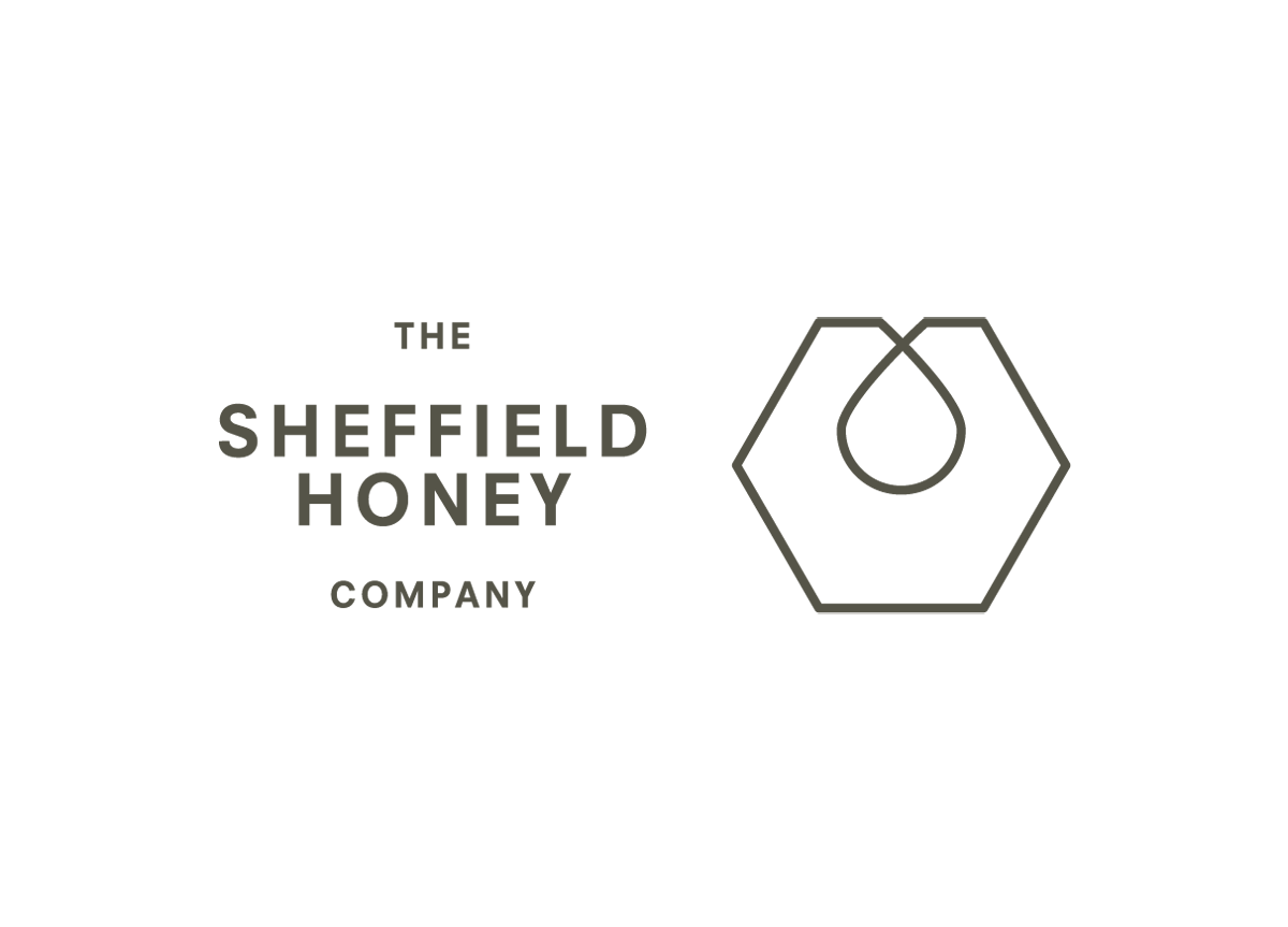
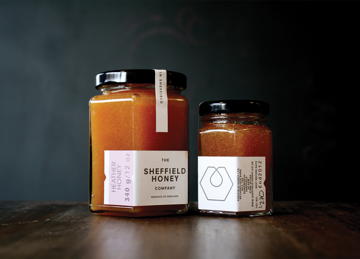
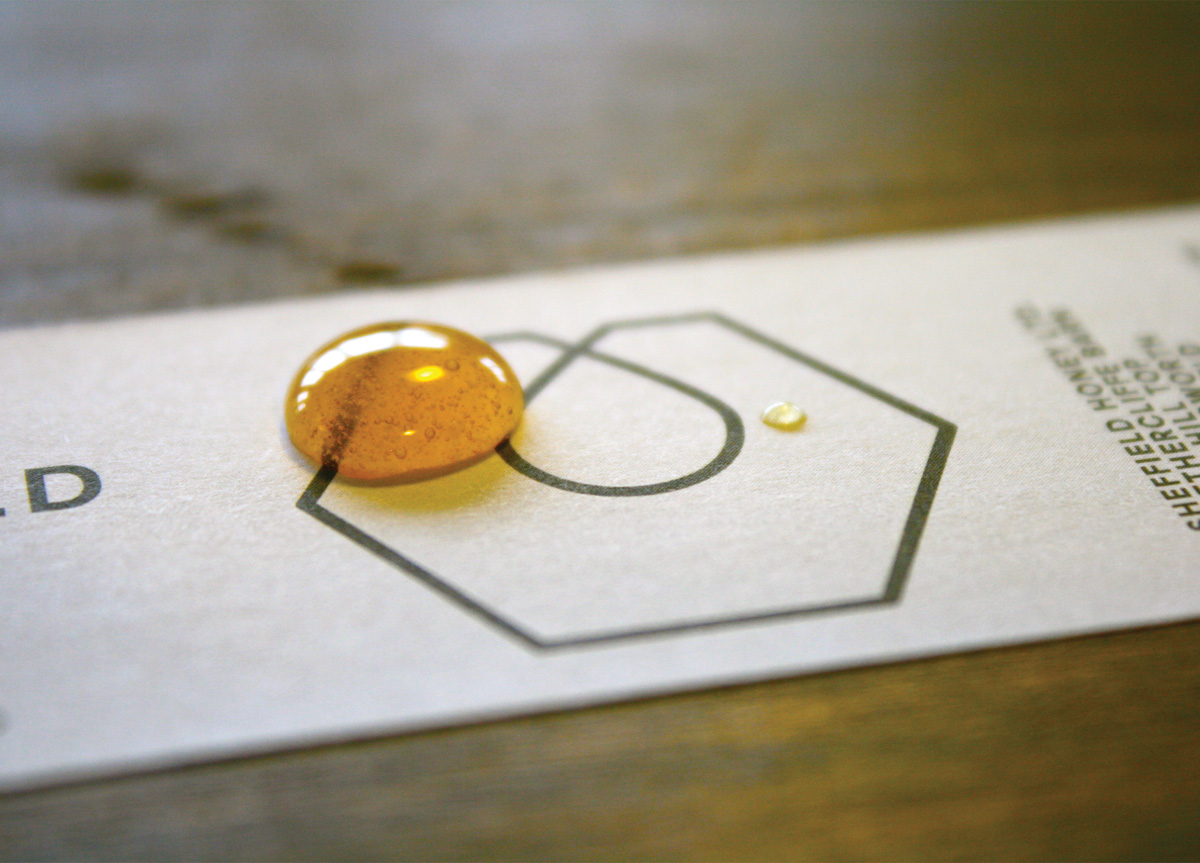
Our approach was to create a utilitarian logo/brand solution that would allow the product’s natural color to take center stage, be it the burnt orange of heather honey or the caramel yellow of the honeycomb candles. An overtly minimal typographic treatment was used, synonymous with the functionality of the steel factories of the city’s past. The label, too, pays a subtle homage to the old street trams and bus tickets that would get clipped by the conductor on presentation. The simple line logo is the joining of the honey drop and the hexagonal form of a steel nut.


