CLIENT
A community-based shop that is managed and owned by members and open to all. It’s situated on Lamb’s Conduit St, London WC1 and takes its format from the popular co-operative “Park Slope Food Coop” in Brooklyn, NY.
BRIEF
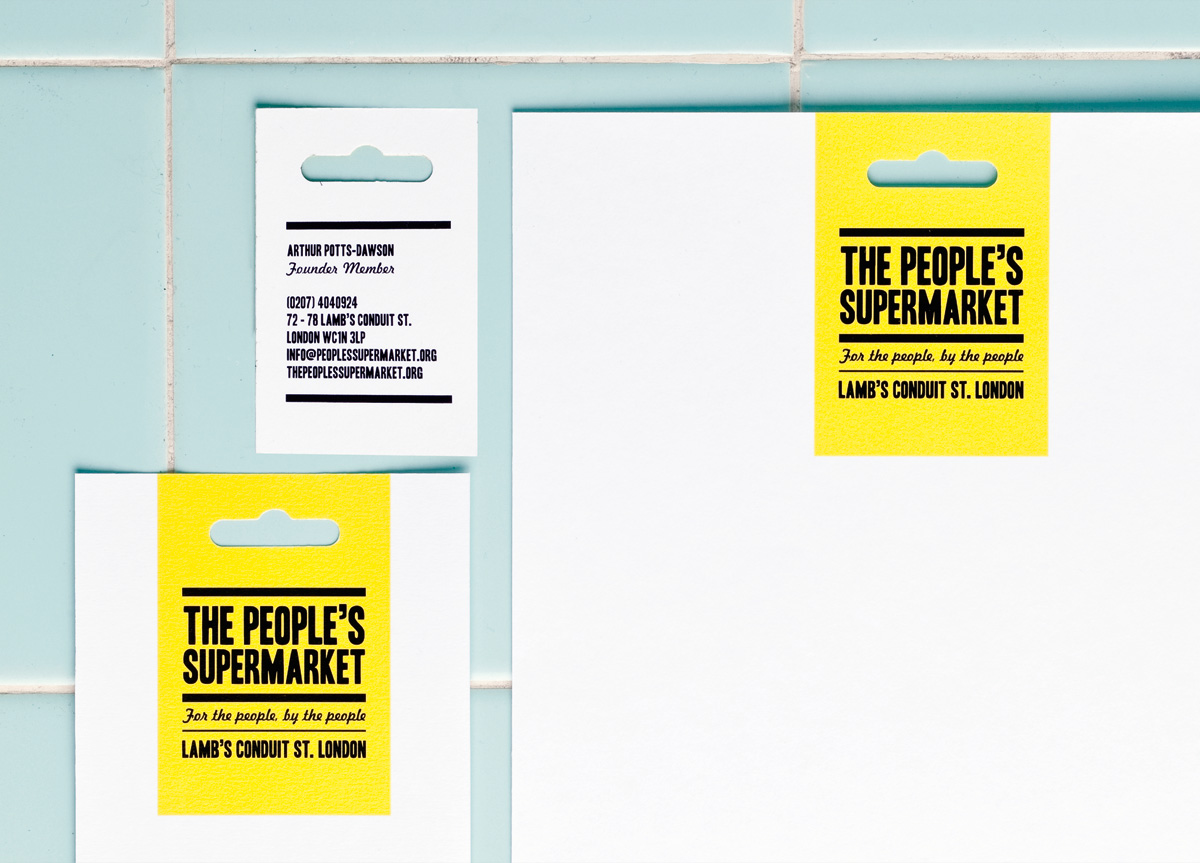
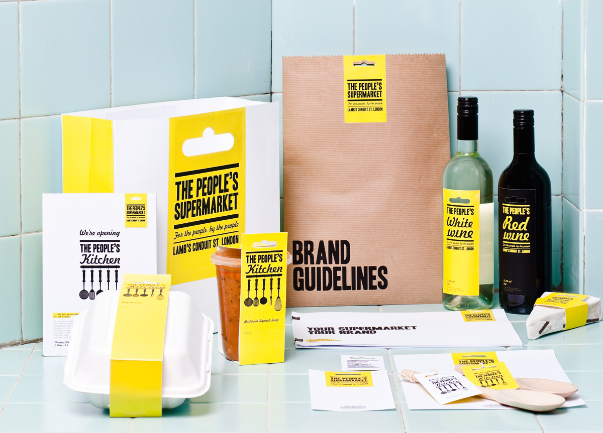
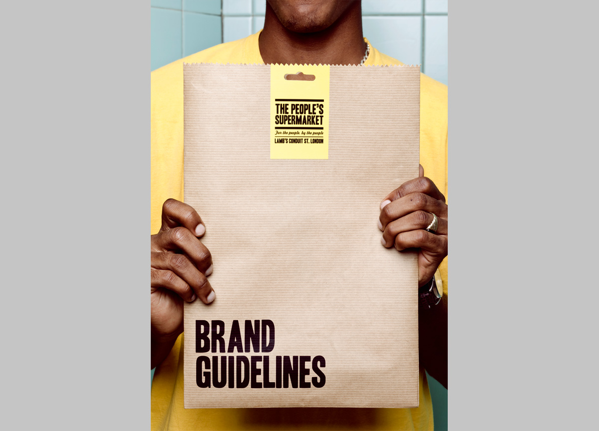
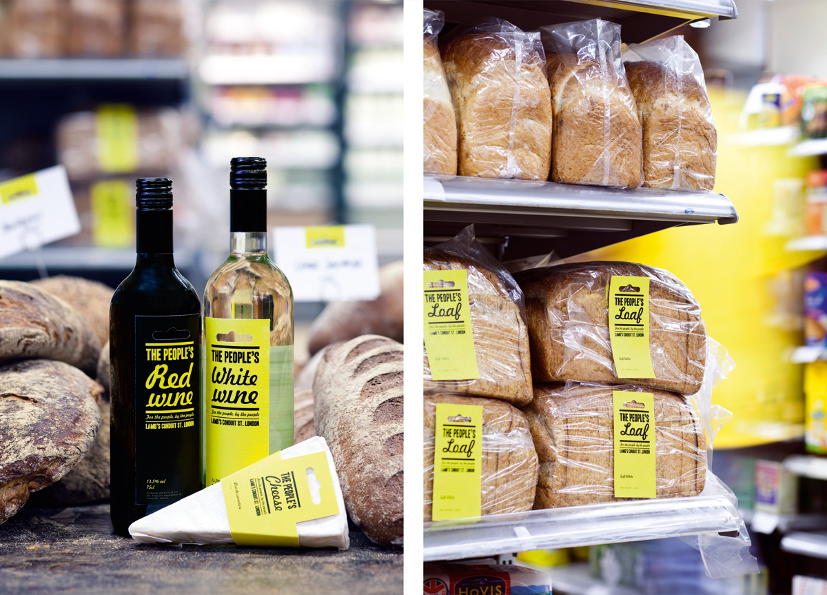
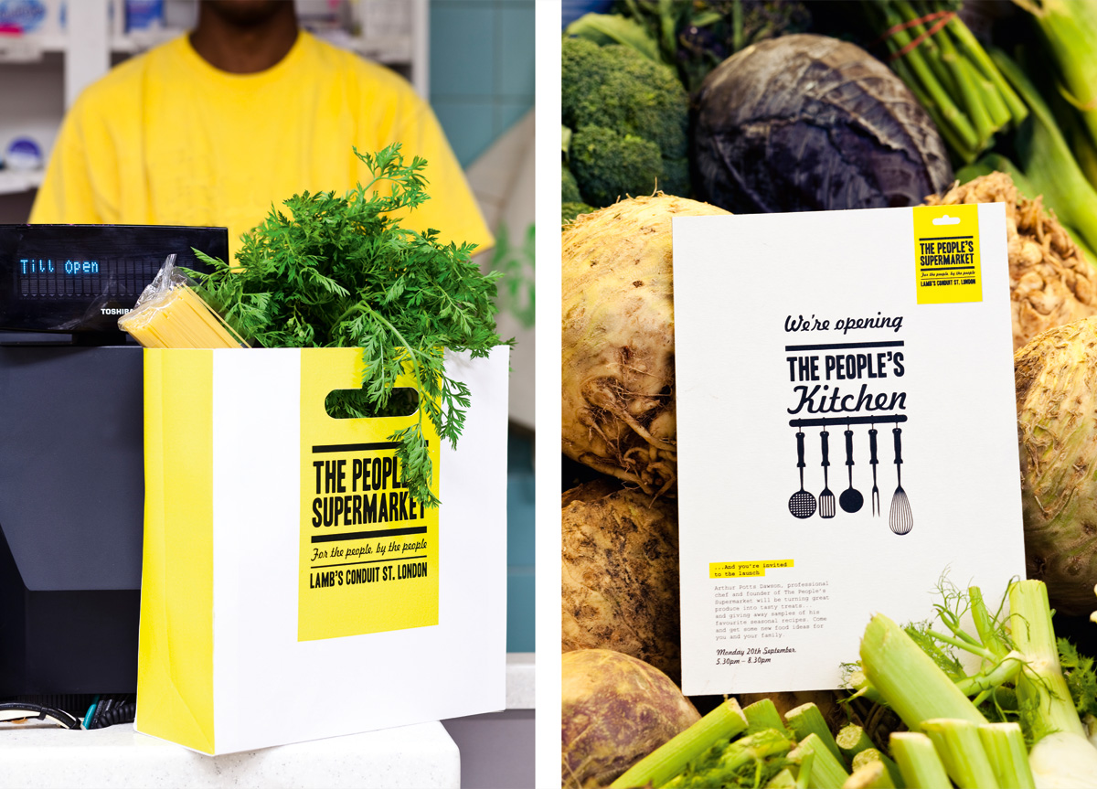
After approaching the Supermarket to design some launch posters, we were tasked with developing the brand, which needed to reflect the co-op’s core values of being communal, affordable and democratic without appearing too virtuous or elitist. A full identity program was required including logo, stationery suite, advertising, packaging and brand guidelines. As the organization is not-for-profit and production budgets are consistently low, the designs needed to be simple to implement. As a result, much of the packaging and print material needed to be produced in-house.
APPROACH
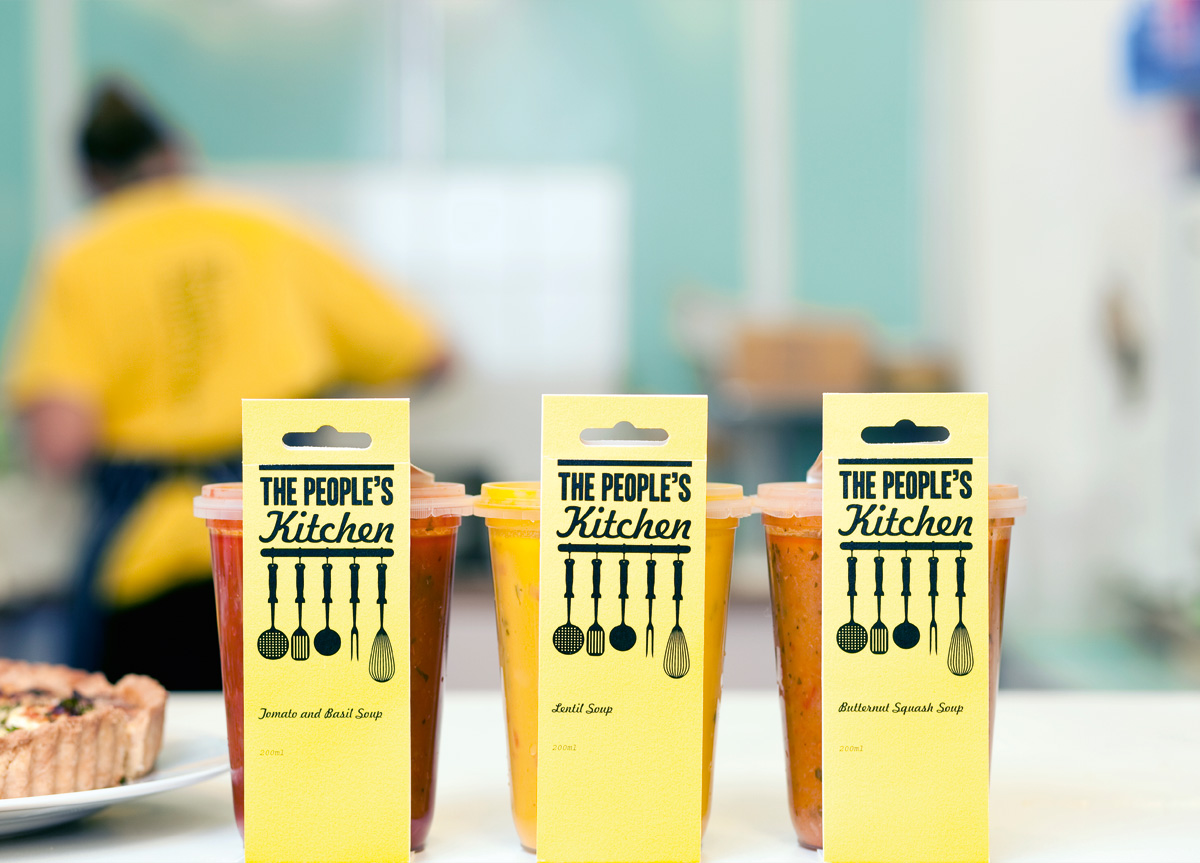
The identity is based on the “Euroslot,” the hole punched at the top of numerous packaged products around the world. The Euroslot is an iconic retail symbol. It represents a wholesome, independent, classic shopping experience which is similar to what The People’s Supermarket is trying to achieve. The completed project is friendly, bold and straightforward, always appearing in two colors. The strong use of yellow represents the color of t‑shirts which members are given when they join. In addition, a sub-brand for The People’s Kitchen was also created.
