![]()
![]()
CLIENT
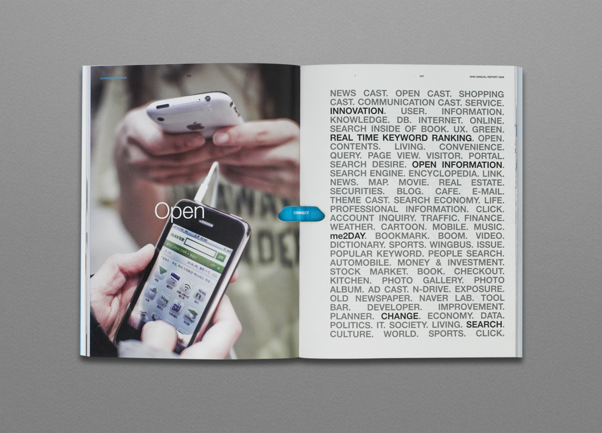
The world’s fifth largest search engine and the most representative internet portal website in Korea. The company releases dozens of new services, and updates its services hundreds of times every year to continue to innovate, and provide better experiences.
BRIEF
NHN, the largest internet company in Korea with only 10 years of history, did not want its identity defined in a specific form or color, as in the cases of most corporations, but wanted its identity to be a lasting “concept” that will be alive among the members of the company. Amidst the rapidly changing business environment where the company has grown 172 times bigger in size in just 10 years, NHN has recognized the importance of having its own identity system that is completely different from the past, and that is both clear and flexible in order to maintain the corporate philosophy and identity.
APPROACH
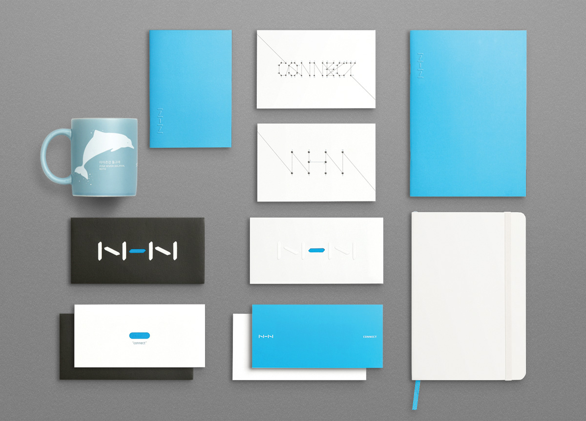
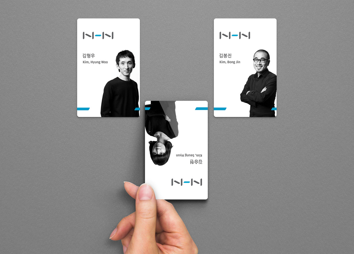
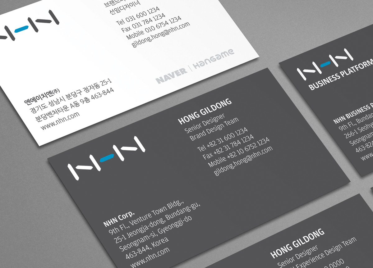
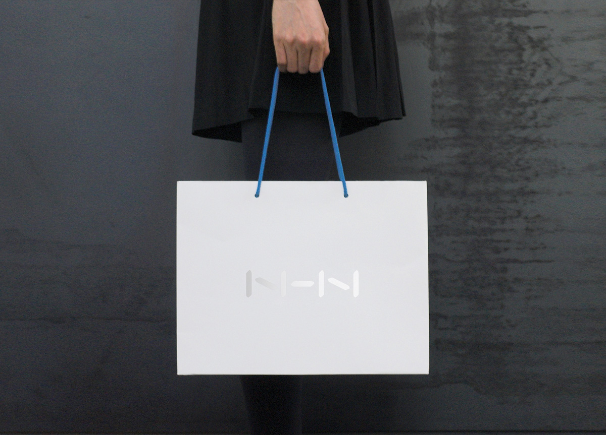
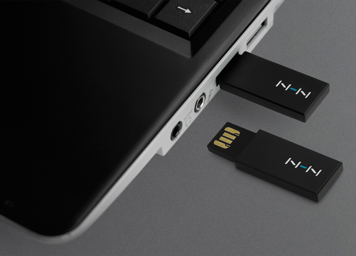
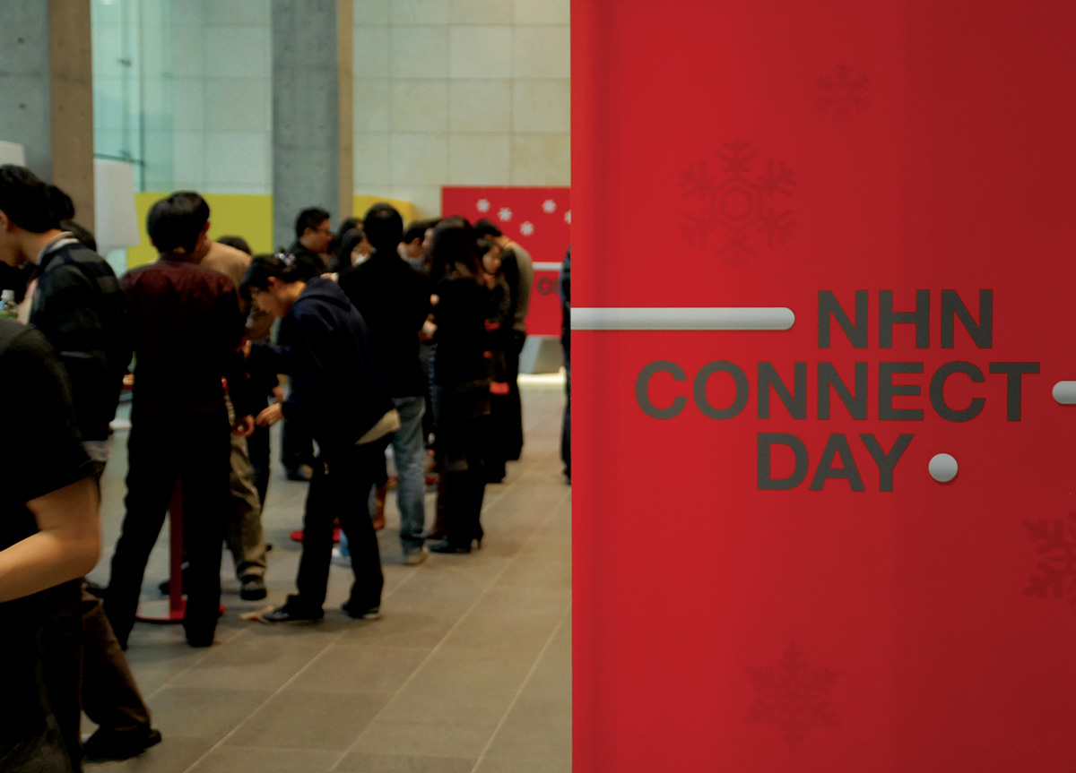
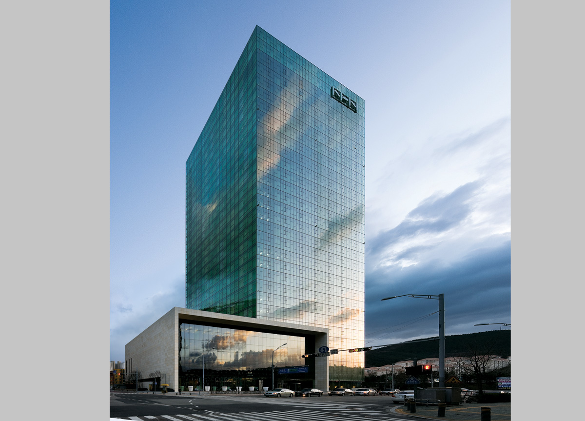
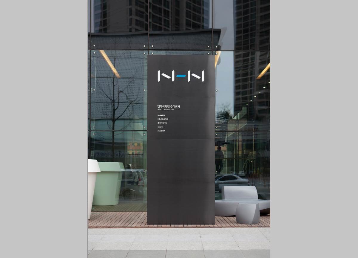
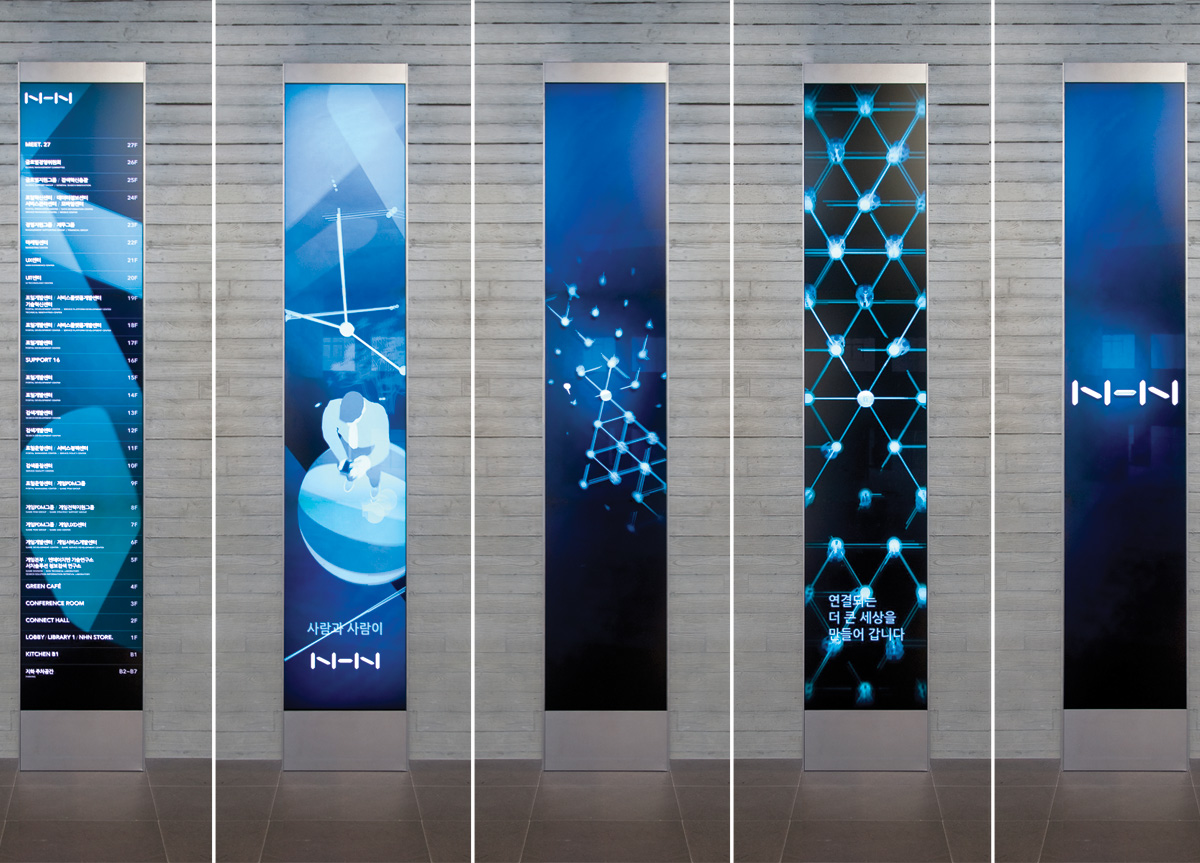
NHN defined its value in a single word, “CONNECT.” The company designed a simple logo to highlight the “CONNECT” concept just by slightly separating each stroke of the characters, “NHN,” not devising another symbol. The “CONNECT” philosophy, which means connecting “person to person,” “information to information” and “past to future” is manifested in the designs of basic items, including the business card. In particular, the philosophy is well applied to the NHN’s newly built company building as a space design concept. Consequently, people sharing the space experience the concept of “CONNECT” as natural as “culture.”


