CLIENT
A Venice, California-based digital creative agency.
BRIEF
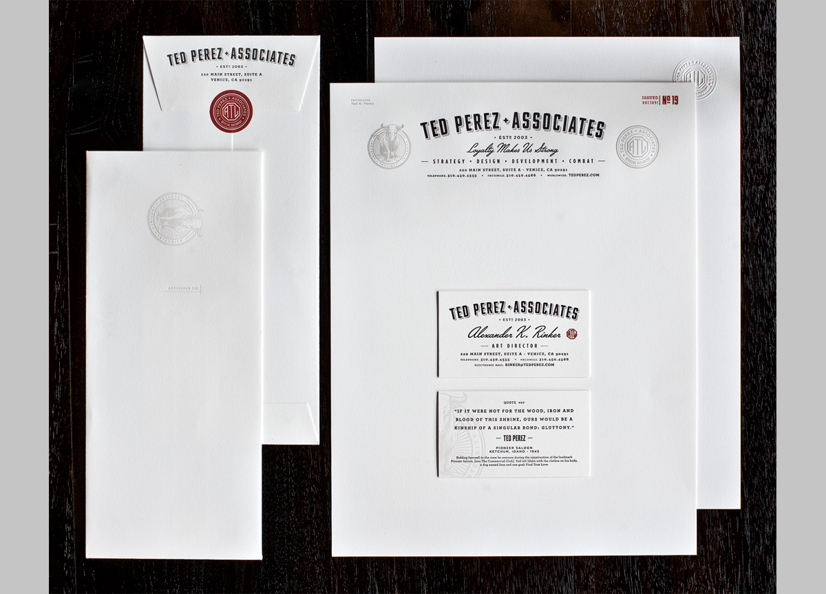
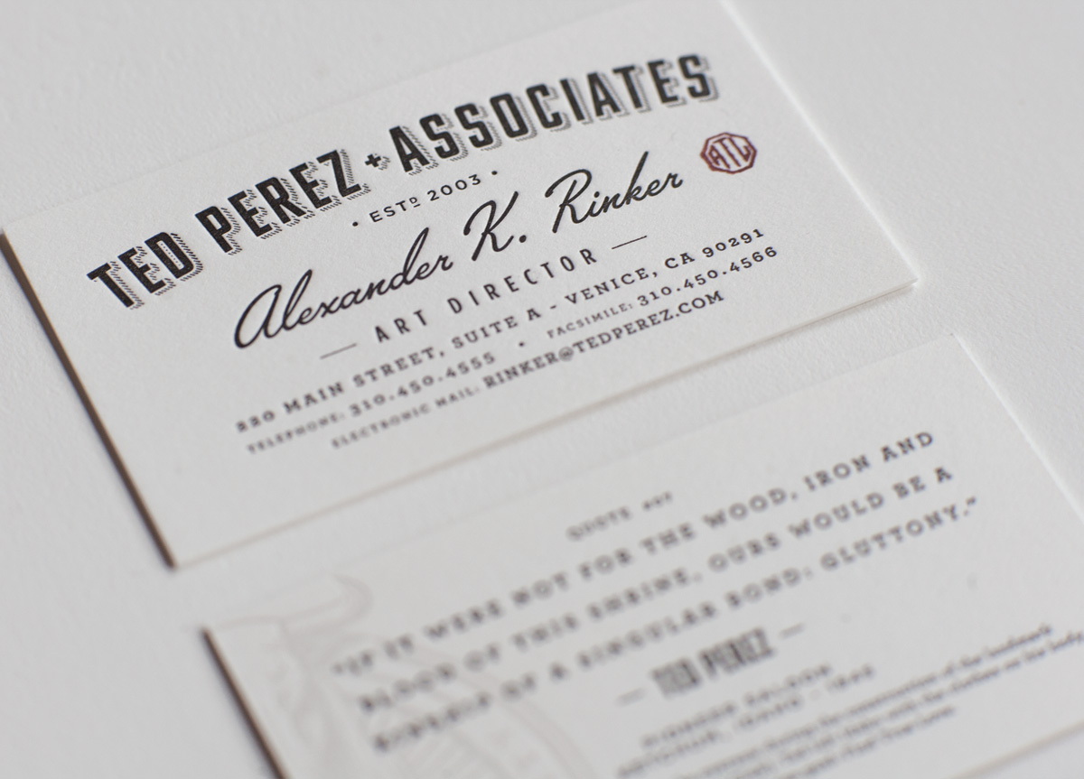
Carrying over from the logo…The challenge was to create a system that needed to feel as timeless and historic as the man (Ted Perez) while still feeling relevant today. The nature of the company business was not important. It needed to feel as though it was intended for a law firm, government agency, or any well respected business. Key aspects of Ted Perez’s history and significance were also included in the identity system in the form of quotes and icons. In addition to the design, the quality of the stock and printing process were just as pertinent.
APPROACH
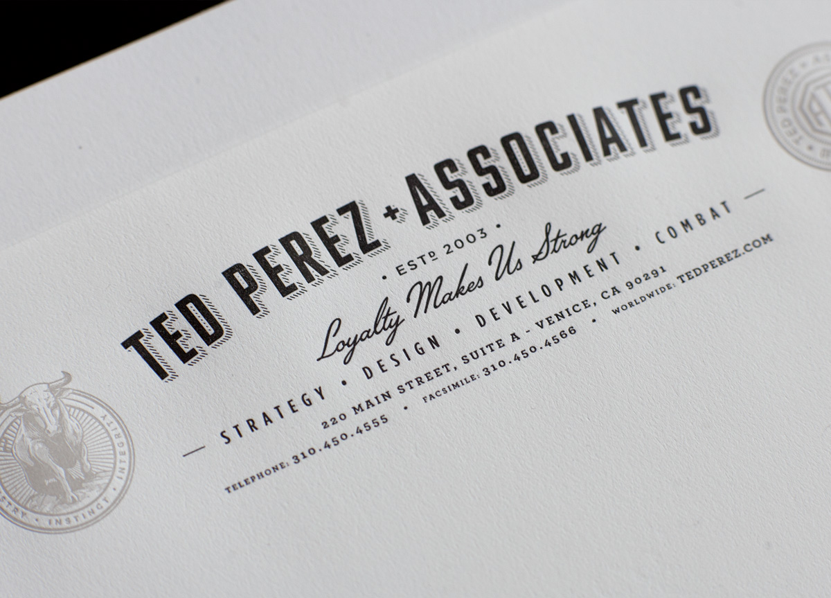
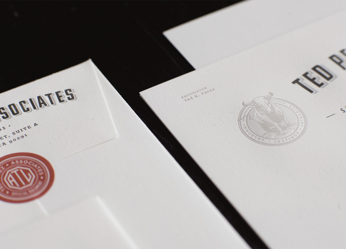
In researching vintage letterheads, cards, seals, marks, identity systems etc., the thing that stood out were these glorious mastheads and “official seal” elements that had a wonderful consistency throughout. These were used to define our masthead with the addition of stamps, embossers, stickers and seals as secondary enhancements. Complementing the primary “Bull” seal is the “ATL” mark. Short for “Attention to detail,” this mark has found its way into all second tier materials. Both the masthead and seals were letterpressed and secondary elements were applied via stamp, sticker and embosser for authenticity.
