CLIENT
A design and digital innovation college in London, UK.
BRIEF
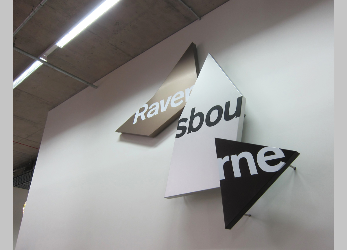
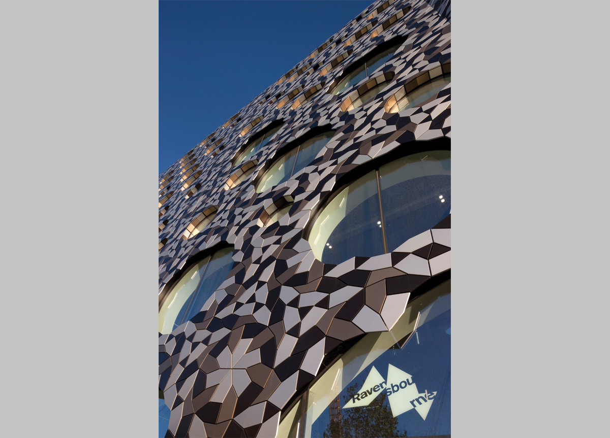
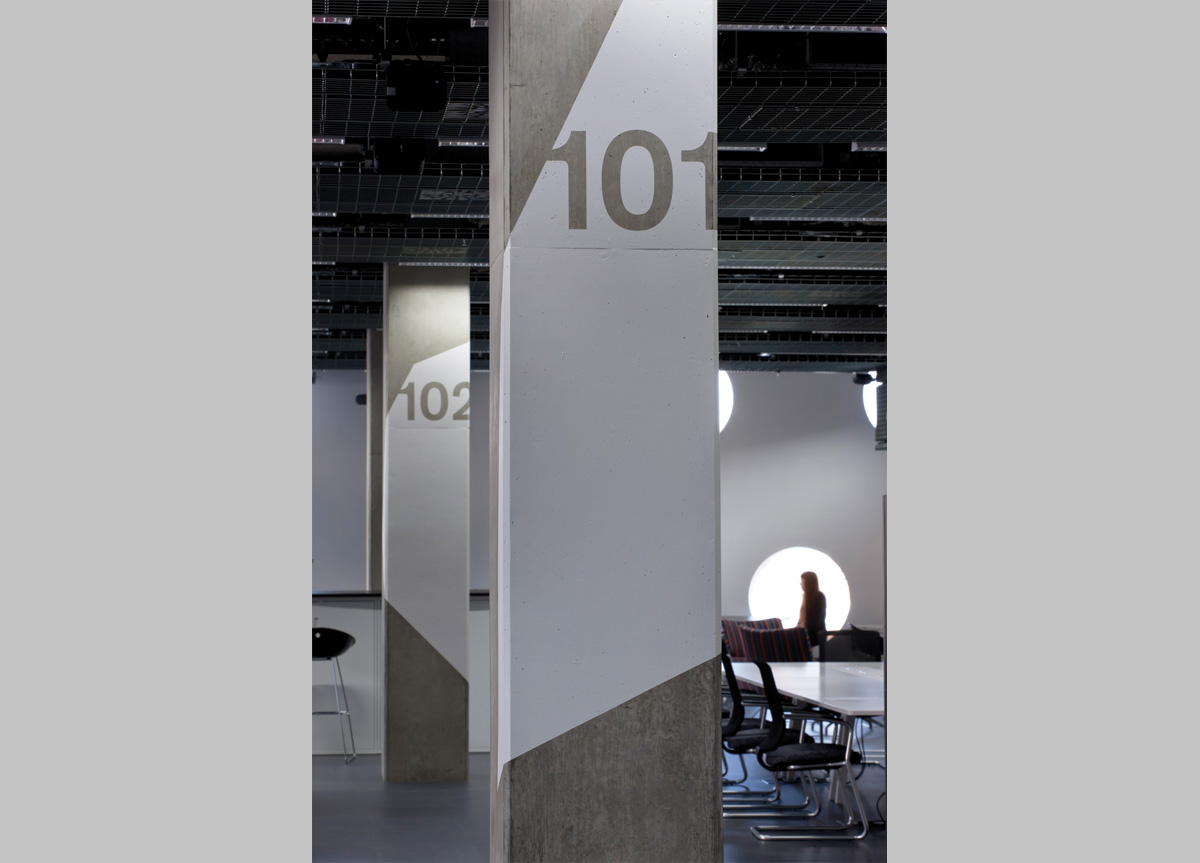
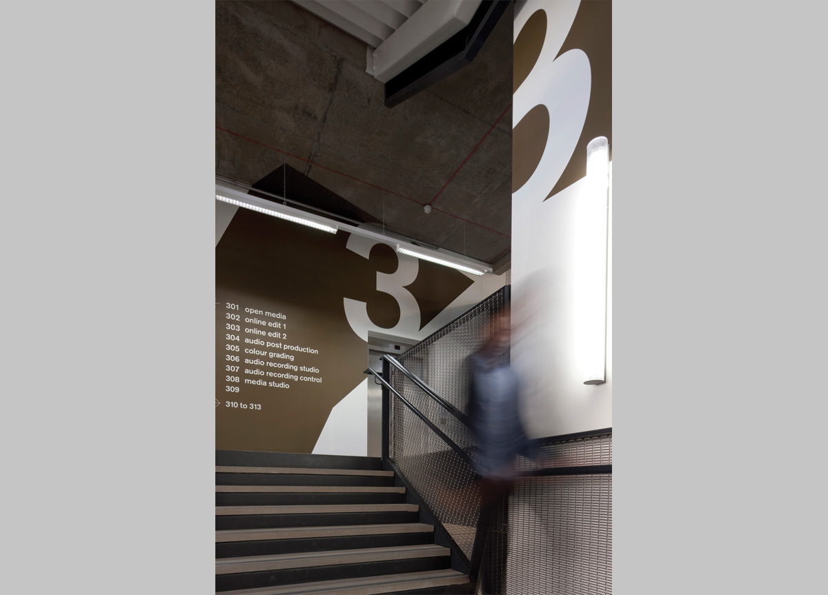
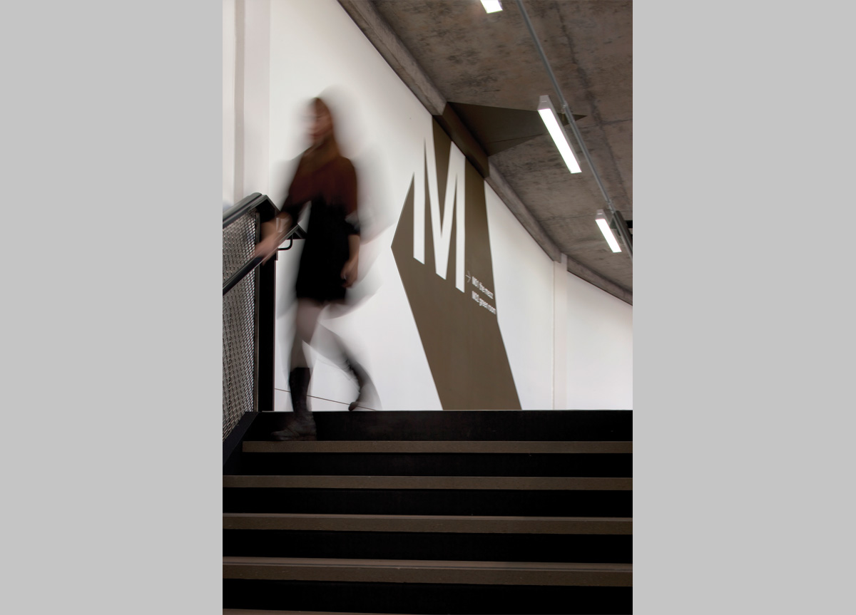
This famous design college has recently undertaken one of the biggest transformations of an educational institution, ever. From a sleepy, low-rise brick campus in suburban London, they planned a move right next to the Millenium Dome, into a purpose-built open-plan architectural wonder built on ten floors and covered on its exterior by 30,000 meticulously interlinked tiles. Our task, with both words and pictures, was to find a way to excite the staff about the move, whilst carefully nudging their positioning into the future and reflecting all of this with an identity change.
APPROACH
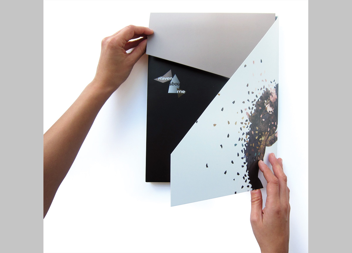
For a while we tried to ignore what was in front of our noses, but fairly soon that seemed a little pointless: Following the tessellating patterns of famed mathematical physicist Roger Penrose, the visual statement of the tiles was too powerful to ignore. We discovered that by slightly rotating the tiles, we could create a sense of movement and restlessness that seemed to fit well with the college’s future ambitions. Every library, every computer shot seemed the same, especially after you’ve looked through a handful of prospectuses. So we developed a way to take the tiling pattern and incorporate it into student photographs that we commissioned. Almost overnight, the college gained an identity approach to logos, typography and images that could glue together elements such as folders, reports, and prospectuses, and has been applied extensively online.
