CLIENT
An international competition that recognizes new cutting-edge products that challenge conventional ideas, solve problems, and improve life through the generation and harnessing of light-based technologies.
BRIEF
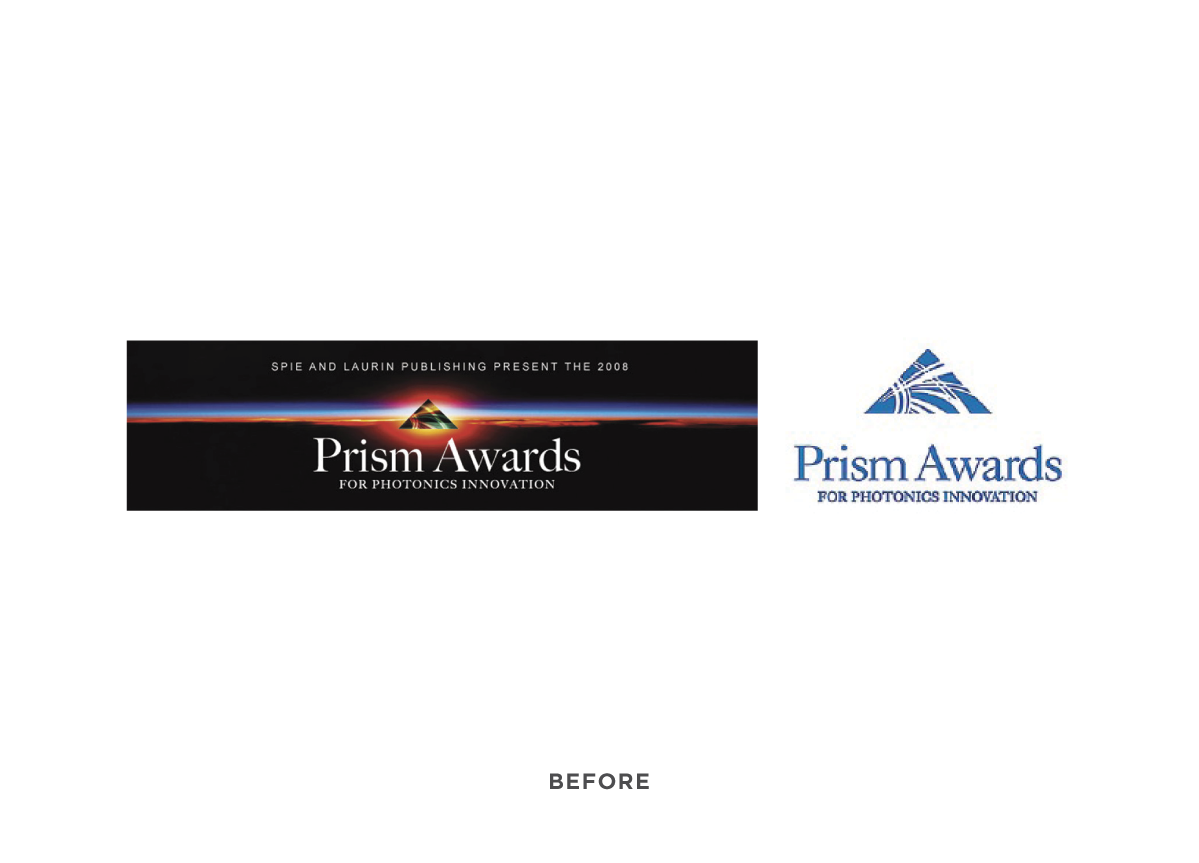
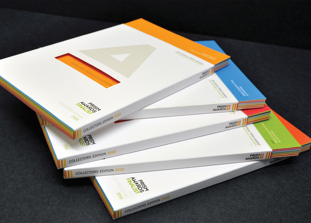
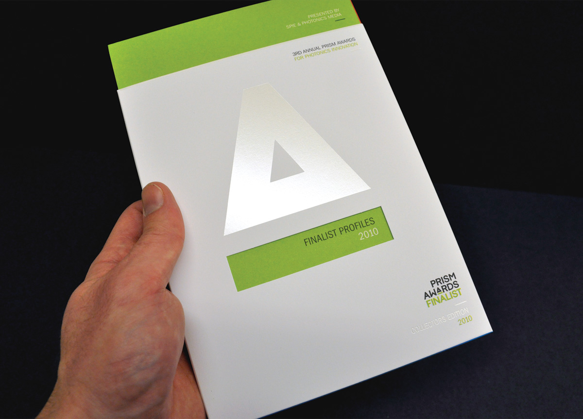
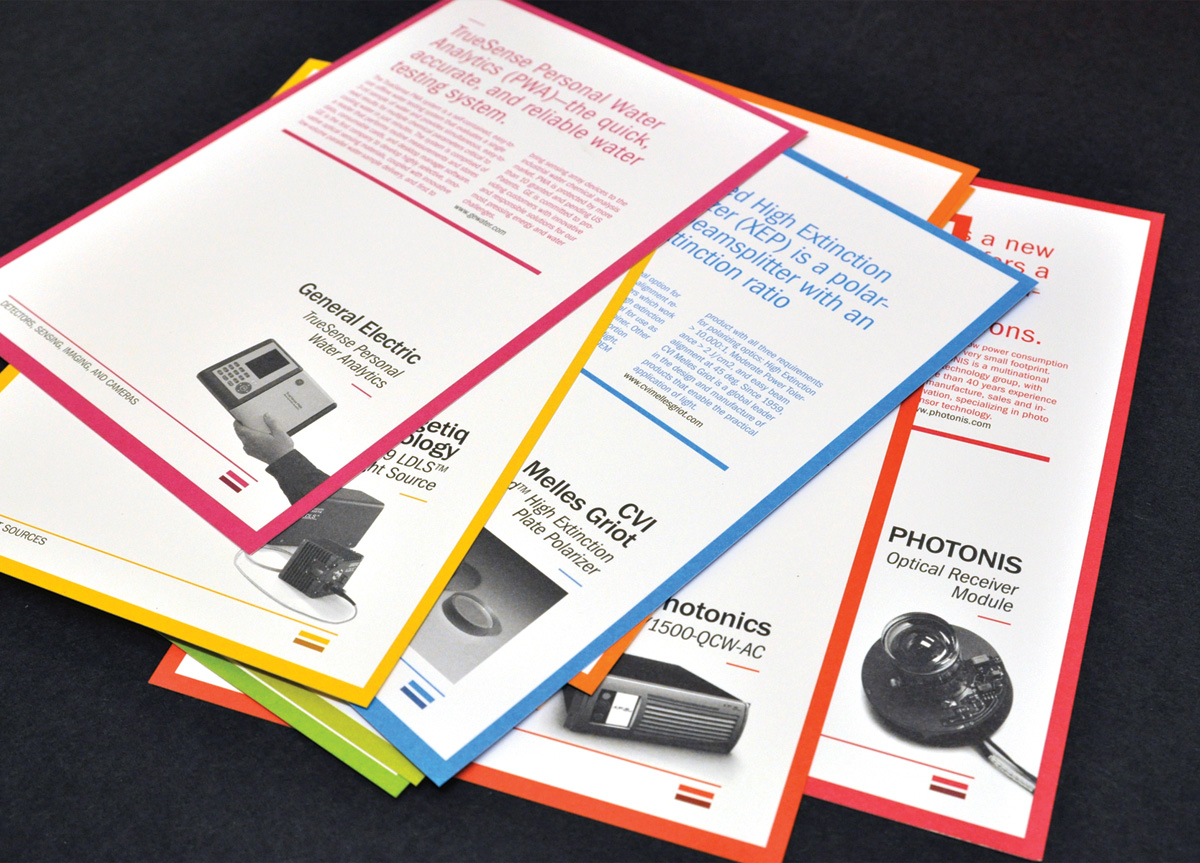
Prism Award stakeholders described the original logo as outdated, limited in application, and cumbersome in usage. They recognized a need for the logo and its representation to be redesigned in order to better position the Prism Awards as innovative, up to date, and appealing—a prestigious and sought-after award. Together we identified a much-needed identity overhaul that started with the logo and evolved into a comprehensive identity program including tangible awards, print, promotions, multimedia, and environmental design applications. Some of the challenges were to develop a cohesive and appropriate identity across nine award categories and to create an identity that incorporates the Prism concept in a fun and classy “award-like” way, while appealing to serious science and engineering innovators.
APPROACH
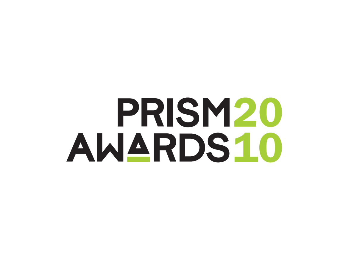
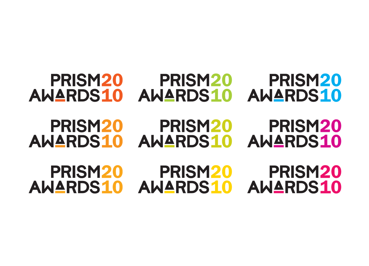
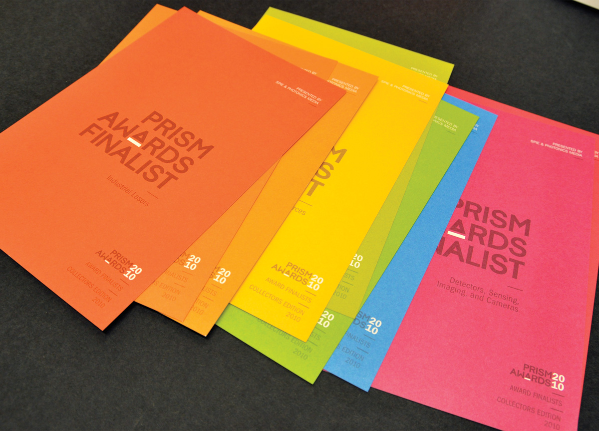
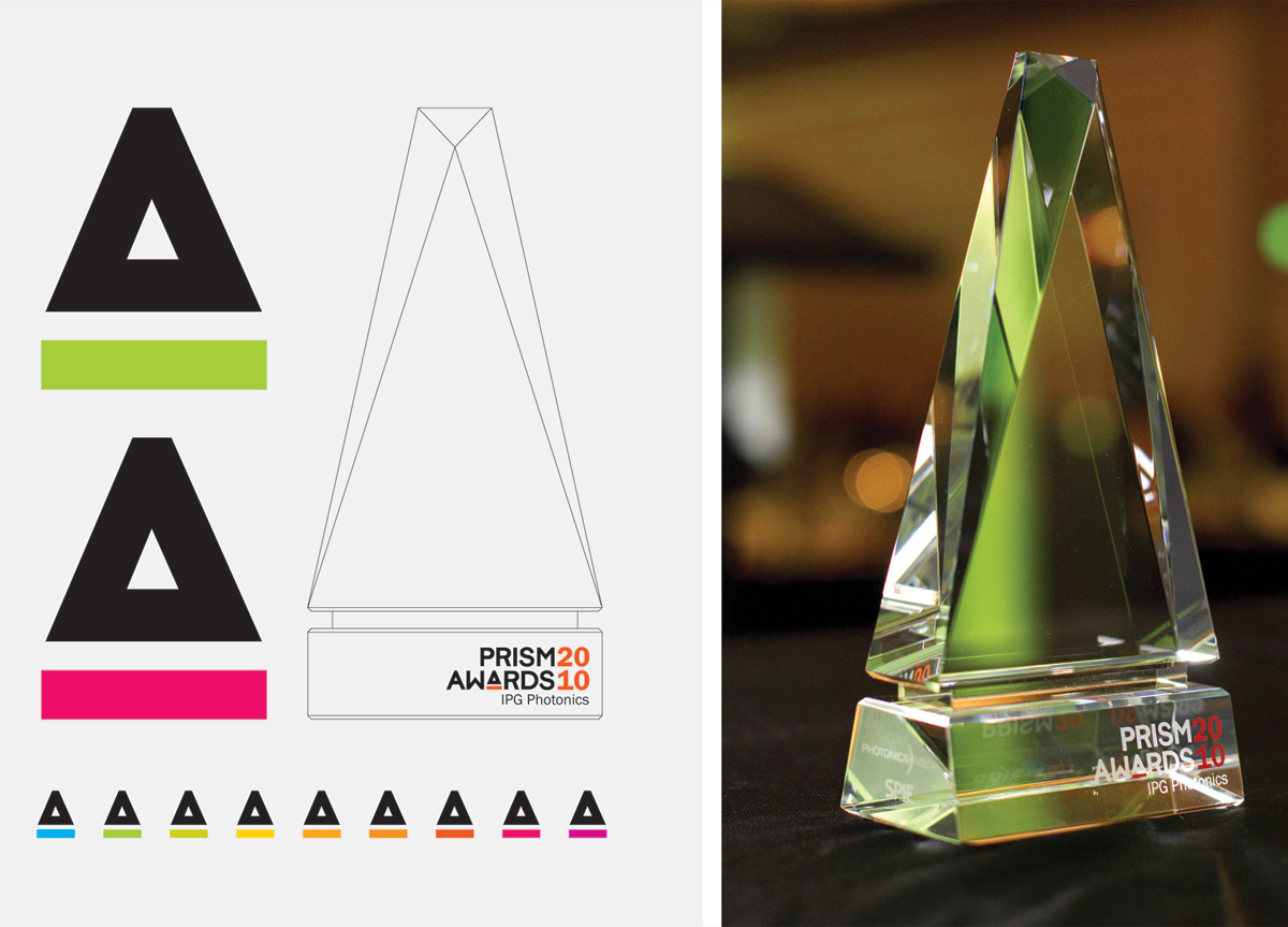
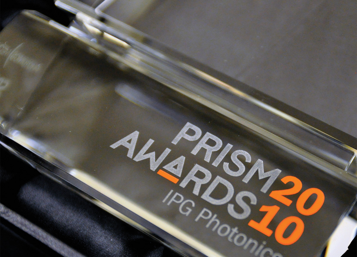
We first researched the definition of a prism: a transparent solid body, often having a triangular base, used for dispersing light into a spectrum (rainbow), or for reflecting rays of light. Using this definition of a prism as a starting point, the logo and crystal award were designed in consideration of one another. The crystal award design, on a basic level, can itself be described as a prism and is representative of the logo mark. The very simple logo mark supports four clear ideas at a glance: symbolic iconography of a prism, a simplified version of the crystal award, as the letter “A” in AWARDS, and the color bar appropriately serves as a flexible rainbow spectrum to differentiate each of the nine categories. These concepts were executed throughout the resulting identity applications.
