CLIENT
(a.k.a. Nick Bertke) is the remix artist and YouTube sensation who composes music entirely from sounds of Disney films. From this, he has attracted contract work with Disney, Pixar and many established brands. He lives in Perth, Australia. His audiences are not only those that enjoy electronic music but also fans of Disney.
BRIEF
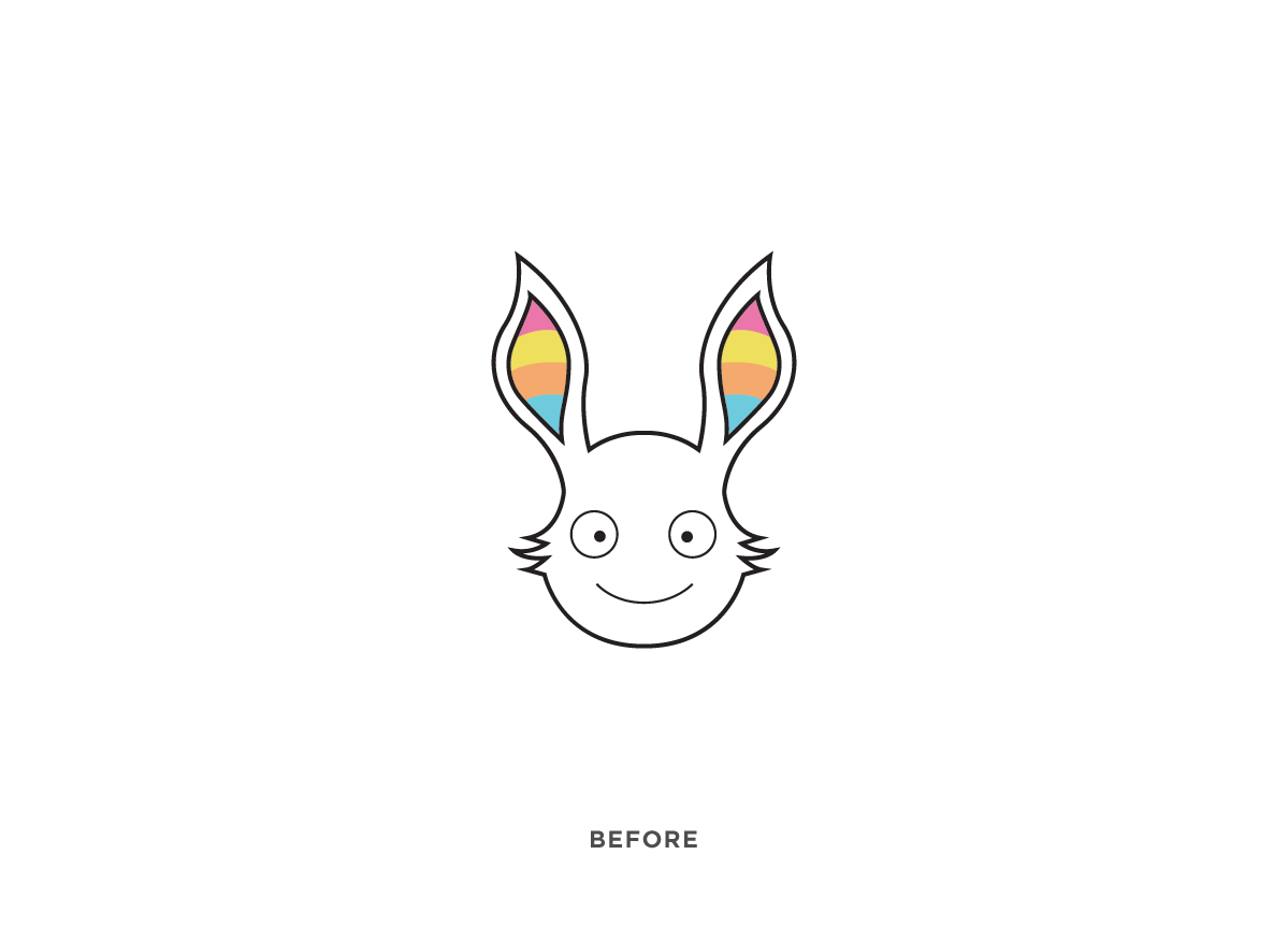
Pogo designed his original logo himself and now that he was attracting work from national clients he decided he needed a more professional one. More importantly, his original logo was lacking any visual connection to Disney; the element that had made his music so popular. The challenge was to take his already established logo, a rabbit, and evolve it into something that was more professional, conceptual and appropriate.
APPROACH
My initial research was spent looking through imagery of electronica, corporate design, pop culture, and Disney films to get a good idea of what would not only attract Pogo more clients but also satisfy his growing audience. The concept that I arrived at was to evolve the bunny head into the “Space Bunny” icon which visually doubles as Mickey Mouse’s eyes and nose.
Tymn’s passion and personable communications made for an experience that was anything but cold and corporate. The logo represents the flamboyancy and simplicity of my music, and the fact that it mimics the face of Mickey Mouse was sheer brilliance. Tymn’s work is at the forefront of today’s trendiest designs, and I thoroughly look forward to working with him again. — Pogo
Judge’s Comment
I love the simplicity of the mark and its evolution happily reinforces Pogo’s primary product: dynamic remixed Disney music. Once a (horribly drawn) bunny, it has evolved to a simple graphic bunny. But this is no regular bunny. If you look again, Pogo takes on the defining facial characteristics of a famous Disney mouse. The ears become eyes and the head becomes a nose. I find this magical, as well as serendipitous. It’s like the space between the “E” and the “x” in FedEx screaming to be recognized as an arrow. Anyway, I’m also intrigued that Pogo typically brands only with this logo. No name. (No limitations?) The icon makes Pogo creations easily recognized and visually expresses this new and otherworldly genre of music that is absolutely fresh and inspiring. — Margaret Youngblood


