CATEGORY

Comprehensive Identity Programs

LEVEL

Professional

RANK

Judges Pick

DESIGN CREDITS

design firm

johnson banks


TAGS

, , , , , , ,


LINKS

johnsonbanks.co.uk
pcah.us

Pew Center for Arts & Heritage by johnson banks


CLIENT

A collection of art and culture initiatives, projects, and grant-giving bodies in Philadelphia, PA.


BRIEF

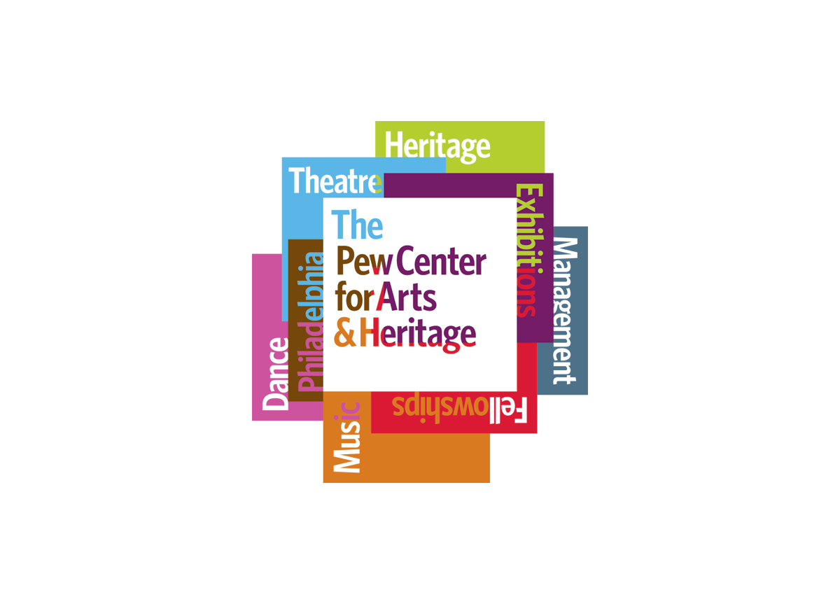
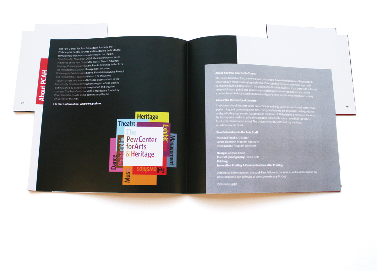
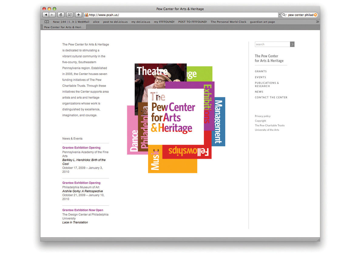
The Pew Center wanted the benefits of one unified identity but still wanted to somehow recognize its work in dance, exhibitions, fellowships, theatre, management, heritage and music. And to make it trickier, they wanted to let the initiatives still use their current names — what one describes as a challenging brief.


APPROACH

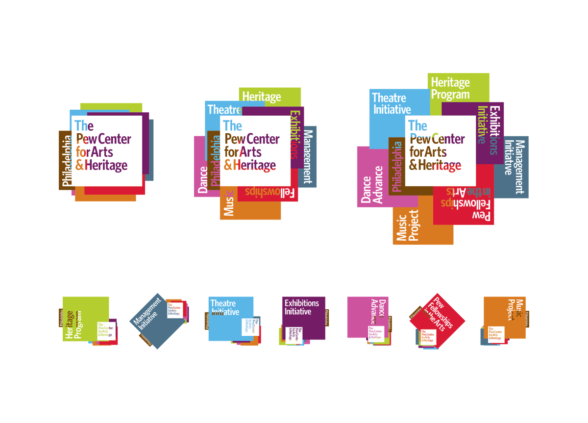
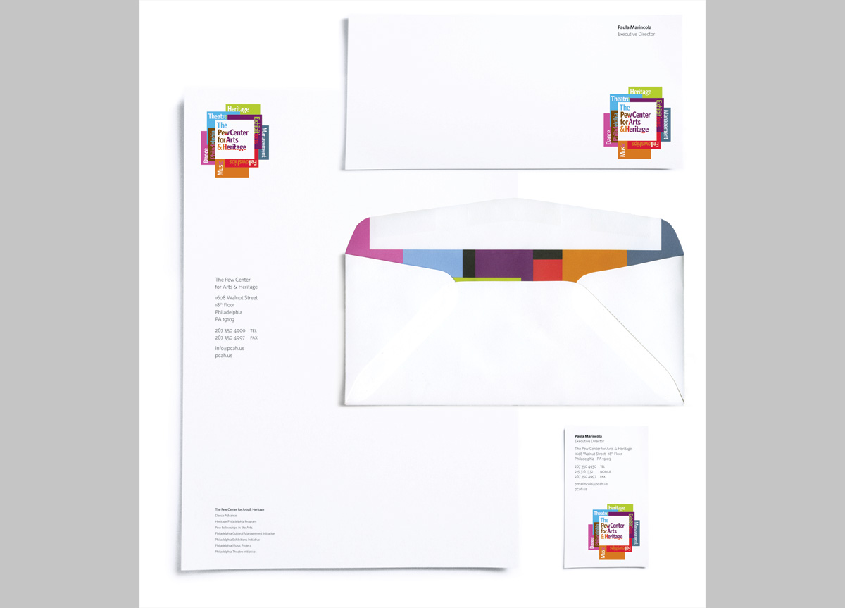
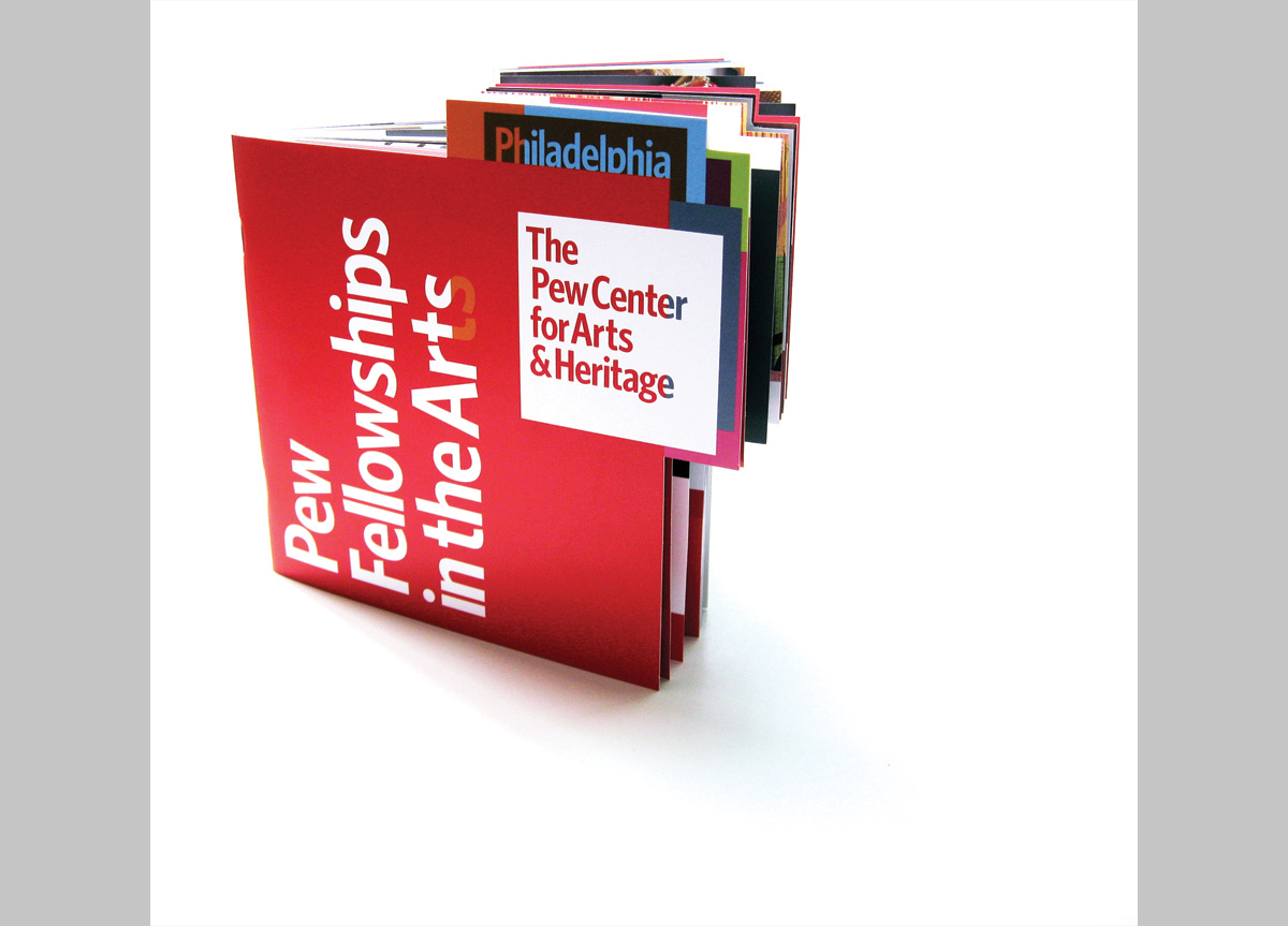
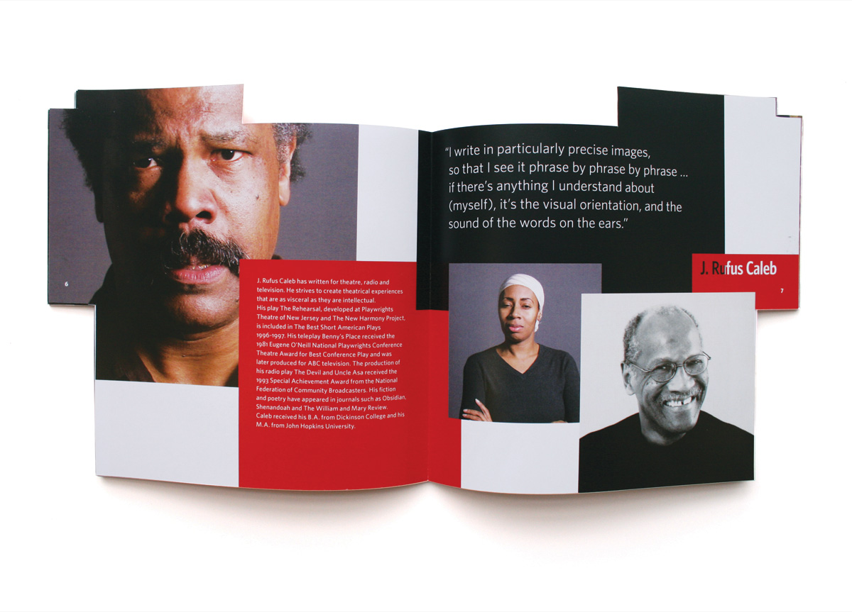
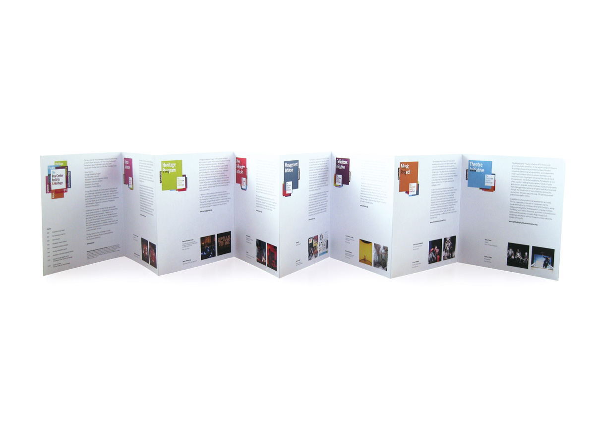
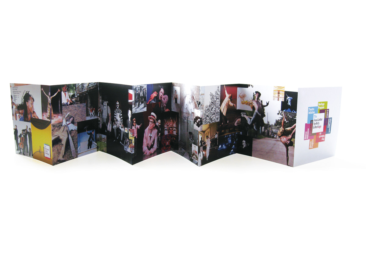
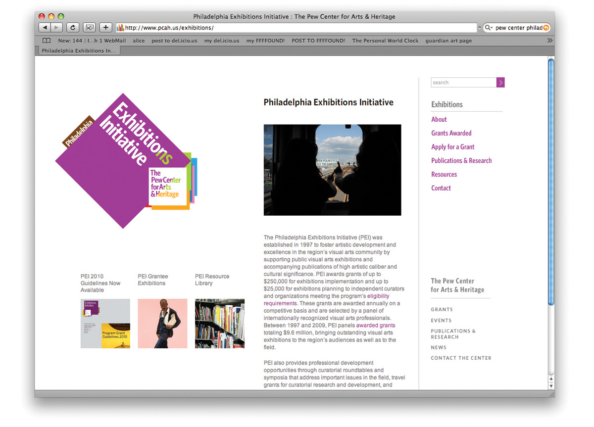
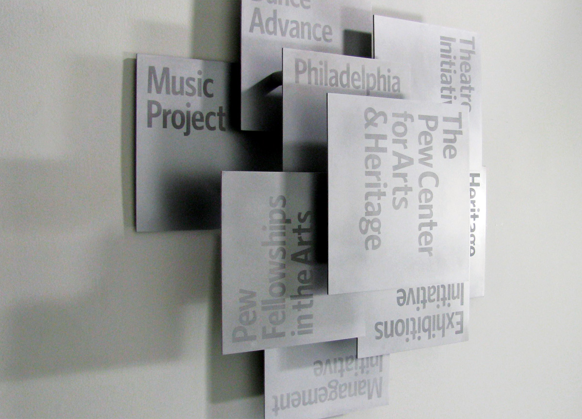
They had agreed to unite under one name, the Pew Center for Arts & Heritage, and wanted to define a clear “parent/child” relationship but somehow keep a “child/parent” relationship as well. We soon began to realize that any of the previous identity “models” were redundant and we needed to think of a new way to express this, and we started to think of the centre and its constituent parts a little like “cards” that we could shuffle and reorganize. The next step was building a uniquely fluid identity system that allows flexibility in the core mark (where you see progressively more of the initiatives) and then completely inverted logos for the divisions. For initiatives such as the Pew Fellowships we were able to utilize the uniquely modular shapes of the logos and reflect them in these designs for brochures and invites. Since the project’s launch at the turn of 2009 – 10, we’ve been applying the scheme out across stationery, animations, websites, signage, and a whole array of printed materials, including 3D metal signs.
Given our brief to include seven lengthy names plus the name of the new entity with a place name thrown in and to make it all look coherent and, more important, good, this project was not for the faint-of-heart designer. We’re delighted to have ended up with a lively, flexible system that allows us to foreground a single program or reveal the entire breadth of what we do. Ours is a memorable brand that evinces a high level of strategic thinking with dynamic design. — Laura Silverman, associate director for administration of Pew Center for Arts & Heritage

Judge’s Comment
The Pew Center identity seems like it should be complicated and hard to read. It’s not. It’s actually immediately legible, conceptually correct, and incredibly dynamic. It’s a mark that’s inextricable from its system. The system moves seamlessly from primary logo to sub-brand to messaging and is surprising in application online, in signage and in print. Great design is baked directly in. My regards to the client for approving the crucial cut-through letters. — Jennifer Kinon

Browse entries