CLIENT
Olmsted Palmer is a woman-owned interior design firm located in Raleigh, NC. They specialize in higher-end residential projects.
BRIEF
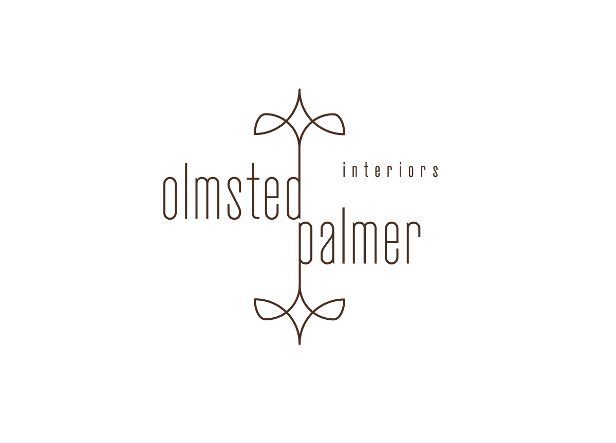
A clean, sophisticated logo that wasn’t too frilly or feminine.
APPROACH
I began this project thinking in terms of the client’s approach to design: uncluttered, sophisticated, but still approachable. I sought to evoke the forms of lighting fixtures, fabric/wallpaper patterns, and an overall sense of space.
We recently started an interior design firm offering design services for residential homes. As part of our brand’s foundation we wanted a clean and simple logo that represented interior design and was attractive to our core audience. Michael really understood what we were looking for and delivered an impressive logo that can either stand on its own or integrate with other design projects (website, business card, etc.). We love this logo and are excited to include it in the plans for our brand. — Catharine Palmer, partner of Olmsted Palmer


