CATEGORY

Guideline Documents

LEVEL

Student

RANK

Best of Category

DESIGN CREDITS

Designer

Siow Werm Goh

Instructor

Hunter Wimmer

Editor

Stephen Abney


TAGS

,


LINKS

Ocean Pacific (O.P.) by Siow Werm Goh


CLIENT

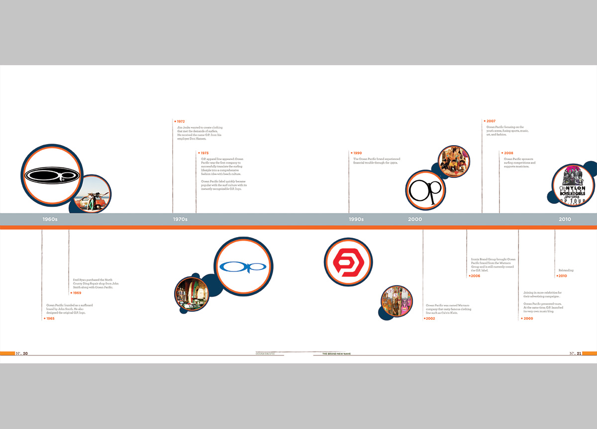
A private company that produces surf-related products such as apparel, swimwear, and accessories. O.P. was the first company to successfully translate the surfing lifestyle into a comprehensive fashion idea by focusing on the youth scene, sports, music, art, and fashion with beach culture.


BRIEF

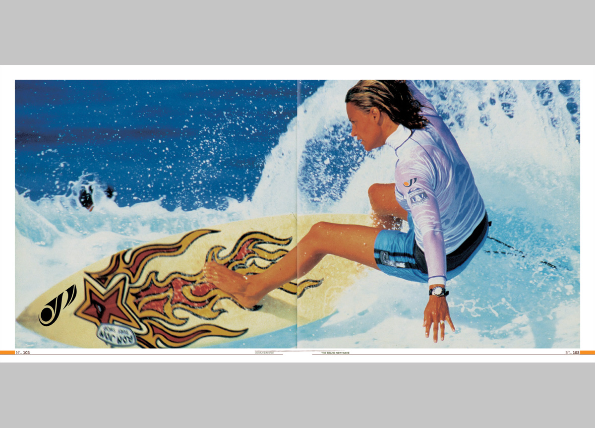
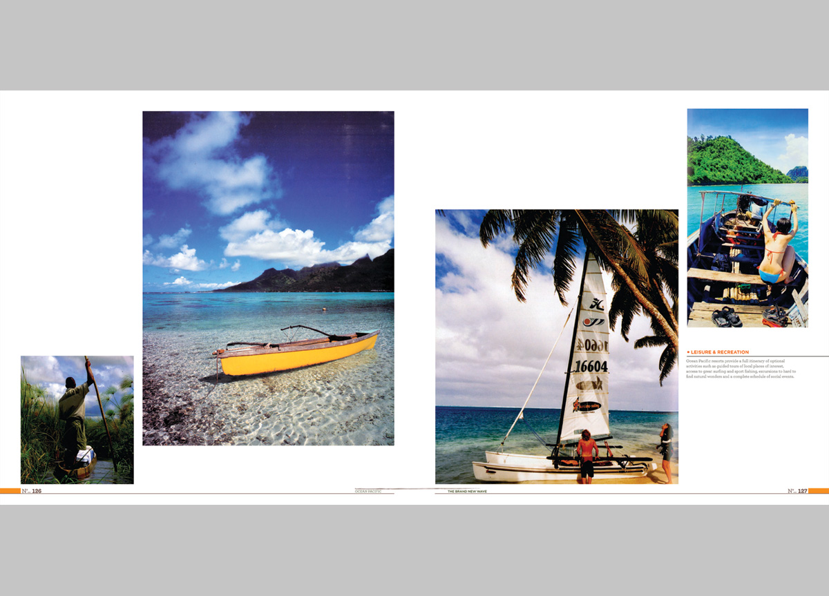
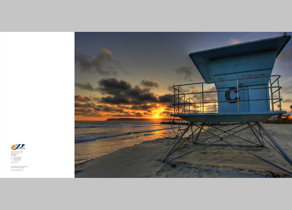
To revitalize an ailing brand with a new identity and potential extensions. The goal of this course is to visually and verbally understand identity and branding as it relates to clients’ organizational structures. Students investigate what defines the personality, identity, and substance of these businesses through the creation and execution of brand and identity programs. We were asked to create a brand manual that shows the soul of the brand, potential audiences, possible brand extensions for the brand to expand and, ultimately, regain its popularity.


APPROACH

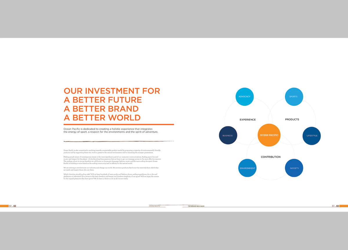
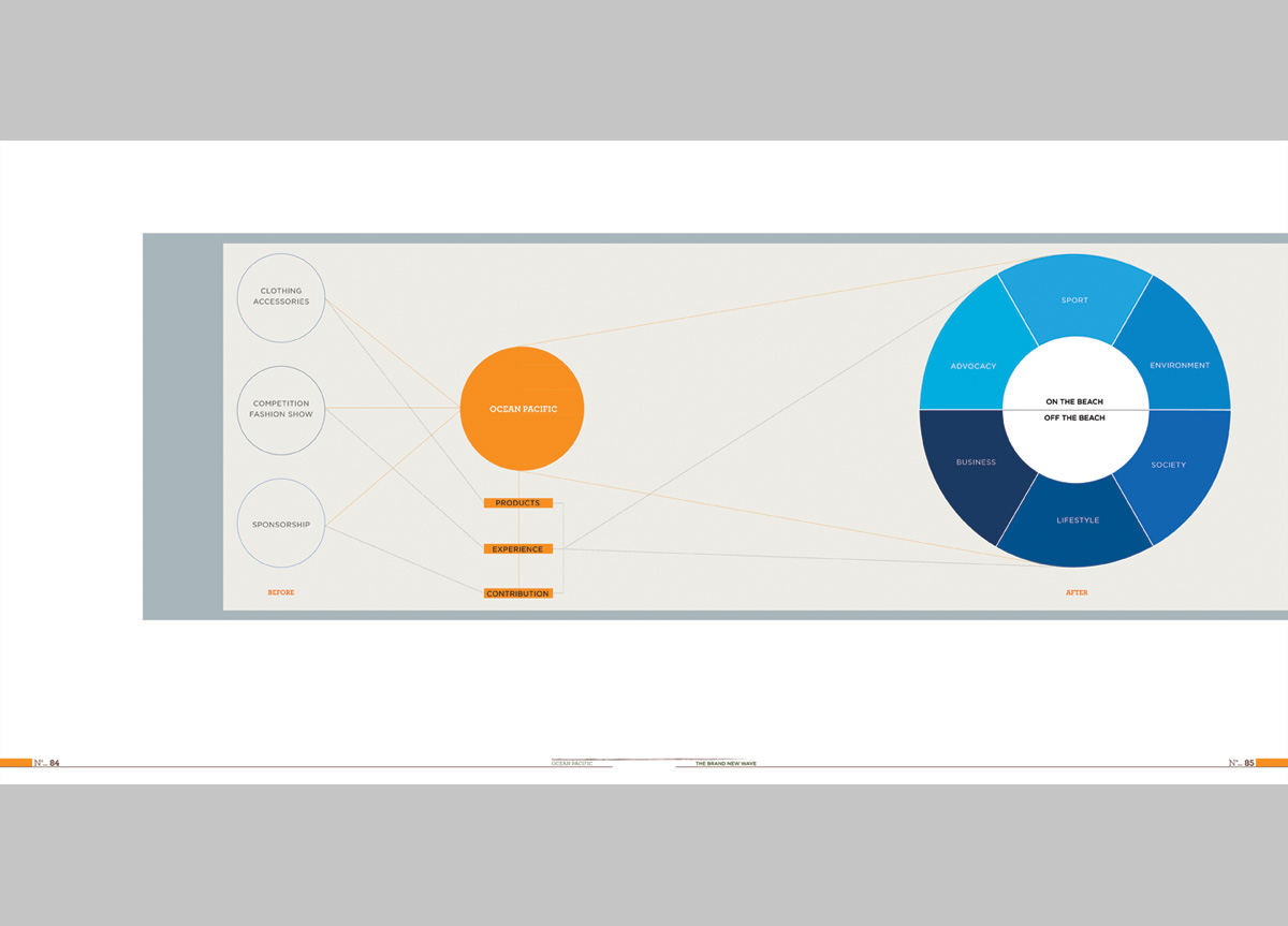
The Ocean Pacific brand will remain a fun, fashionable, and action-loving brand, but it has evolved another dimension to its identity. The new direction will not just focus on apparel and products but have a social and environmental promise to its customers. The new O.P. is giving back to society and the environment with experiences that focus on environmentally friendly products, sustainable resort and tourism, sports, nature, and marine education as well as organization to protect the surfers and the ocean. It will also offer services like fundraising, beach cleanups, rescue teams, and volunteerism.
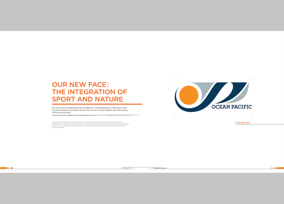
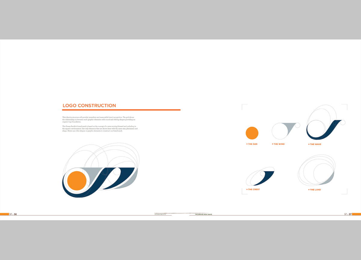
The initial drafts of the new Ocean Pacific mark were a reaffirmation for Werm that great ideas often start as simple sketches. After thinking and planning for weeks, her first round of comps yielded a nugget — a mash-up of swooping, organic shapes that felt like the wind, surf, and sun all wrapped up in one — and one that everyone kept coming back to even after rounds and rounds of divergent exploration… one of those rare “the first idea really was the best one” moments. However, not stopping there, she took that same simple mark and must have done a hundred variations on curvature, proportion, and color to get it “just right.” She continued on to create a very solid set of standards and brand expressions for O.P., which would make any CEO and surf-rat happy. — Hunter Wimmer, instructor at Academy of Art University

Judge’s Comments
In spite of the logo the guidelines are very professional and well laid out with a lot of research and content. — Steff Geissbuhler

Completely convincing. Everything from page numbering to layout to branded content is well developed. — Jennifer Kinon

Browse entries