CLIENT
A boutique consulting practice that specializes in business continuity, crisis, emergency and incident management. They deal with Australia’s largest financial institutions along with small to mid-sized businesses.
BRIEF
A mark that needed to exude power and sophistication to speak to big business. Conversely, the mark also needed to feel peaceful and approachable, to instill a sense of ease and security in the midst of business crises. Overall the style of the logotype needed to position Ocean as a thoughtful, elegant and considered business with a unique offer.
APPROACH
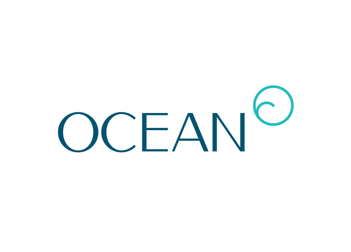
The circular symbol was designed to represent the ocean as both a raging force and healing power. The round shape is derived from the “O” and also provides a sense of calm. The wave shape within represents a destructive breaker, yet is illustrated in an elegant style that diffuses the sense of danger. The resulting trademark is a clean and attractive combination of these parts. The symbol is hung on the right of the logotype to avoid a collision between the two circular shapes. The trademark feels strong and traditional, while maintaining a sense of individuality that can be rare within this business sector.


