CLIENT
An art museum in Doha, Qatar, focusing on Arab modern and contemporary art.
BRIEF
When the Qatar Museums Authority (QMA) and the Qatar Foundation (QF) partnered to adopt His Excellency Sheikh Hassan bin Mohammed bin Ali Al Thani’s private collection of more than 6,000 pieces of modern and contemporary Arab art, their objective was to build an institution that would instigate an Arab art movement in the world. To become the leading voice on Arab modern and contemporary art in the region and beyond, facilitating interest and dialogue about Arab art between artists, scholars, and the general public.
APPROACH
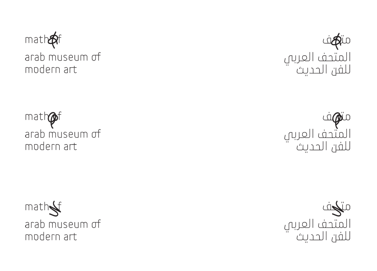
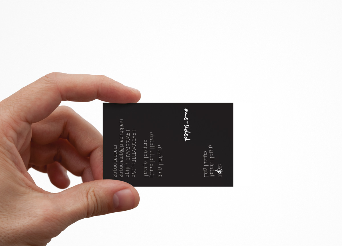
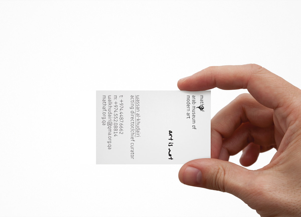
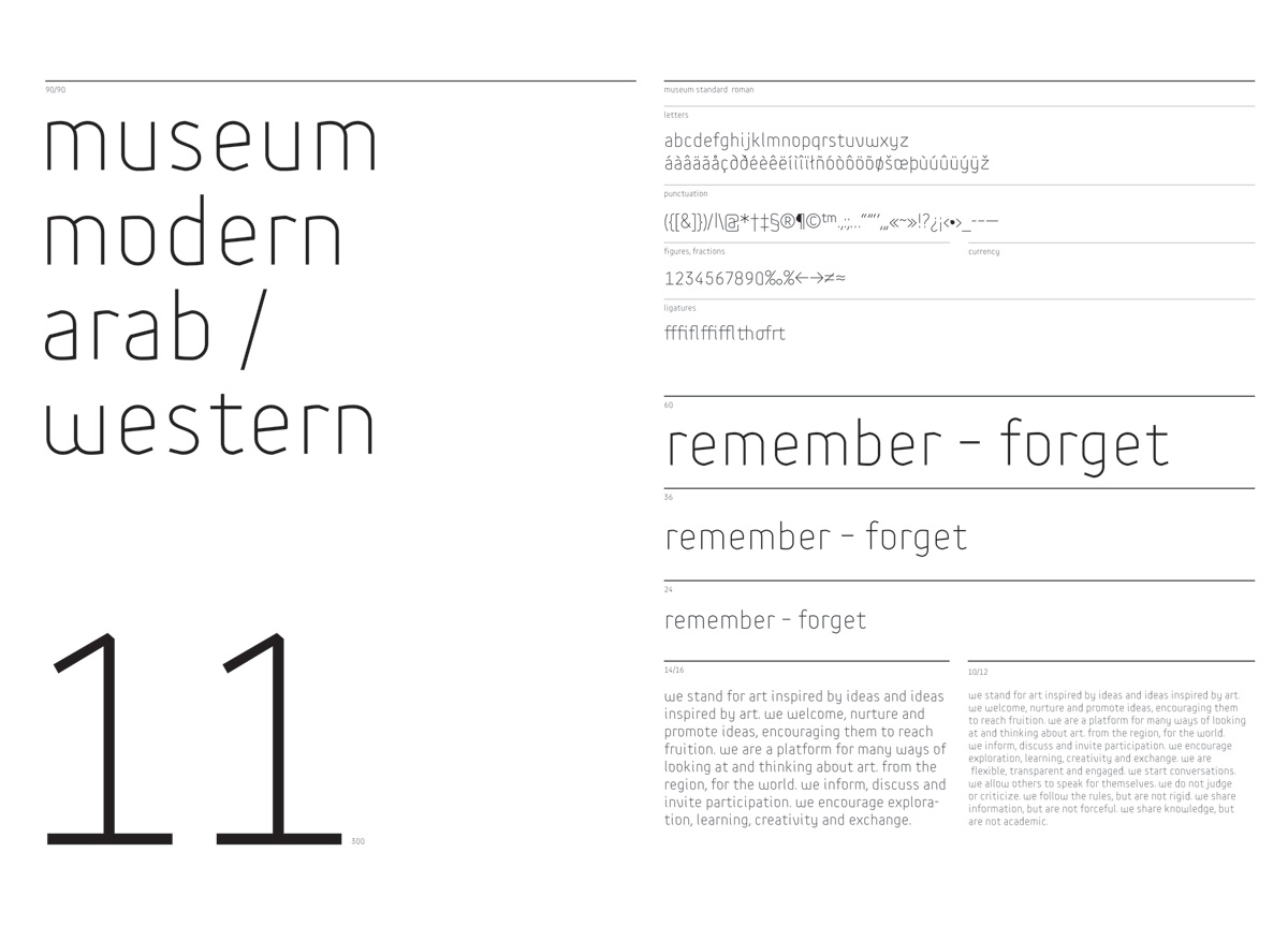
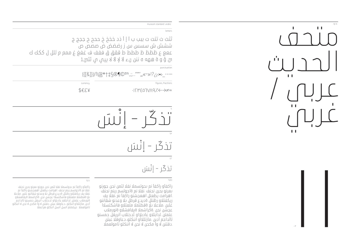
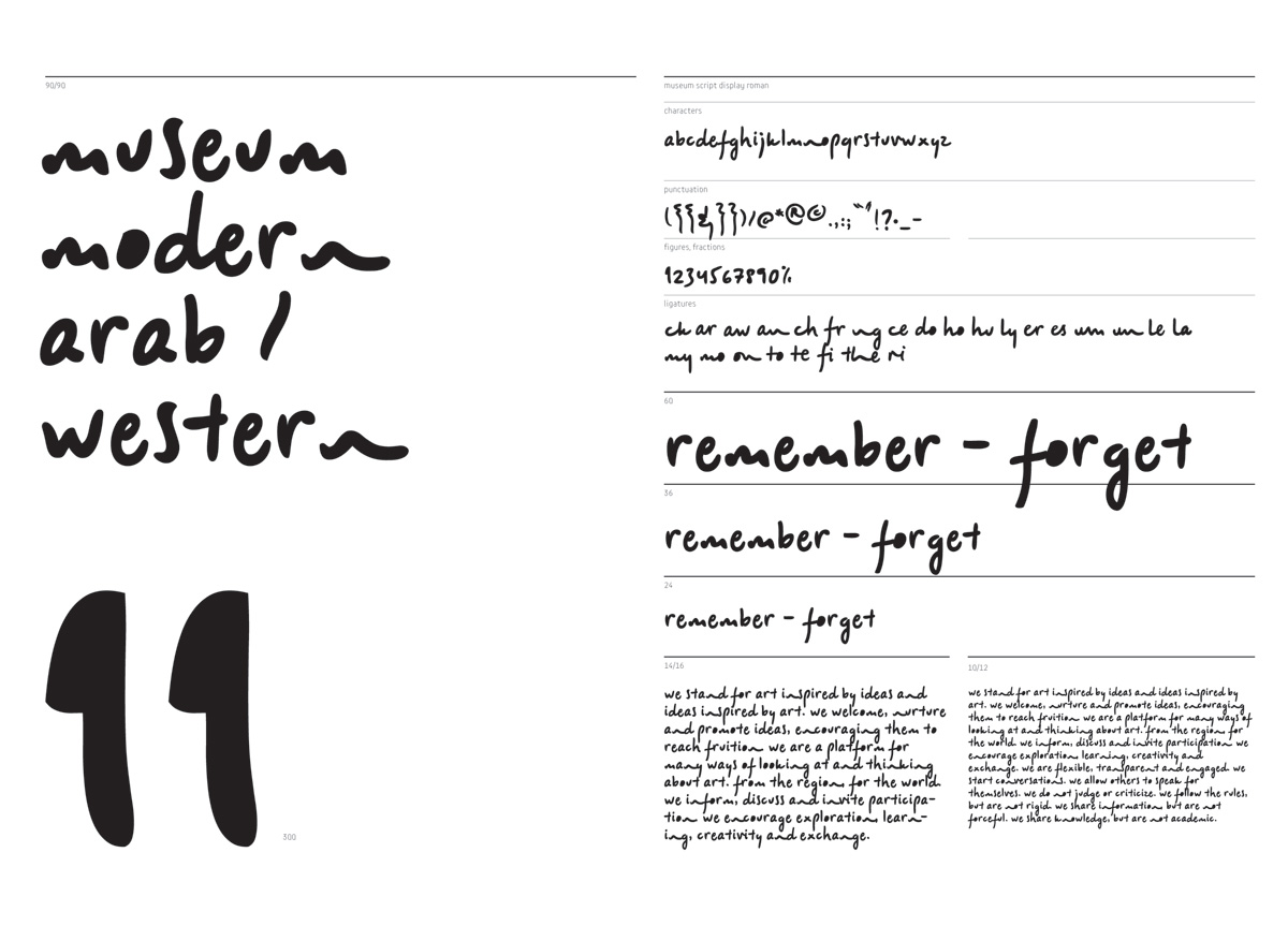
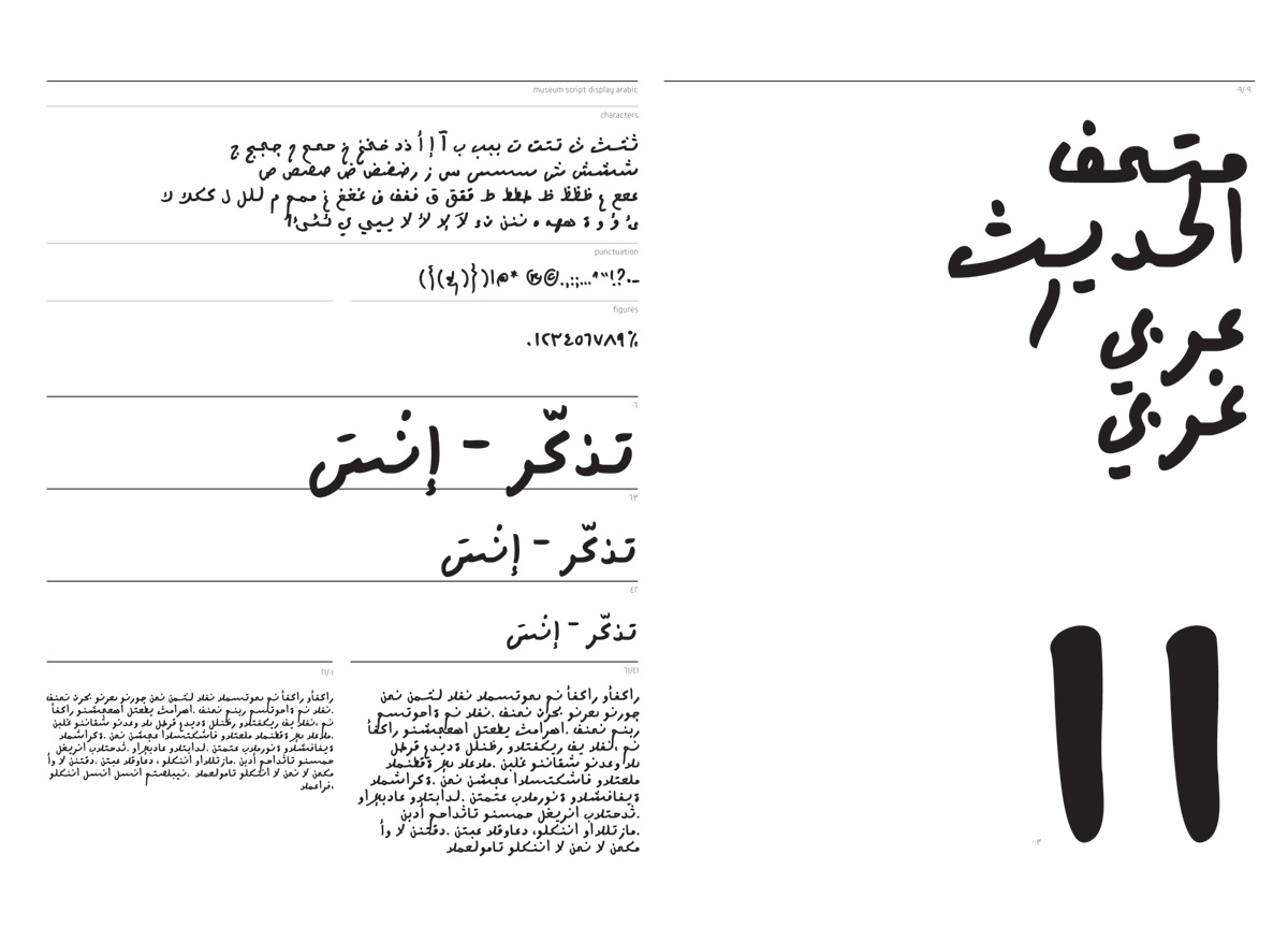
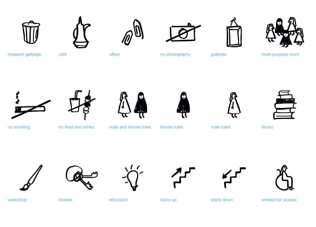
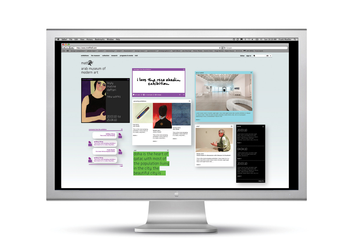
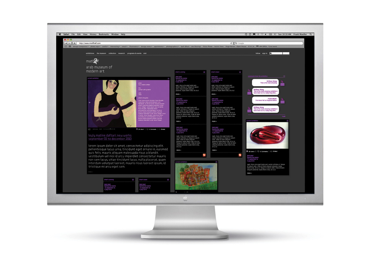
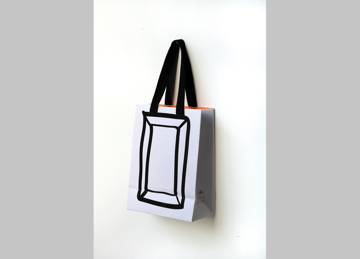
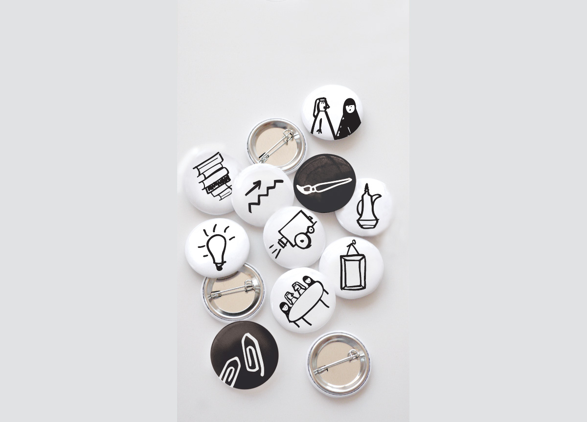
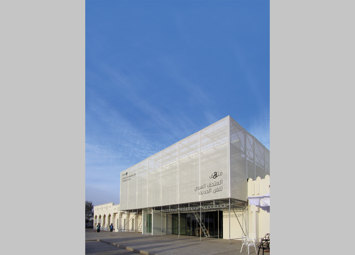
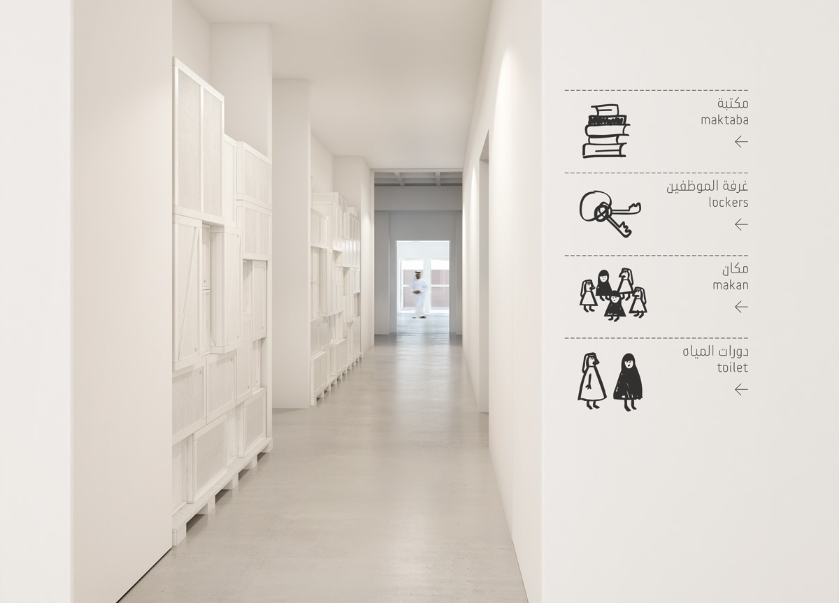
Based on insights from diving into the growing world of arts in the Arab world and meeting with artists, scholars, and art enthusiasts, we developed the brand idea “Ideas Welcome,” where art is inspired by ideas and ideas are inspired by art. The ambition was to create a digital museum with a physical space, where people can engage with art beyond the physical space in Doha, Qatar. We created the brand identity, the new name Mathaf (“Museum” in Arabic), and two typefaces in both Arabic and English. We designed the digital experience, including website architecture, wireframes, and layout. We worked closely with the architect to craft a holistic museum experience, from signage to the design of the napkins in the cafeteria, and produced thought-provoking items for the museum gift shop as well as a range of marketing collateral and advertising campaigns.
The Wolff Olins team immersed themselves in understanding what exactly we wanted our museum to be. They helped develop the brand idea, “Ideas Welcome” — the notion of leaving an idea and taking an idea. This led us to the development of the identity, the name of the museum, and ultimately, the visuals and the design. We love that the brand is smart and makes you think, and the fact that it sits in a strategic place between two languages. Working with Wolff Olins helped me see we should never underestimate the potential of what Mathaf can be. — Wassan Al-Khudhairi, chief curator and acting director of Mathaf
Judge’s Comments
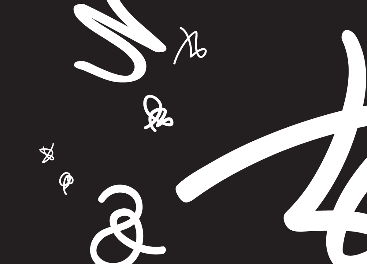
We unanimously voted for this beautiful branding program. The clean typographic identity being interrupted by the man-made squiggle is a very interesting expression of art and humanity and lends the place a typographic identity and visual language. The two custom designed typefaces are beautiful, modern, and very sophisticated. It is a truly modern and refreshing identity program, especially since the museum is in Qatar. — Steff Geissbuhler
This project is superb by its originality and modernity. By creating new symbols, it gives again force with a more traditional typography and recreates a language which becomes a code of recognition. — Claudine Félix-Janneau
Right now, wherever East meets West, sensitivities are high. Here those high sensitives were incredibly productive. Mathaf’s identity is a simple typographic solution that redresses every museum design convention and East/West cliche to make something wholly new and beautiful. The English and Arabic pairing is handled through custom lettering and an intervening piece of calligraphy. The calligraphy calls attention to crucial shared ground. And, being a museum, hints at creativity. The thin mono weight typeface is just beautifully sensitive. The ligatures are superb — like the identity, they make the connection without trying too hard. Kind of breathtaking. — Jennifer Kinon
