CLIENT
They are a group of farmers who wanted to save Singapore’s last piece of land for nature. This piece of land will be developed for agritainment purposes. They are located in the northwest region of Singapore. Their main target audience are tourists and also families living in Singapore.
BRIEF
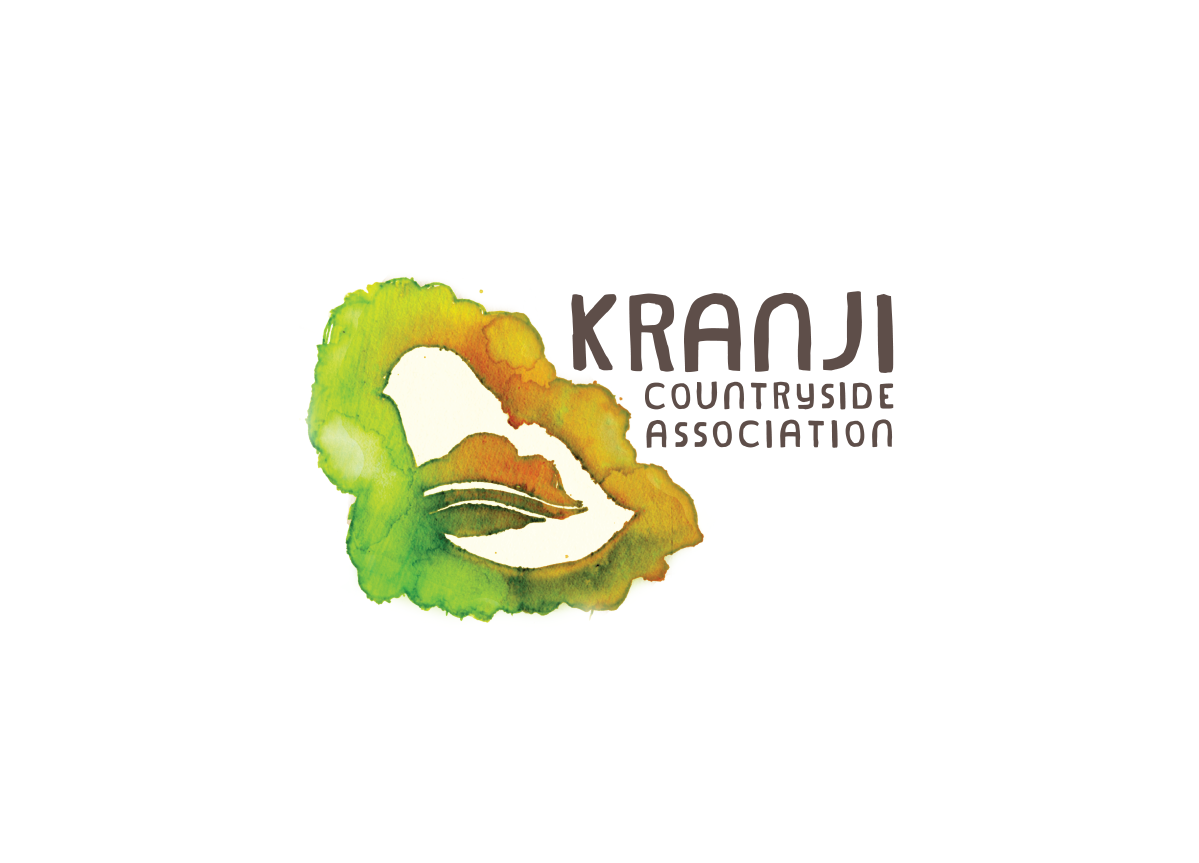
Create a logo, stationery and bus design to attract people to come to the farm. To portray the rawness of Kranji Countryside as a theme. We needed to create interesting and suitable design and colors to inform the logo and collateral materials that suit the place and the environment.
APPROACH
Our concept is to show the rawness of the place. The word “raw” means to make use of our five senses to see the place in a whole new perspective. This way it attracts people to interact with nature and gain knowledge faster and in a fun way.


