CLIENT
A young Belgian idea-focused graphic design and advertising studio. FRED + ERIC focuses on clear and powerful concepts that make brands stand out. These concepts can be a starting point for complete visual identities or advertising campaigns, depending on the client’s individual needs.
BRIEF
I recently began working as a self-employed graphic designer/art director. I wanted a unique name for my business, that was both personal and memorable to potential and existing clients. Because I want to promote myself as a graphic designer and art director with strong concepts, I wanted my name and logo to communicate exactly that.
APPROACH
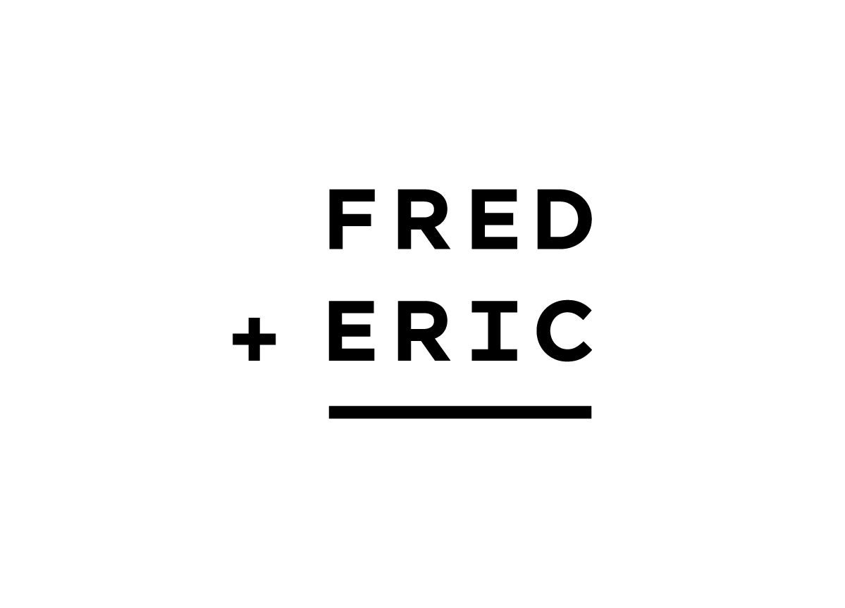
During my search for a suitable name for my business, I noticed that many names of graphic design studios and advertising agencies comprise two (or more) names. In addition, advertising agencies believe in the strength of creative teams. Instead of looking for another name to put on the door, I simply split myself up into two persons. Frederic became Fred and Eric. The logo I designed represents a sum, with the result left blank. This way, it is left to the viewer to add up both names and see my full name.


