CLIENT
A small motion graphics firm that specializes in film and broadcasting. The company is located in Central New Jersey with clients primarily in California and New York.
BRIEF
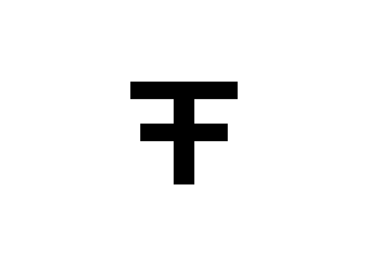
A logo that could be applied to a website, printed materials, and promotional reels. Early discussions and proposals led to the eventual abbreviation of Far From the Tree. This decision helped to resolve the challenges associated with the length of the company name by allowing the logo to exist at a fraction of its previous size.
APPROACH
The logo was inspired by the sequence and repetition of the letters within Far From the Tree. The completed treelike logo is constructed entirely from two “F”s that mirror and overlap at the stem to create two “T”s (one upper and one lower case), for a total of four letters. The final mark can be easily scaled and used in a variety of contexts.


