CLIENT
A gourmet market in downtown Brooklyn, NY, that offers a selection ranging from high-end prepared foods to everyday basics.
BRIEF
Name the market, create the entire retail experience, and develop an advertising campaign and online presence. A particular challenge was to attract two different demographic groups: a daytime business crowd working in nearby office buildings and affluent residents of incoming condos.
APPROACH
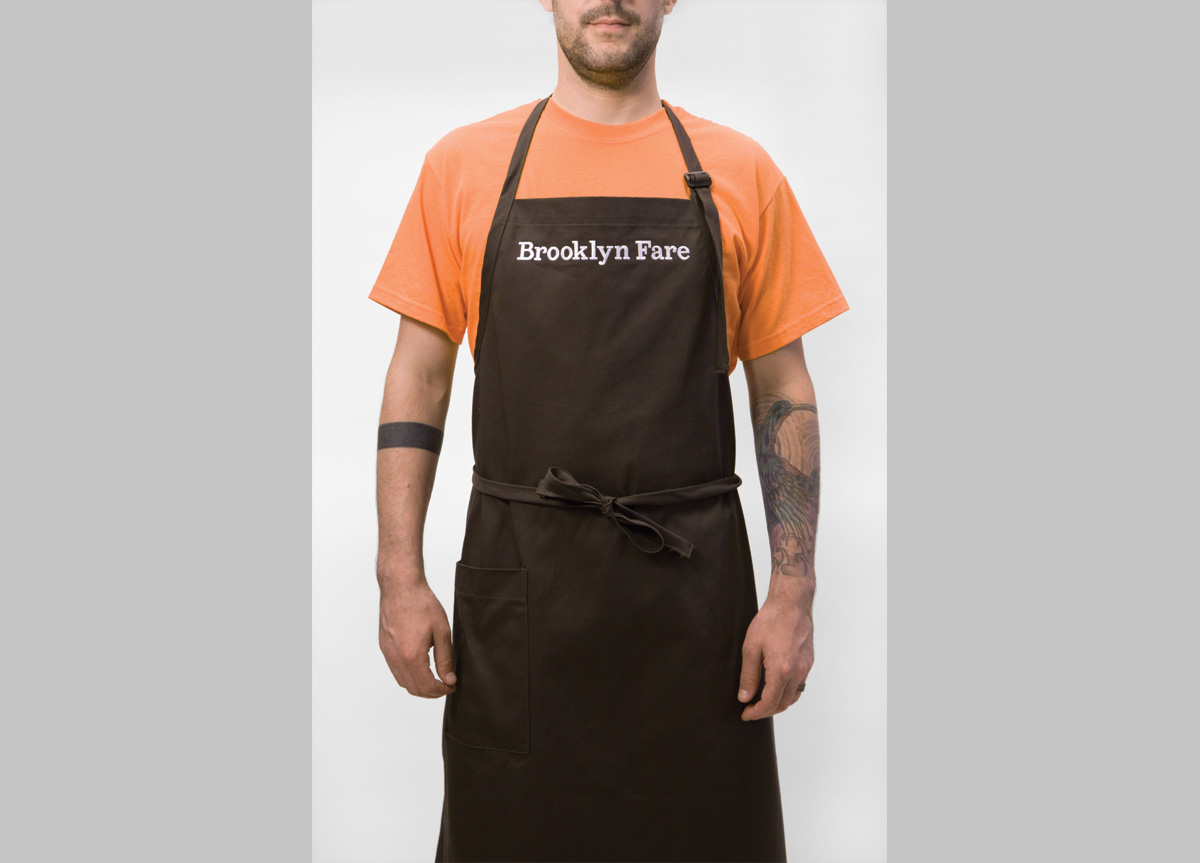
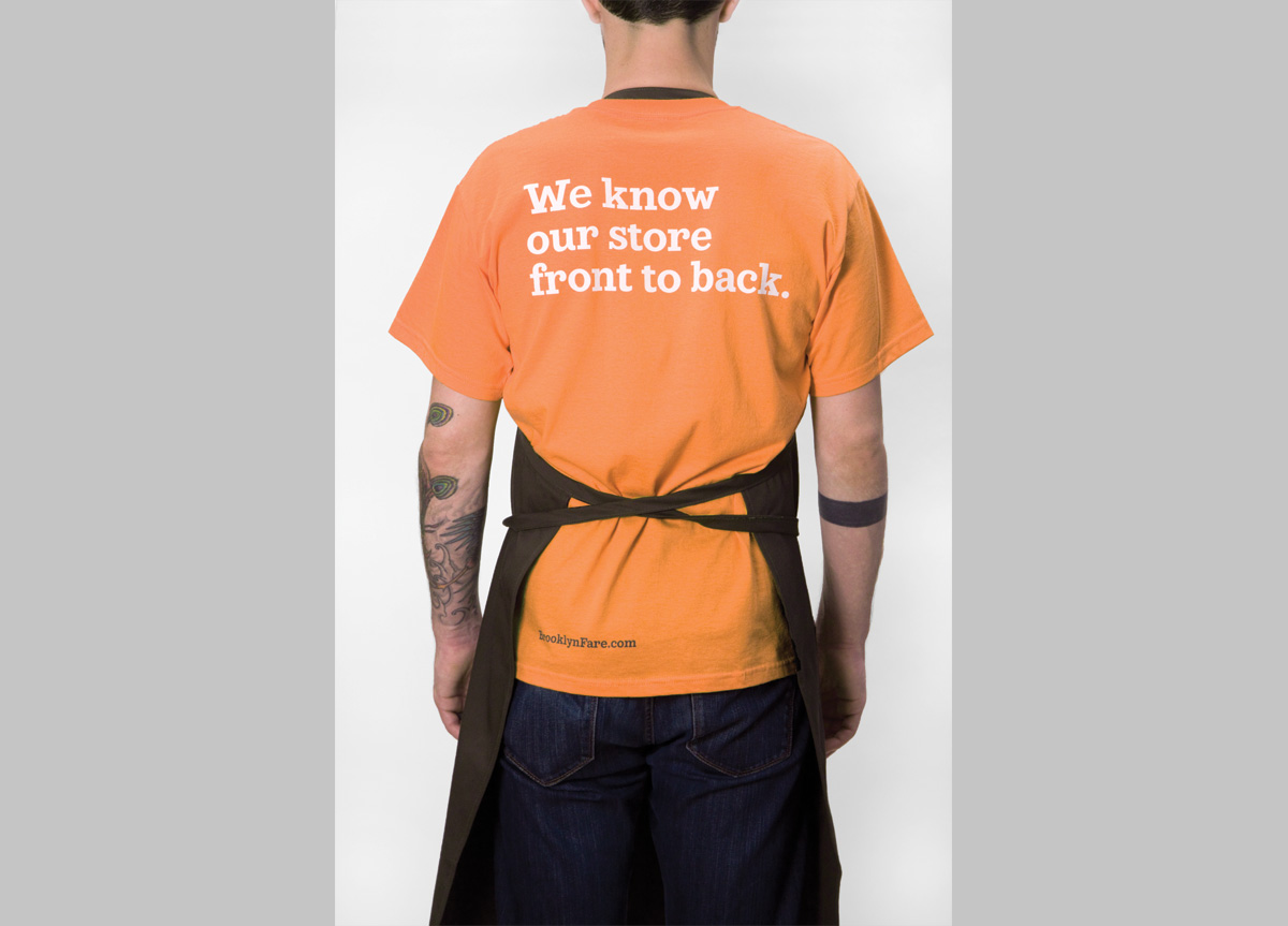
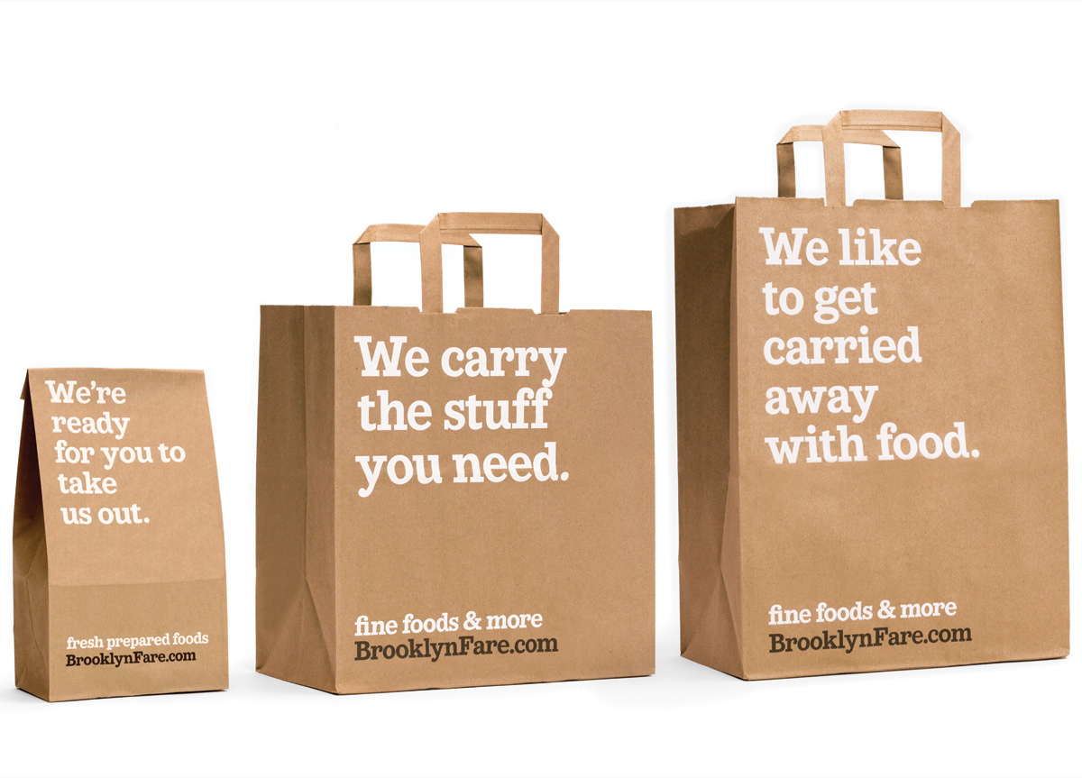
A key focus of our branding strategy was to give the store a unique voice to gain attention in an emerging neighborhood and distinguish it from its chain store competitors, which came through in a literal manner, with irreverent text as the focus of the brand. We took great care to achieve the right tone, writing copy with a smart humor that New Yorkers would respond to. Because the brand is based on text meant to engage the customer, we created a proprietary typeface, Fare Serif, to echo the same playful tone. From store signage to packaging to employee uniforms, Brooklyn Fare speaks to consumers in a language that makes the daily grocery run a little more palatable.


