CATEGORY

Offset

RANK


PRODUCTION DETAILS

Quantity

500 each

Page Count

Number of Colors

4

Binding

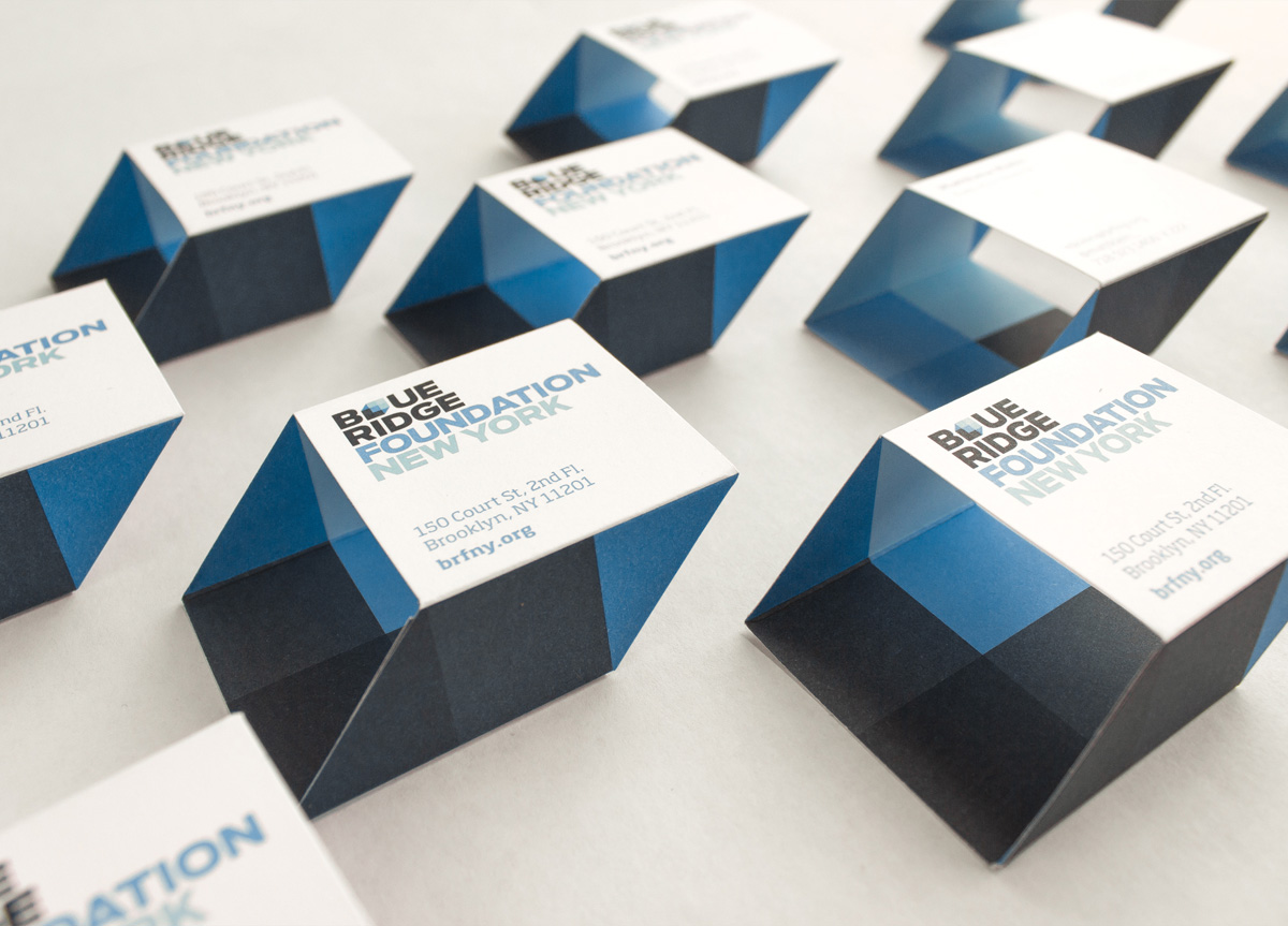
Business card Hand glued

Dimensions

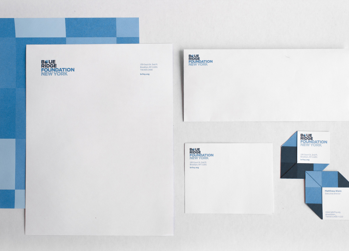
Letterhead 8.5 × 11
Envelope 4.125 × 9.5
Card (flat) 2.75 × 6.41

Paper Stock

Card Domtar, Cougar Cover, Smooth, 65lb
Letterhead Domtar, Cougar Cover, Smooth, 80lb

Special Techniques

Aqueous varnish


DESIGN CREDITS

Creative Directors

Julia Vakser Zeltser, Deroy Peraza

Creative Director and Designer

Josh Smith

Designers

Margaux Le Pierres, Rui Rideiro

Designer and Coder

Wen Ping Huang


TAGS

, , , , ,


LINKS

hyperakt.com
recycledpaper.com
brfny.org

Stationery for Blue Ridge Foundation by HyperaktStationery for Blue Ridge Foundation by HyperaktStationery for Blue Ridge Foundation by Hyperakt


CLIENT

Blue Ridge Foun­da­tion helps startups—new busi­ness­es with a mis­sion to make a difference—become suc­cess­ful orga­ni­za­tions. They pro­vide mon­ey, exper­tise, and office space, help­ing to tran­si­tion great ideas into mean­ing­ful impact. For 20 years they’ve helped launch social­ly con­scious initiatives.


BRIEF

Recent­ly, their focus has shift­ed towards tech­nol­o­gy-cen­tered ideas, and they reached out to us to help them com­mu­ni­cate with their new audience.


APPROACH

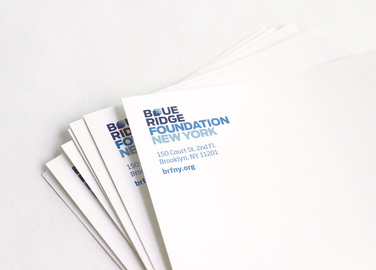
The client knew that in order to be cred­i­ble in the tech-start­up and social entre­pre­neur­ship sphere their brand would need to become more out­ward-fac­ing and inno­v­a­tive. We need­ed to nego­ti­ate between appeal­ing to a new, youth­ful, tech­nol­o­gy-cen­tered audi­ence, while still remain­ing authen­tic to the foun­da­tion’s his­to­ry. The three-dimen­sion­al cube visu­al­izes Blue Ridge as an incu­ba­tor space. The logo com­mu­ni­cates build­ing blocks, as the client helps new orga­ni­za­tions build a sol­id foundation.

PRODUCTION LESSONS

One important production lesson learned from this job was to leave areas that required glueing without any ink. Glue sticks best when on virgin paper.

Table of Contents