CLIENT
BRED focuses on different mediums serving non-profit, cultural, and corporate environments while seeking clients that share their appreciation for creative opportunities. The studio’s core belief revolves around effective design, the organizing force in defining, creating, and communication of meaning.
BRIEF
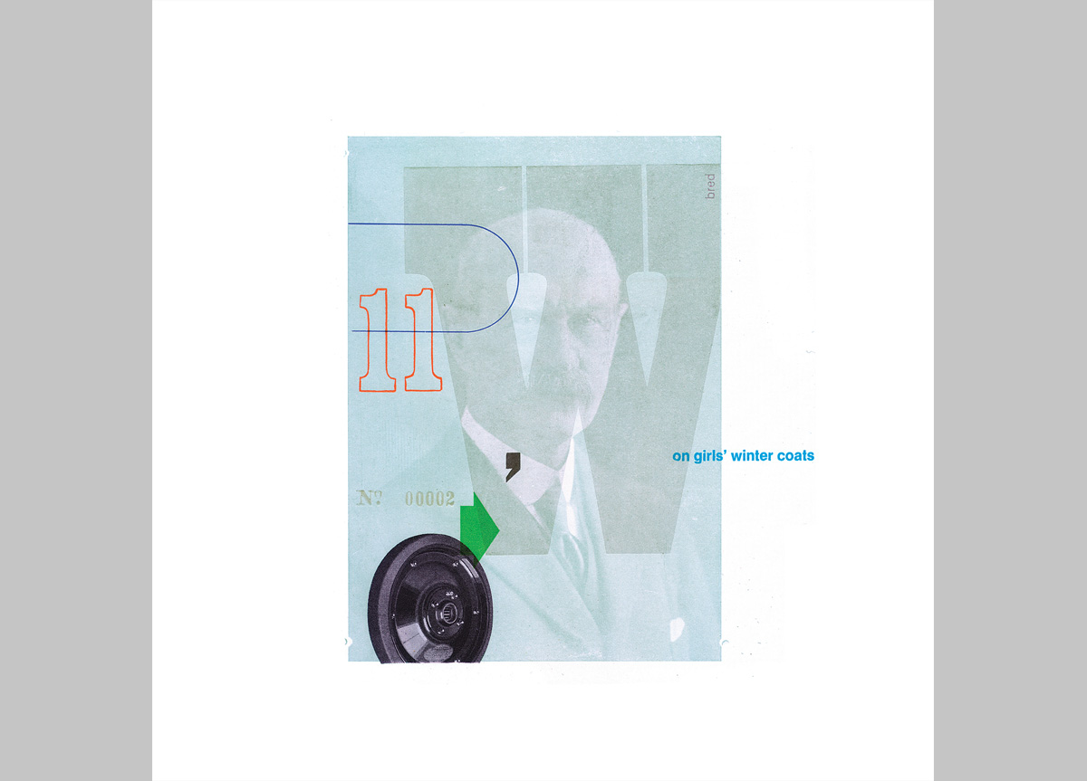
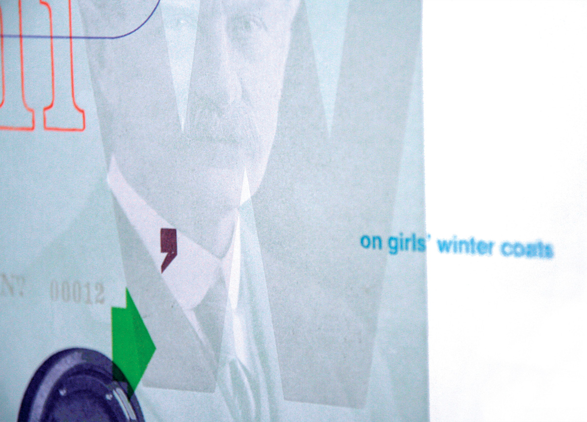
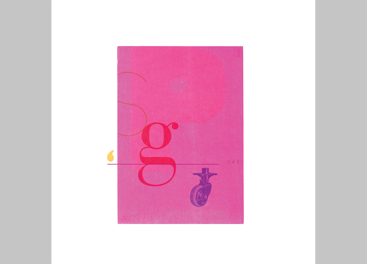
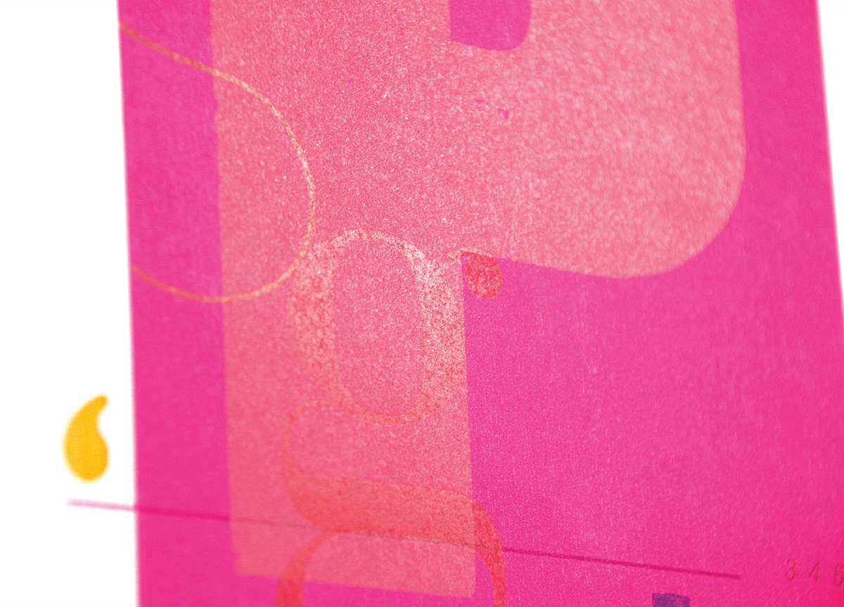
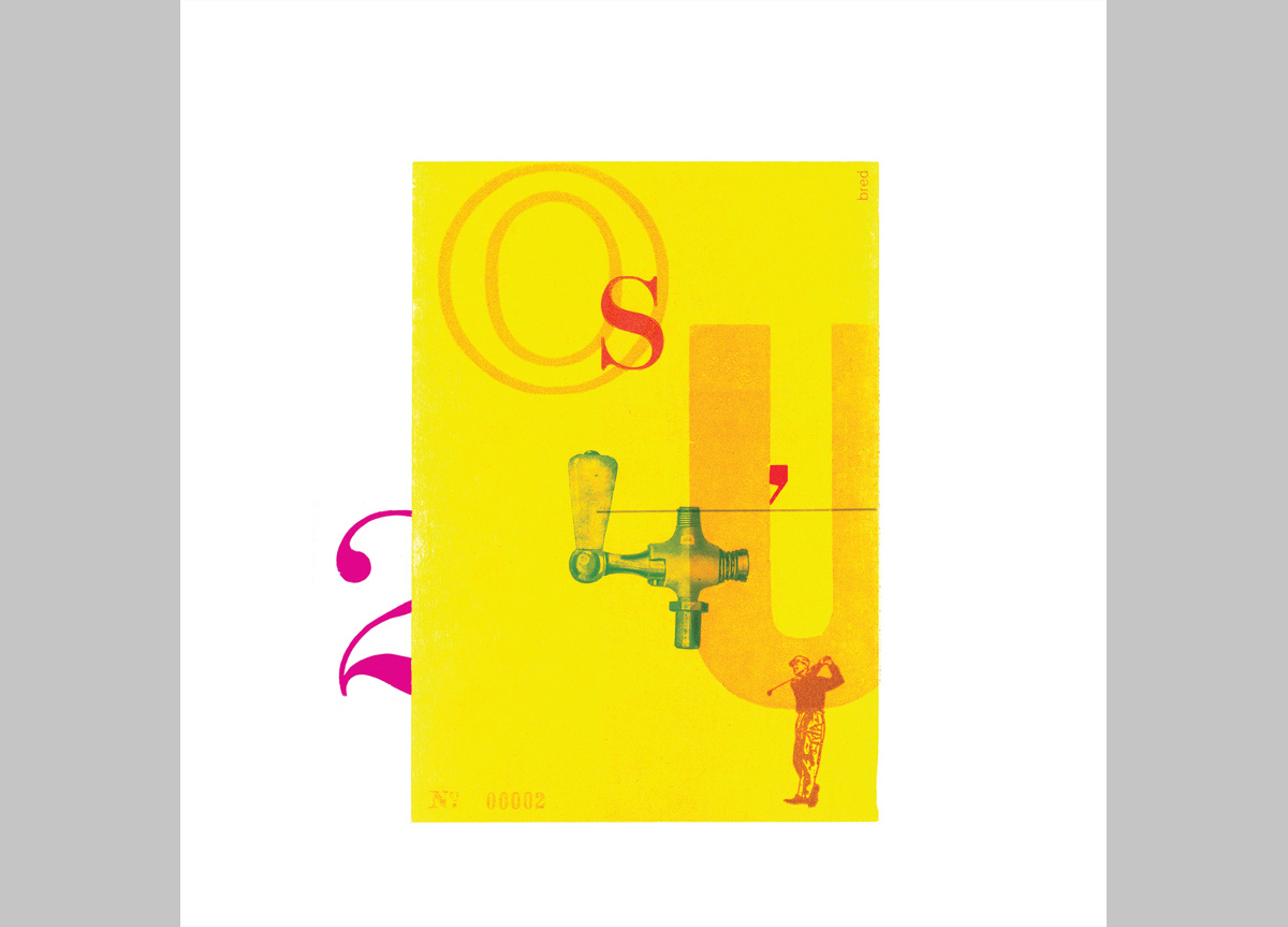
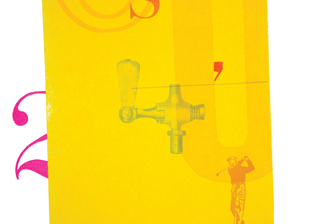
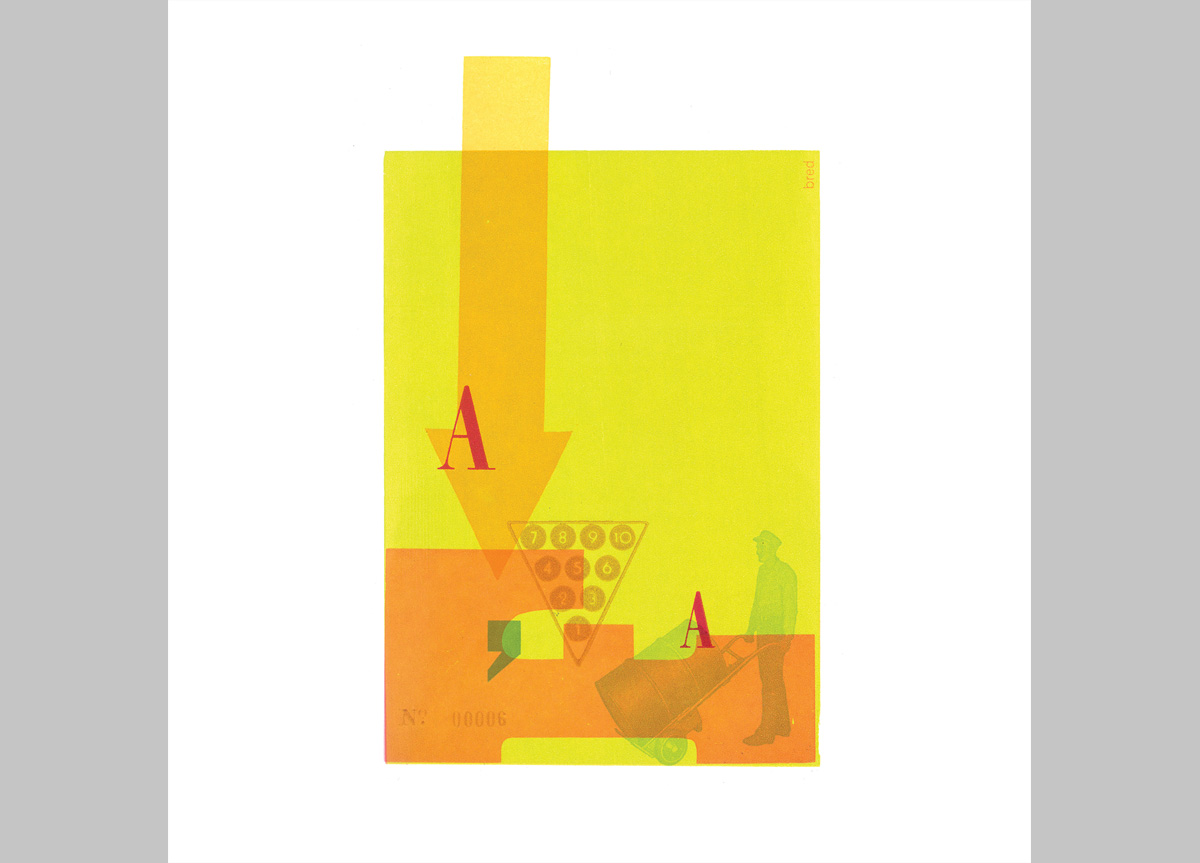
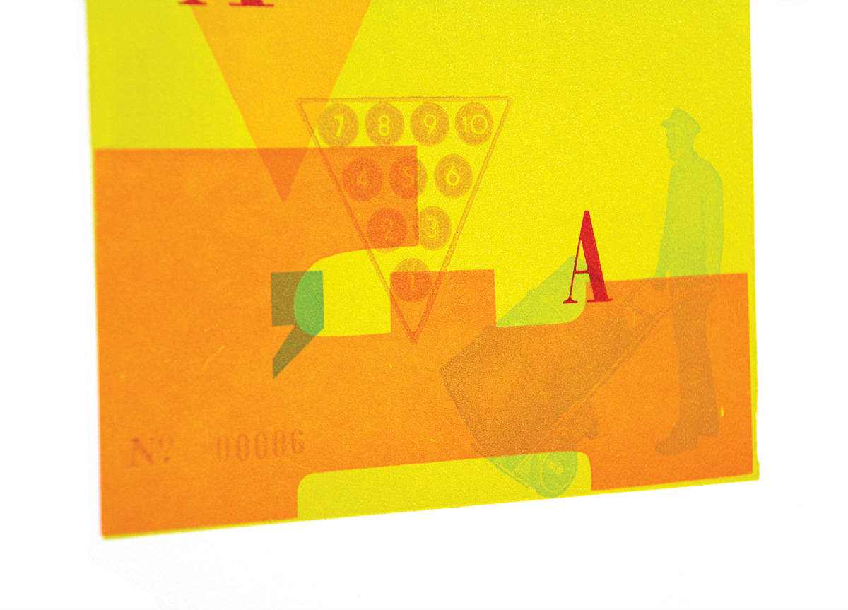
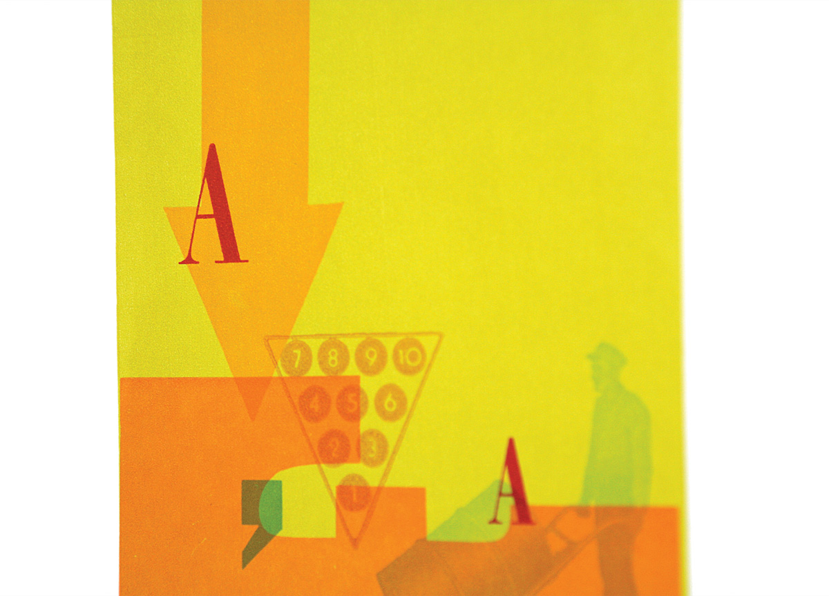
This self-promotional project was used to showcase our letterpress collection and capabilities. We wanted to exploit our eclectic collection of letterforms, halftones, and wood blocks with a bright and dynamic color palette.
APPROACH
Contrasting letterforms and images were juxtaposed against each other playing off their formal and conceptual qualities such as large vs. small, thick vs. thin, or play vs. production. As we printed, a narrative began to informally develop, allowing for each composition to reinforce the essence of the season. We used a centered 5‑by-7-inch woodblock as our base to give the series a consistent look as well as to establish a seasonal color palette. The compositions shifted from warm colors to cool, illustrating the seasonal change.
