CLIENT
MC Kitchen opened in the Miami, FL, Design District in November 2012. Chef Dena Marino and partner Brandy Coletta serve up modern Italian organic food that is rich, fresh, and delicious. The high-end restaurant is flanked by Mercato, an Italian-inspired marketplace bringing freshly-made gourmet items to-go.
BRIEF
The restaurant space is buttressed by Flos, Vitra, and Alessi. It is modern, high-end, and polished but its heart is an enormous and very busy open kitchen. MC Kitchen is driven by contrast: Miami/Italian, refined/rustic, modern/kitchen. The identity system had to walk that same line.
APPROACH
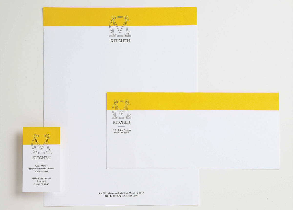
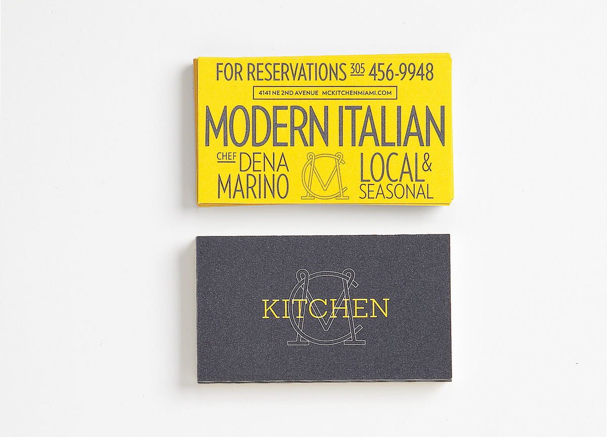
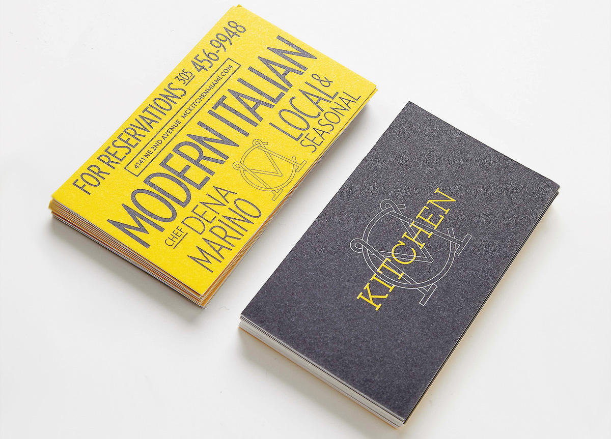
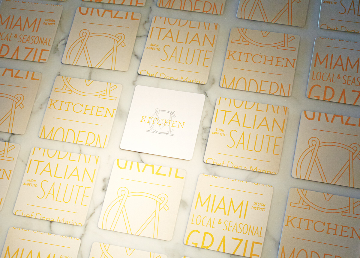
The sharp Verlag contrasts the colloquial Rockwell and the hand-drawn monogram. The color palette is white and warm gray with yellow. And that’s it. The tool kit is simple and straightforward. The graphic language is entirely typographic. And the color balance bravely walks the Miami/Italian line. Phase One deliverables included menu books and menus, takeaway bags, coasters, corporate stationery, web layout, and uniforms. Ongoing work includes expansion to market, signage, and collateral. It all drives forward to bring together the refined/rustic food with the modern/kitchen in Miami/Italy.


