CLIENT
Reactor is a design studio that focuses on branding and print design based out of Kansas City, MO.
BRIEF
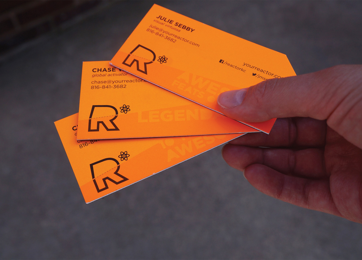
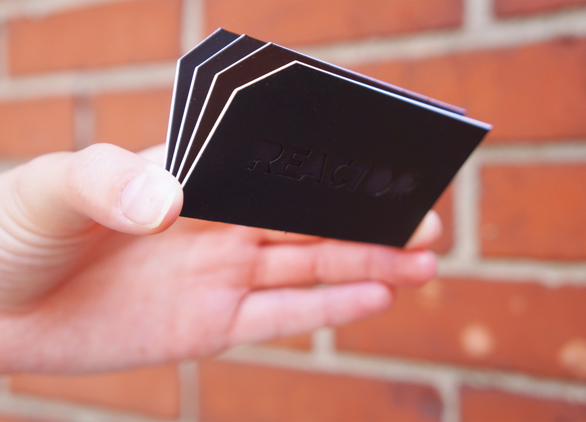
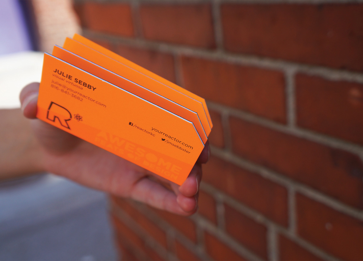
We have become somewhat known for the business cards that we have created for ourselves and clients throughout the years. So when we set out to create these cards, they had to be special. We wanted to use materials like lenticular in a way that it’s not typically used, while keeping the cards simple and legible.
APPROACH
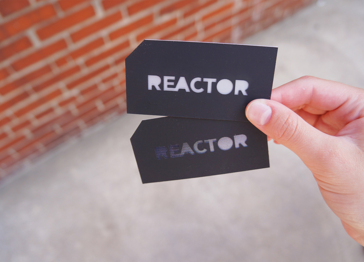
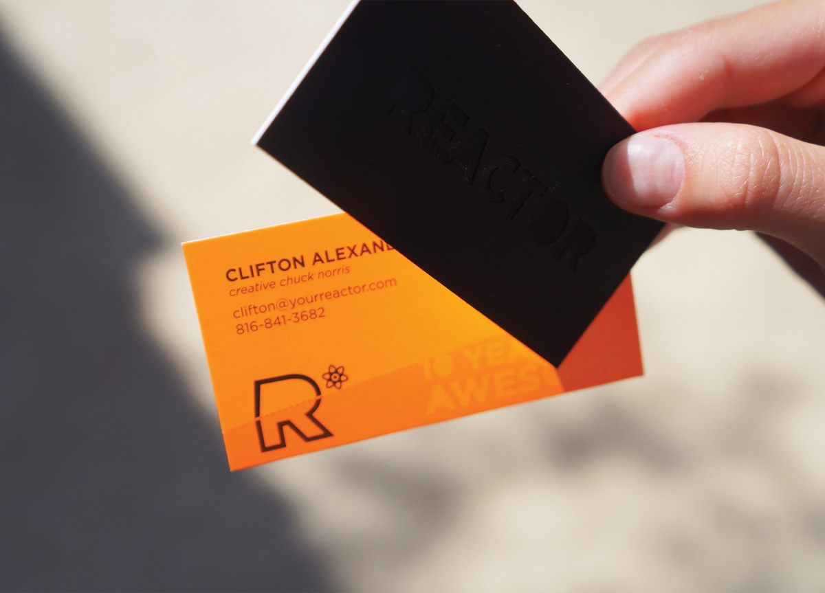
We chose a simple black-to-white flip which makes the Reactor name almost disappear on the black paper. We also chose to embed the lenticular piece inside the card to give it sense of depth and mystery. The black side of the card then contrasts directly with the fluorescent orange side. The receiver of the card continually flips it from one side to the other, creating an awesome interaction.
